
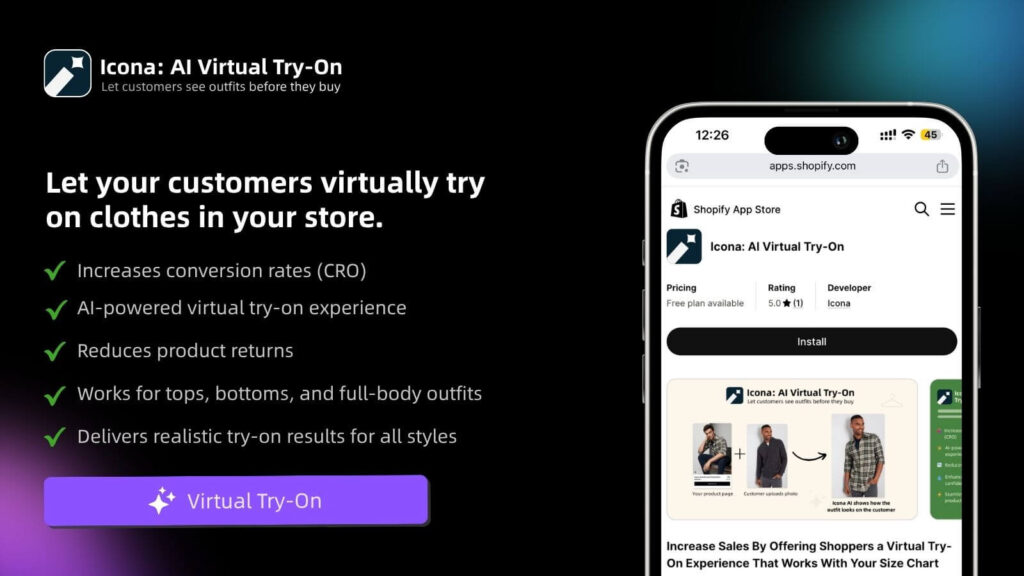
Are you tired of wrestling with your budget just to get professional-looking product photos for your store? You’re not alone. For years, creating stunning, studio-quality images felt like a massive uphill battle. But that’s all changing. AI product photography is here, and it’s completely reshaping how you can create the visuals that sell your products. It puts the power of a full-scale photo studio right at your fingertips—no camera or lighting crew needed.
A New Chapter for Your E-commerce Visuals
Let’s be real: incredible visuals are the heart and soul of your Shopify store. But traditional photoshoots are a huge roadblock for growing brands like yours. The costs pile up, the logistics are a nightmare, and the whole process takes forever. You end up with just a handful of images you’re forced to recycle over and over again. It’s a creative bottleneck that can leave you feeling stuck, unable to refresh your product pages or launch exciting new campaigns.
Now, what if you could dream up an endless variety of lifestyle shots, custom backgrounds, and perfectly on-brand imagery whenever you wanted? That’s the promise of AI product photography. This isn’t about faking products. It’s about taking a simple, clean photo of your real product and dropping it into countless professionally crafted scenes.
A Smarter, Faster Way to Create
Picture this: your best-selling handbag, beautifully shot in a cozy Parisian café, then on a sun-drenched tropical beach, and finally in a sleek, modern apartment. You could generate all of these—and hundreds more—in a single afternoon, right from your laptop. This kind of visual firepower was once only accessible to brands with eye-watering budgets. Not anymore.
This isn’t just a niche trend; it’s a massive shift. The global AI market is absolutely exploding and is projected to hit $1.81 trillion by 2030. A huge part of that growth is fueled by tools built specifically for e-commerce, designed to automate and elevate creative work for entrepreneurs like you.
The Big Idea: AI product photography isn’t some futuristic gimmick. It’s a fundamental change in how online brands create their most valuable asset: product visuals. It levels the playing field, giving you the ability to compete visually with the biggest names in your space.
Let’s look at how this directly tackles the headaches that come with traditional photography.
| Factor | Traditional Photoshoot | AI Product Photography |
|---|---|---|
| Cost | High (photographer, studio, props, models) | Low, predictable subscription fee |
| Time | Weeks of planning, shooting, and editing | Minutes to generate dozens of images |
| Variety | Limited to the scenes and props on-site | Virtually unlimited creative possibilities |
| Logistics | Complex coordination, shipping products | Simple: just upload a photo of your product |
| Consistency | Can be difficult to maintain across shoots | Effortless brand consistency with saved styles |
As you can see, the difference is night and day. AI gives you the freedom to create without the traditional constraints.
Solving Your Biggest Photography Headaches
This technology is a direct answer to the most common frustrations you face as a Shopify merchant. By handing over the heavy lifting to AI, you can finally break through the barriers that have been holding back your visual marketing.
- Crushing Costs: Forget about renting studios, hiring photographers, or sourcing expensive props. You can generate thousands of unique images for less than the cost of a single traditional photoshoot.
- Endless Logistics: Skip the weeks of planning, scheduling, and back-and-forth. Create images ready for your next big campaign in minutes, so you can jump on trends or holidays instantly.
- The Variety Problem: Stop reusing the same five photos everywhere. Build a deep, diverse library of visuals to keep your website, social media, and ads feeling fresh and exciting.
- Wobbly Branding: Easily generate images that lock into your specific style, color palette, and brand vibe. This ensures a polished, cohesive look across your entire store. To learn more about building that seamless look, check out our guide on the best ecommerce personalization tools.
How to Create Your First AI-Powered Photoshoot in 4 Simple Steps
Alright, let’s get your hands dirty and create some incredible AI-powered images for your store. This is where the magic really happens. We’re going to walk you through the entire process, from taking a simple photo with your phone to generating a professional-quality lifestyle shot that actually sells.
Forget everything you think you know about product photography. The days of booking expensive studios and hiring photographers are fading. Today, it’s about a smart, creative workflow that puts you in the director’s chair.
This diagram perfectly captures the shift. You’re moving away from the old, expensive, and slow process to something fast, flexible, and far more creative.
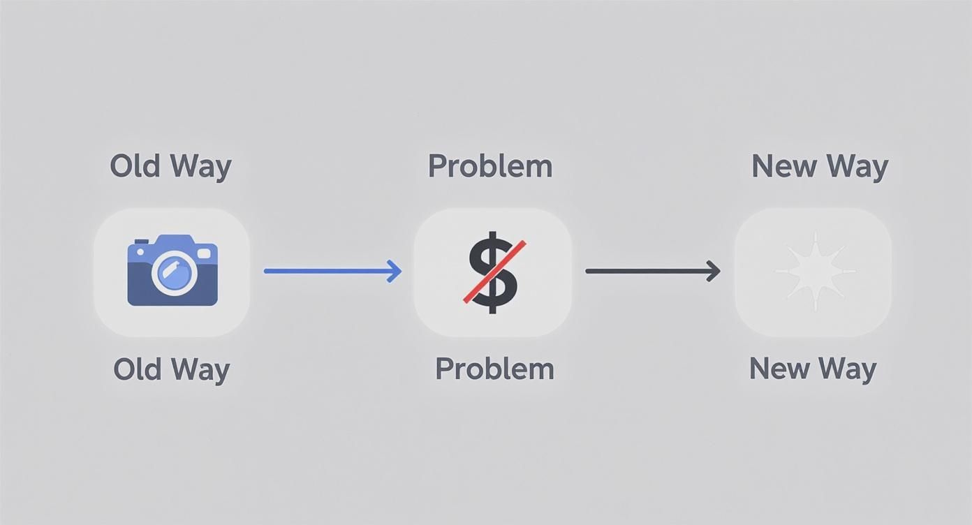
The new way removes the biggest hurdles—cost and complexity—so you can focus on bringing your brand’s vision to life.
Step 1: Start with the Perfect Product Shot
Here’s the thing: your final AI image is only as good as the initial photo you give it. This is the single most important part of the process. A clean, high-quality image of your actual product is non-negotiable. Think of it as giving your AI artist the best canvas and paints to work with.
And no, you don’t need a fancy DSLR. Your smartphone is more than powerful enough.
Here’s my advice for getting that perfect shot:
- Hunt for Good Light: Natural, diffused light is your secret weapon. Place your product near a window on a cloudy day or in a spot with bright, indirect sun. You want to avoid the harsh, direct sunlight that creates those sharp, ugly shadows.
- Keep the Background Simple: A plain white or light-colored background is ideal. It helps the AI cleanly separate your product from everything else. A large sheet of paper, a poster board, or even a clean wall works wonders. If you want a more pro setup, you can find different kinds of photography background cloth that provide a perfectly smooth surface.
- Capture All the Angles: Don’t just take one photo. Shoot your product from the front, the side, and a three-quarter view. This gives you options later and lets you find its most flattering side for your AI scenes.
- Get it Sharp: Tap your phone’s screen right on the product to lock in the focus. A blurry source photo will only ever produce a blurry AI image. It has to be crisp.
Your Go-To Pro Tip: After you’ve taken the picture, use a free app like PhotoRoom or even Canva’s background remover. Uploading a PNG file with a transparent background gives the AI the cleanest possible starting point and leads to much better results.
Step 2: Write Prompts That Create Magic
With your product photo ready, it’s time for the really fun part: telling the AI what kind of world to build around it. You do this with a text prompt, which is just a short, descriptive sentence that acts as your creative brief. Your job is to paint a picture with your words.
The secret to a killer prompt is specificity. Don’t just say “on a table.” What kind of table? What’s it made of? What’s the lighting like? What’s the mood? Every detail you add makes the final image more believable and compelling.
Let’s break it down with a couple of real-world examples.
Example 1: A Skincare Product
- Vague Prompt: “A skincare bottle on a counter.” (Boring.)
- Detailed, Effective Prompt: “A minimalist white skincare bottle on a white marble countertop. Soft morning light streams in from a window on the left. A single dewy green leaf rests beside the bottle. Photorealistic, clean, and serene.”
Example 2: A Leather Handbag
- Vague Prompt: “A handbag on a chair.” (You can do better.)
- Detailed, Effective Prompt: “A rich brown leather tote bag sitting on a rustic wooden chair in a cozy café. A steaming cup of coffee and an open book are on the small table next to it. Warm, inviting afternoon light. Lifestyle shot.”
See the difference? The detailed prompts mention materials, lighting, mood, and even the desired camera style (“photorealistic,” “lifestyle shot”). These words are the direct instructions the AI uses to craft a scene that feels real.
When you use a tool like Icona Studio, the process is incredibly straightforward. You just upload your product shot and start describing the scene you envision. It’s built for people who aren’t tech wizards, making it easy for you to jump right in.
Step 3: Generate and Iterate
Ready to give it a shot? Run your first generation! Don’t expect perfection on the first try. The real power is in refining your prompt. Tweak the lighting from “morning light” to “golden hour,” or swap “marble countertop” for “slate tile,” and see what happens. This isn’t just about making pretty pictures; it’s about giving you the creative control of a professional photographer without the sky-high costs and logistical nightmares.
Step 4: Optimize Your New Images for Shopify
You’ve used AI to create a whole library of incredible, eye-catching product photos. That’s a huge win. But here’s a hard truth: creating the images is only half the job.
Now it’s time for you to put those visuals to work. Getting this next part right is what turns pretty pictures into assets that actually drive sales. This isn’t just about dragging and dropping files into your Shopify admin. You need to think like a customer and, just as importantly, like a search engine.
A gorgeous, high-resolution image that takes forever to load can kill a sale in seconds and tank your Google rankings. Let’s make sure all your creative effort pays off.
Nail the Technicals for Speed and SEO
Before you upload a single image, you have to talk about speed. Page load time is everything in e-commerce. It’s not just a minor annoyance for your shoppers; it’s a conversion killer. The data is clear: even a one-second delay can cause a 7% drop in conversions. That’s a painful number. Your beautiful AI product photography should be an asset, not an anchor.
Here’s how to make sure your images are lean, mean, and lightning-fast:
- Choose the Right File Format: Forget what you know about JPEGs. In 2025, the gold standard for the web is WebP. This format, developed by Google, delivers fantastic image quality at a fraction of the file size. Most AI tools can export directly to WebP, and if not, a quick online converter will do the trick.
- Compress Everything: A massive, uncompressed image file is the enemy of a fast website. Use a tool like TinyPNG or rely on Shopify’s excellent built-in optimizer to shrink file sizes without any noticeable loss in quality. A great target to aim for is under 100 KB per image.
- Get Your Dimensions Right: This is a classic rookie mistake. Never upload a giant 4000×4000 pixel image when your theme is only going to display it at 800×800. Resize your images to the exact dimensions your Shopify theme requires before you upload. This saves the browser from having to resize it on the fly, which is a huge drag on loading time.
Write Alt Text That Actually Gets You Found
Next up is something that’s so easy to ignore but so incredibly powerful: alt text. This is the little text description you add to an image in Shopify. It does two critical things. First, it makes your store accessible for visually impaired users who use screen readers. Second, it’s a direct signal to Google about what your image contains, which is pure SEO gold.
A lazy alt text is just “handbag.” A great alt text tells a story.
Your Personal Tip: Don’t just stuff keywords in there. Write your alt text as if you’re describing the photo over the phone to a friend. When you do that, the important keywords naturally fall into place, and you create a much better experience for everyone.
Here’s a simple formula you can use for writing effective alt text:
[Product Name] – [Key Features] in a [Scene/Setting]
- Weak Alt Text:
alt="skincare bottle" - Strong Alt Text:
alt="Glow Serum minimalist skincare bottle on a white marble countertop with soft morning light"
See the difference? That detailed description helps Google understand the context of your product. This is how you start ranking in image searches and bringing more free, organic traffic straight to your product pages.
Build a Product Gallery That Sells
Finally, let’s think about the big picture. How will these new images look together on your product page? A product gallery shouldn’t feel like a random collection of photos. It should be a carefully curated visual narrative that walks a customer from curiosity to “add to cart.”
You’ve got a fantastic variety of shots from your AI tool, so let’s be strategic.
- The Hero Image: Start with a crisp, clear shot of the product on a simple background. This is your classic “packshot” that shows the customer exactly what they’re buying, no distractions.
- Lifestyle in Context: Next, bring in 2-3 of your best AI-generated lifestyle images. Show your product being used or admired in an environment that speaks directly to your target audience’s aspirations.
- The Devil’s in the Details: Add close-ups that highlight the texture, materials, or unique craftsmanship of your product. If you find your AI images are a bit soft on the fine details, a good online image upscaler can sharpen them up beautifully.
- Show Off the Options: If you offer different colors, materials, or styles, you absolutely need a dedicated, high-quality image for every single variant. Don’t make your customers guess.
By taking the time to optimize the technical stuff and thoughtfully arrange your gallery, you transform those AI-generated images into a high-octane sales engine. This is where your creative vision meets real-world results, building a store that isn’t just stunning but is also fast, accessible, and designed to convert.
Turning Your AI Visuals Into More Sales
You’ve got a fantastic library of AI images. That’s the first step. Now, let’s make them work for you—let’s turn that creative spark into actual revenue. Your product images are your silent salespeople, and knowing how to make them speak directly to your customers is what separates a good store from a great one. This isn’t about the tech; it’s about connecting with people.
Remember, your customers aren’t just buying a thing. They’re buying a feeling, a solution, or a better version of themselves. When you use AI product photography to drop your product into a scene that feels relatable and aspirational, you’re not just showing what it is—you’re showing what it enables. This helps shoppers instantly picture it in their own lives, making the decision to buy feel less like a transaction and more like a natural next step.
Tap Into Your Customer’s Aspirations
Take a moment and really think about your ideal customer. What does their world look like? What do they dream about? Your product photos should be a mirror, reflecting that world right back at them.
AI gives you this incredible superpower to craft these perfect scenes instantly. Selling handcrafted leather journals? Forget the sterile white background. Use an AI prompt to place it on a rustic wooden desk next to a steaming mug of coffee, with soft morning light spilling through a window. Suddenly, it’s not just a journal; it’s a portal to creativity, a promise of quiet, reflective mornings.
Here are a few actionable ideas for your store:
- Fitness Gear: That water bottle isn’t just for hydration. Show it on a yoga mat overlooking a serene mountain sunrise.
- Luxury Skincare: Place your face cream on a sleek marble vanity next to a plush silk robe. It’s an act of self-care.
- Children’s Toys: Generate a scene with your toy in a bright, sun-drenched playroom. It’s a scene of pure, simple joy.
These context-rich images answer your customer’s unspoken questions and help them see your product as a piece of the life they’re building for themselves.
The Power of A/B Testing Your Visuals
One of the most effective—and historically expensive—marketing tactics is now completely within your reach: visual A/B testing. For years, this was a game only big brands with huge budgets could play. To test if a handbag sold better against a city backdrop versus a beach scene, you’d have to commission two entirely separate, costly photoshoots.
Those days are over.
With AI, you can spin up dozens of variations in minutes for practically nothing. Does your handbag get more clicks in a bustling city street scene or a quiet, minimalist café? Does a dark, moody background convert better than a light, airy one? You don’t have to guess anymore. AI makes finding the real answer simple, affordable, and incredibly fast. For example, a Shopify store A/B tested their hero images and found that lifestyle shots increased add-to-carts by 28% compared to plain background photos.
Your Next Step: Stop guessing what your customers want to see. Use AI to create a handful of different visual concepts, run simple tests on your product pages or in your ads, and let the data point you to what truly drives clicks and sales.
This data-first approach takes the guesswork out of your creative decisions and helps you build a visual strategy that’s actually proven to work. It’s a fundamental shift that levels the playing field for small businesses. In fact, the global e-commerce product photography market hit around $1 billion in 2024 and is expected to double by 2033, largely because AI is making powerful strategies like this accessible to everyone. You can dig into more of the market growth data on businessresearchinsights.com.
Build Trust with Visual Consistency
While variety is key for testing, consistency is what builds a brand people trust. You want your AI-generated images to feel like they all belong to the same story. A cohesive visual identity makes your store look polished and professional, which gives shoppers the confidence to buy from you.
Use your AI tool to deliberately establish a clear visual style.
- Define Your Lighting: Is your brand all about “soft, natural morning light” or “dramatic, high-contrast studio lighting”?
- Choose Your Color Palette: Do your backdrops lean into “warm, earthy tones” or “cool, minimalist grays and blues”?
- Select Your Environments: Are your scenes typically “urban and modern” or “rustic and natural”?
Once you figure out what works, create a “prompt library”—just a simple document where you save your best-performing prompts. This becomes your brand’s visual playbook, ensuring every new image reinforces your identity. It’s just like how Icona Studio helps customers see how a product fits their personal style; your consistent imagery helps them see how your brand fits into their life. That’s how you move beyond one-time sales and start building a loyal following that comes back for more.
Working Through the Quirks of AI Photography
Jumping into AI product photography is an adventure, but let’s be real—it’s not always a straight line from prompt to perfection. AI is a phenomenal creative partner, but it has its odd moments. Sooner or later, you’ll generate an image that’s just… off. The lighting might feel alien, a shadow lands in the wrong place, or the AI invents a bizarre detail that has no business being there.
Don’t sweat it. This is part of the creative dance. The goal isn’t to get frustrated but to learn how to nudge the AI in the right direction. Think of it less like a vending machine and more like a collaboration—you’re refining the vision together.

Troubleshooting Those “What Happened Here?” Moments
When a generation goes sideways, the temptation is to scrap it and start fresh. But hold on. Often, a small adjustment to your prompt is all you need. The AI doesn’t see like we do; it interprets your text literally. When it gets something wrong, it’s usually because your instructions left a little too much room for creative (and sometimes weird) interpretation.
Here are a few common hiccups and how to fix them by tightening up your prompts.
Problem: The shadows and lighting look unnatural.
- The Fix: Get hyper-specific about your light source. Instead of a generic “brightly lit,” tell the AI where the light is coming from. Try phrases like “soft morning light filtering through a window on the left” or “dramatic, single-source overhead studio lighting.” This gives the AI a clear point of reference for casting believable shadows and highlights.
Problem: The AI is adding random objects to the scene.
- The Fix: This is where negative prompts are your best friend. Most advanced AI tools, including Icona Studio, let you specify what you don’t want. If you keep getting surprise floral arrangements in your minimalist shots, adding a negative prompt like
no flowers, no patternscan instantly clean up the composition. It’s a game-changer.
- The Fix: This is where negative prompts are your best friend. Most advanced AI tools, including Icona Studio, let you specify what you don’t want. If you keep getting surprise floral arrangements in your minimalist shots, adding a negative prompt like
Problem: The textures look flat or synthetic.
- The Fix: Layer in descriptive adjectives. Don’t just say “wooden table.” Is it a “rustic, weathered oak table with a prominent grain” or a “smooth, polished dark cherry wood table with a high-gloss finish”? Those extra details give the AI the data it needs to render textures that look and feel real.
Build a Prompt Library to Keep Your Brand on Point
Once you start getting the hang of it, a new challenge pops up: consistency. A product page filled with images in a dozen different styles looks messy and unprofessional. The secret to keeping your brand’s visual identity tight is building a prompt library.
This doesn’t have to be complicated. A simple Google Doc or a page in Notion is perfect. It’s a living document where you save your greatest hits—the prompts that perfectly capture your brand’s essence.
Your prompt library is your brand’s visual style guide for the AI era. It’s the key to making sure every image, whether you create it today or six months from now, feels like it belongs to one cohesive, polished brand.
Start by defining your brand’s core visual DNA. What’s the signature look you’re after?
- Lighting Style: “Soft, diffused natural light, always”
- Color Palette: “Warm, earthy tones—think muted greens, beiges, and terracotta”
- Overall Vibe: “Minimalist and clean, with organic, natural elements”
When you finally write a prompt that nails this aesthetic, save it! For example:"A [product name] on a light, unfinished oak surface. Soft, diffused natural light comes from a large window on the right. The background is a simple, out-of-focus room with a single large monstera plant. Minimalist, clean composition with warm, earthy tones."
Now, you have a master template. The next time you need an image, just copy this base prompt and swap in the new product details. This simple habit will save you countless hours and is the single most effective way to ensure your AI product photography consistently strengthens your brand identity.
A Quick Word on Ethics and Building Trust
Finally, let’s talk about the most important thing: trust. AI gives you the power to create stunning, aspirational scenes, but that power comes with responsibility. Your customers trust you to show them what they’re actually buying.
Using AI to mislead—to make a product look larger than it is, to change its color, or to imply it comes with accessories that are sold separately—is a fast track to broken trust and a flood of returns.
The goal isn’t to create a fantasy your product can’t live up to. It’s to tell the story of your real product in the most beautiful way possible. Use this incredible technology to build a brand that’s not just gorgeous, but also honest and trustworthy.
Your Top AI Photography Questions, Answered
Diving into AI product photography can feel like stepping into a whole new world, and it’s totally normal to have a few questions. You’re not just testing out a new app; you’re fundamentally changing how you create your store’s most critical assets. Let’s tackle some of the biggest questions from Shopify owners just like you, so you can jump in with complete confidence.
Think of this as your personal FAQ, clearing the path so you can focus on creating amazing visuals.
Is AI Product Photography Too Expensive for a Small Store?
Honestly, this is one of the biggest myths out there. The reality? AI photography is one of the most cost-effective upgrades you can possibly make to your store.
Think about the old way of doing things: hiring a photographer, booking a studio, sourcing props, paying for editing… the bill can easily hit thousands of dollars for just a handful of shots. That traditional model has always been a barrier for smaller businesses and startups like yours.
AI completely turns that on its head. Most tools, including Icona Studio, work on a super flexible subscription or credit-based system. This means you can create a massive library of unique, professional-quality images for a predictable, low monthly cost. It’s a game-changer that levels the playing field, putting incredible visuals within your reach.
Will My AI-Generated Images Look Fake or Unrealistic?
This is the big one, isn’t it? You don’t want your products to look cheap or obviously computer-generated. The good news is that the AI has gotten so good at creating photorealistic scenes that this is rarely an issue anymore.
The secret to getting it right isn’t about the AI—it’s about what you give it to work with.
The key to realistic AI images is incredibly simple: start with a great photo of your actual product and give the AI a clear, descriptive prompt.
Remember, you’re not creating a “fake” product. You’re simply placing your real, tangible product into a new, beautifully imagined setting. When you guide the AI with specific details—like “warm afternoon sunlight filtering through a window” or “a rustic, dark wood table”—you steer it toward a result that’s often impossible to tell apart from a real photo. Your product is the star, the anchor that makes the whole scene feel real.
Do I Need to Be a Tech Guru to Use These Tools?
Absolutely not. The best AI product photography platforms were built for entrepreneurs and marketers, not for professional graphic designers. The whole point is to make this process incredibly simple and intuitive for you.
If you can upload a picture to Instagram and write a quick sentence describing what you want, you already have all the skills you need.
The workflow is usually a piece of cake:
- Upload a clean shot of your product.
- Describe the scene you’re picturing in plain English.
- Click a button to generate the images.
All the heavy lifting and complex tech stuff happens in the background. Your role is purely creative—you’re the visionary, not the technician.
How Can AI Help Me A/B Test My Product Images?
This is where AI goes from being a cool tool to a powerful growth machine for your store. In the past, A/B testing different product photos was a slow and expensive process, something only the big brands could really afford to do.
AI makes it fast, cheap, and accessible for everyone. It gives you the power to test different creative ideas and let your customers show you what they respond to.
For instance, you could take one product and generate images for a dozen different concepts:
- A bright, minimalist studio shot.
- A cozy, lived-in home setting.
- A rugged, outdoor adventure scene.
From there, you can run simple tests on your product pages or in your ads to see which style gets the most engagement, add-to-carts, and ultimately, sales. You’re no longer guessing what works; you’re using real data to build a visual strategy that’s proven to convert. Just like TryIcona helps your customers visualize products before they buy, using AI-powered A/B testing helps you validate your creative choices to maximize sales.
You now have the playbook to create stunning visuals that actually sell. The next step is to put it into action. By combining the creative freedom of AI with a smart, customer-focused strategy, you can build a Shopify store that not only looks incredible but also converts like never before. Start today and see the difference it makes for your brand.
Start Creating with Icona for Free
Building a modern website today requires more than just a pretty interface. You need speed, flexibility, powerful customization, advanced animation controls, and—most importantly—a builder that doesn’t limit your creativity. After building countless WordPress projects over the years and trying nearly every major page builder (Elementor, Divi, Bricks, Gutenberg, Oxygen), I eventually found something refreshingly different: Droip WordPress Page Builder.
Droip is relatively new compared to giants in the industry, but its approach is fresh, scalable, and shockingly powerful. When building TryIcona.com, I needed a platform that could handle advanced layouts, smooth interactions, and pixel-perfect flexibility without drowning the site in heavy scripts. Droip delivered exactly that.
If you’re a WordPress user looking for a next-gen design tool—or if you’re simply curious why more developers are switching to Droip—this in-depth guide will walk you through everything.
What Makes Droip Different from Traditional Page Builders?
Most page builders follow the same formula: drag-and-drop widgets, preset modules, and limited styling adjustments. That works fine for simple sites, but if you’ve ever tried to build something unique or fully customized, you’ve probably run into walls.
Droip takes a fundamentally different approach:
1. A True Visual Builder With Full Design Freedom
Droip behaves like a professional design canvas rather than a typical WordPress widget builder. Instead of choosing from predefined blocks, you can freely:
- Position elements anywhere
- Adjust spacing precisely
- Create custom layouts
- Layer elements like in Figma
- Apply CSS-level controls visually
- Customize at breakpoints for full responsiveness
There’s no “boxed-in” feeling. Everything is editable.
2. Interaction & Animation Systems That Feel Like Webflow
This is arguably Droip’s standout feature.
You can create:
- On-scroll animations
- Hover interactions
- Parallax effects
- Entrance and exit transitions
- Mouse movement animations
- Timeline-based, multi-step animations
…all without coding.
For TryIcona.com, this made it incredibly easy to display product demos, animate elements on scroll, and improve user engagement without bloating the site with multiple JS libraries.
3. Lightweight Code Output
Many page builders generate messy HTML, unnecessary wrappers, or heavy scripts. Droip emphasizes clean code:
- Minimal DOM structure
- Efficient CSS
- Optimized JS
- Faster loading pages
This is especially important now that Core Web Vitals determine search rankings and user experience.
4. Built for Power Users AND Beginners
Beginners get drag-and-drop simplicity.
Developers get full control via:
- CSS
- Flexbox & Grid
- Asset management
- Responsive breakpoints
- Custom attributes
- JavaScript integration
- Accessibility tools
It’s rare to find a builder that satisfies both groups equally.
Why I Used Droip to Build TryIcona.com
When creating the homepage, landing pages, documentation, and product showcase for TryIcona, I evaluated all the usual options. What I needed was:
- A professional look with smooth micro-interactions
- Fast load times for SEO and conversions
- Absolute layout control
- A builder that respects responsive design
- Zero-code animations
- Easy embedding of app demos, images, and videos
- Stability on all devices
Droip checked all boxes.
Here’s how it directly impacted different sections of the website:
1. Homepage Hero Section
The hero area on TryIcona needed:
- A dynamic background
- Overlapping elements
- Animation on scroll
- Responsive behavior on all screens
Droip’s layering and interaction features allowed me to build this quickly without writing a single line of JavaScript.
2. Product Demonstrations & Visuals
TryIcona is a virtual try-on app, meaning visuals matter. Droip made it easy to:
- Add smooth fade-in animations
- Highlight before/after transitions
- Create custom hover states
- Present GIF or video demos attractively
Everything looks modern and lively.
3. Conversion-Focused Sections
With Droip, I built:
- Call-to-action sections
- Trust badges
- Feature blocks
- Scroll-triggered animations
- Testimonials
The builder’s granular spacing and typography control made every section feel polished.
4. Mobile Experience
Droip offers per-breakpoint editing, which allowed me to create a perfectly responsive layout. I never felt limited by device constraints.
5. Performance & SEO
Because Droip outputs efficient code, the site remains fast—even with interactions and media-heavy sections. For an app-focused site like TryIcona, this is crucial for conversions.
Top Features of Droip That Developers Love
1. Flexbox & Grid Editing
You can visually manipulate complex layouts without touching CSS. Droip lets you:
- Switch between Flexbox and Grid layouts
- Adjust column/row sizes
- Align items precisely
- Create responsive versions for tablet & mobile
This level of control is extremely useful for creating modern, balanced page designs.
2. Advanced Visual Interactions
Droip’s interaction builder rivals tools like Webflow. You can define animations triggered by:
- Scroll
- Mouse movement
- Hover
- Click
- Page load
- Element visibility
Each animation can have its own duration, delay, easing, and sequence.
3. No More “Widget-Only” Limitations
Instead of being locked into:
- pre-built blocks
- rigid templates
- shortcode-based content
Droip lets you build freely, combining elements organically.
4. Reusable Components
If you create:
- buttons
- pricing cards
- CTA sections
- feature sections
- headers or footers
…you can save them, reuse them, and edit globally.
5. Template & Block Library
Droip includes beautifully designed templates for:
- landing pages
- SaaS websites
- ecommerce pages
- agency portfolios
- blogs
- contact pages
These templates are built with modern 2025 design trends in mind—clean, geometric, minimal, and conversion-driven.
6. Responsive Design Tools
Droip allows you to:
- Adjust spacing per device
- Change typography for different screen sizes
- Resize images
- Hide/show elements
- Use mobile-first or desktop-first strategies
Many builders claim “responsive editing,” but Droip actually delivers a powerful, intuitive version.
7. Clean Code & High Performance
This is a big reason developers are switching from heavier builders:
- Minimal CSS
- No unnecessary wrappers
- Fewer JavaScript dependencies
- Optimized animations
Better performance = better SEO and better conversions.
8. Developer Mode Features
For those who want deeper control, Droip offers:
- Custom HTML blocks
- Custom CSS
- Custom JavaScript
- Element attributes
- Data attributes
- Integration-ready components
It’s extremely flexible under the hood.
How Droip Improves User Engagement Through Interactions
Interactions are no longer “nice-to-have.” They’re part of modern UX.
- Scroll animations improve storytelling.
- Micro-interactions enhance button clicks.
- Fade-in effects boost readability.
- Parallax gives depth.
- Hover states improve product visualization.
- Movement triggers make designs feel alive.
Droip makes all this accessible without any coding.
For example, on TryIcona.com:
- Images animate gently as you scroll.
- Headings rise into view.
- Icons brighten on hover.
- Sections slide into place with subtle timing.
These small touches add up to a premium experience.
Who Should Use Droip? (And When Not To)
Recommended for:
- Designers who want freedom like Figma/Webflow
- Developers who need cleaner code output
- Agencies building conversion-focused websites
- SaaS landing pages
- Ecommerce brands
- Portfolio websites
- Animation-heavy webpages
- Businesses wanting premium and modern design
Not the best fit if:
- You want a builder with thousands of pre-made widgets
- You prefer extremely rigid templates
- You rely heavily on third-party integrations through builder plugins
Droip is more of a creative canvas than a widget marketplace—this is why it’s perfect for custom brands like TryIcona.
Droip vs. Other Popular Page Builders
Here’s a quick comparison:
| Feature | Droip | Elementor | Divi | Bricks | Oxygen |
|---|---|---|---|---|---|
| Clean Code Output | Yes | Moderate | Heavy | Good | Good |
| Animation Controls | Excellent | Basic | Good | Limited | Advanced (code-heavy) |
| Flexbox & Grid | Visual & Advanced | Limited | Basic | Good | Good |
| Canvas-style Editing | Yes | No | No | No | No |
| Learning Curve | Medium | Easy | Easy | Medium | High |
| Performance | High | Medium | Medium | High | High |
| Designer Freedom | Excellent | Good | Good | Good | Medium |
Droip is closest to Webflow in terms of design freedom—but inside WordPress.
Tips for Building a Professional Website with Droip
Based on building TryIcona, here are some practical lessons:
1. Use Global Colors and Styles
Set brand colors, fonts, and spacing globally before designing pages.
2. Build Reusable Sections
Things like CTAs, pricing sections, FAQs, or footers should be saved for reuse.
3. Keep Animations Subtle
Too much movement becomes distracting—aim for smooth, gentle transitions.
4. Optimize Media Files
Use WebP images and compressed videos to keep pages light.
5. Structure Layouts with Flexbox/Grid
This keeps everything responsive and clean.
6. Test on Multiple Devices
Droip’s responsive preview tool helps ensure pixel-perfect layouts.
Final Thoughts: Droip is the Future of WordPress Page Building
Droip brings a refreshing, innovative approach to web design inside WordPress. For creators, entrepreneurs, and developers who care about:
- design freedom
- performance
- interactions
- custom layouts
- modern animation capabilities
…it offers something genuinely powerful. When building TryIcona.com, Droip gave me the control I wanted without any of the typical limitations of traditional page builders.
If your brand deserves a premium, modern, interactive website—Droip is absolutely worth the investment.
Ever felt that gut-wrenching moment when you upload a product photo, only to see it look fuzzy and unprofessional on a big screen? When your images are blurry, you’re not just losing pixels; you’re losing customers. This is where an online image upscaler becomes your secret weapon for growth.
Struggling to turn your product photos into conversion-driving assets? You’re in the right place. Think of an upscaler as a digital artist, powered by smart AI, that meticulously adds detail and clarity back into your photos. It transforms them from passable to polished, making your products look crisp, professional, and completely irresistible.
Your Guide to Flawless Shopify Product Images
An upscaler can be a total game-changer for your store. It can rescue low-quality photos from a supplier, sharpen up pictures you snapped on your phone, and breathe new life into your entire product catalog. In this guide, I’ll pull back the curtain on how this technology works and give you a practical, step-by-step roadmap to elevate your store’s visuals, build customer trust, and watch your sales climb.
This isn’t just a niche tool; it’s a booming industry. Projections show the AI image enhancer market could explode to over USD 10 billion by 2033, which tells you everything you need to know about how vital high-quality visuals have become for businesses just like yours. You can explore more data on global AI image enhancer market trends to see just how massive this trend is.
What an Online Image Upscaler Can Do for You
At its heart, an online image upscaler increases the resolution—or the pixel count—of a digital image. But here’s the magic: unlike old-school resizing tools that just stretch out the existing pixels and create a blurry mess, modern upscalers use artificial intelligence to intelligently add new, realistic detail.
It’s less about stretching and more about rebuilding. The AI has been trained on millions of images to understand what a high-resolution version of your photo should look like, and it fills in the gaps with stunning accuracy.
The immediate benefits for your store are powerful:
- Rescue Low-Resolution Photos: Got grainy images from a supplier or old marketing shots? An upscaler can turn them into crisp, usable assets for your product pages.
- Enhance Smartphone Photography: Take the great photos from your phone and elevate them to a professional standard, making them perfect for retina displays and zoom features. A Shopify store that upscaled its smartphone photos saw a 28% increase in add-to-carts because customers could finally see the product details clearly.
- Improve Perceived Product Value: Sharp, detailed images signal quality and trustworthiness. They make your products look more premium, encouraging your customers to buy with confidence.
- Create Versatile Marketing Materials: Upscale a single image and use it everywhere—from a huge website banner to a small social media post—without losing an ounce of quality.
Online Image Upscaler Key Benefits at a Glance
Here is a quick summary of the immediate advantages an online image upscaler offers your Shopify store.
| Benefit | Impact on Your Store |
|---|---|
| Cost-Effective | Avoids expensive reshoots by fixing your existing low-quality images. |
| Increased Conversions | High-quality visuals are proven to build trust and encourage purchases. |
| Brand Consistency | Ensures all your product images have a uniform, professional look. |
| Time-Saving | Upscales images in seconds, dramatically speeding up your workflow. |
These benefits add up to a stronger brand and a healthier bottom line.
Key Takeaway: An online image upscaler isn’t just making your pictures bigger; it’s making them better. It intelligently rebuilds your photos to add detail, clarity, and a professional polish that directly shapes how your customers see your brand.
By weaving this tool into your workflow, you can turn every visual on your site into an opportunity to impress. It’s a simple, accessible way to gain a serious competitive edge. After all, a perfectly upscaled image will look even more stunning against the right professional backdrop, a crucial element you can master in our guide on choosing the perfect photography background cloth.
How AI Magically Transforms Your Images

Have you ever wondered what’s really going on when you hit “upscale” on a blurry photo? It’s not just a simple trick of stretching the image. It’s a genuinely creative process, powered by some seriously smart AI, that feels like magic but is actually grounded in some fascinating technology.
Forget the old “zoom and enhance” trope from TV shows that just gave you bigger, blockier pixels. Modern online image upscalers are playing a completely different game. They don’t just guess what’s missing—they intelligently create it.
The AI as a Master Art Restorer
One of the most common methods uses something called a Convolutional Neural Network (CNN). The best way to think about a CNN is to imagine a master art restorer who has spent a lifetime studying millions of high-resolution images. This expert has an almost intuitive grasp of how textures, light, and edges are supposed to look in perfect detail.
When you feed this AI your low-resolution product photo, it sees it as a faded masterpiece in need of restoration. It scans the existing pixels and, drawing on its vast knowledge, begins to meticulously “paint in” the missing information with astonishing accuracy. It recognizes that a certain pattern of pixels suggests the rugged weave of denim, the smooth sheen of leather, or the clean line of a logo, and it reconstructs those details with confidence.
That’s the key. The final image doesn’t just look bigger; it looks sharper, cleaner, and more authentic because the AI has added brand-new, context-aware information. It’s breathing life back into your photo.
The AI with a Built-In Critic
Another incredible technique involves a Generative Adversarial Network (GAN). The name sounds intimidating, but the concept behind it is pure genius. Imagine you have two AIs working together in a competitive partnership:
- The Generator: This is the artist. Its sole purpose is to take your fuzzy image and generate the most realistic, high-resolution version it can possibly dream up. It’s literally creating new pixels from scratch to fill in the gaps.
- The Discriminator: This is the tough critic. Its job is to scrutinize the Generator’s work and determine if it looks like a genuine, high-quality photograph or just a clever fake.
These two are locked in a constant feedback loop. The Generator relentlessly tries to fool the Discriminator, while the Discriminator gets better and better at spotting imperfections. This rivalry forces the Generator to produce images that are so stunningly realistic they can easily pass for original, high-resolution photography.
Key Insight: The true power of AI upscaling lies in its ability to predict and generate new, believable details. It’s not just enlarging what’s already there; it’s creatively filling in the blanks based on an incredible depth of training, giving you a remarkably crisp final image.
What This Means for Your Shopify Store
Understanding what’s happening under the hood helps you see why an online image upscaler can be such a game-changer. You’re not just making a small photo bigger; you’re commissioning a digital artist to bring out its full potential.
This technology empowers you to:
- Enhance Product Details: The AI masterfully reconstructs fine textures, making fabrics, materials, and tiny features truly stand out. This gives your customers the clarity they need to make a confident purchase.
- Build Customer Confidence: Sharp, professional images send a powerful message of quality and care. It tells your customers you’re serious about your brand, which builds immediate trust.
- Create Versatile Assets: A single, beautifully upscaled image can become a stunning homepage banner, a detailed product zoom, or a crisp social media ad. Your brand will look its absolute best, everywhere.
This is how you turn a mediocre photo into one of your most powerful sales tools, ensuring your products look absolutely phenomenal on every device, from a small phone to a massive monitor.
Your Product Photos Can Make or Break Your Sales

Let’s be honest. In the world of e-commerce, your product photos are your best salespeople. They work around the clock, showcasing your products and nudging shoppers to click “add to cart.” But if those photos are fuzzy, pixelated, or just plain unclear, they aren’t just failing at their job—they’re actively chasing away your customers.
High-resolution images are no longer a nice-to-have; they are the bedrock of a store that actually converts.
Crystal-clear, detailed photos do so much more than just look pretty. They instantly build trust and broadcast the quality of your brand. When a potential customer can zoom right in and see the fine stitching on a leather bag or the delicate texture of a hand-woven scarf, their confidence in what you’re selling goes through the roof. It’s the closest you can get to letting them hold the item in their hands.
The Psychology Behind a Perfect Picture
So, why do great images have such a profound effect on us? It all comes down to a simple, powerful psychological trigger: perceived value.
When a product is presented with sharp, professional photography, we instantly see it as more valuable, better made, and far more desirable. On the flip side, blurry images scream “cheap” and suggest a lack of care, planting seeds of doubt in a shopper’s mind.
This is exactly where an online image upscaler stops being a simple tool and starts becoming a direct investment in your revenue. By elevating your photos, you are directly elevating the perceived worth of every single thing you sell.
The demand for these tools is exploding as more and more businesses stake their claim online. With an incredible number of small and medium-sized businesses (SMEs) worldwide projected to top 400 million by 2025, countless entrepreneurs like you are turning to AI-powered solutions to create visuals that don’t just look good, but actively drive sales.
Turning Shopper Hesitation into Buyer Confidence
Think about the last time you shopped online. Did you ever bail on a purchase simply because you couldn’t get a clear look at the product? You’re definitely not alone. High-resolution images are the antidote to that uncertainty.
Here’s how upscaled images directly solve common customer headaches:
- Enables Deep Dives: A zoom feature is completely useless without a high-res photo to back it up. Upscaling ensures your customers can magnify every last detail without it dissolving into a blocky, pixelated mess.
- Answers Questions Visually: “What does the clasp on that necklace look like?” “Can I see the wood grain on that table?” Sharp images answer these questions before they’re even asked, smoothing out the path to purchase.
- Slashes Return Rates: When your customers know exactly what they’re getting, the chance of disappointment plummets. Clarity leads to happier customers and, thankfully, fewer returns.
The Bottom Line: Every pixel is an opportunity. High-resolution images build a bridge of trust between your brand and your customer. They erase doubt, provide answers, and create a powerful sense of quality that gives shoppers the confidence they need to hit that “buy” button.
It’s Time to Turn Your Visuals into Sales
Upgrading your product photography doesn’t have to mean booking expensive, time-consuming photoshoots. By using an online image upscaler, you can breathe new life into your existing photos—even the decent ones you snapped on your smartphone—and turn them into professional-grade assets that convert.
A beautifully optimized image is a non-negotiable part of a high-performing product page. To see how these visuals fit into the bigger picture of creating a winning storefront, check out our deep dive on Shopify product page customization.
By taking a few moments to enhance your images, you’re doing more than just improving the look of your site. You’re building a more credible, trustworthy, and ultimately more profitable brand.
A Practical Guide to Upscaling Your Shopify Images
Ready to give your product photos the glow-up they deserve? You don’t need to be a Photoshop wizard to get jaw-dropping results. With the right approach and a good online image upscaler, you can transform your product visuals from “good enough” to “add to cart.”
Let’s walk through the exact steps to breathe new life into your store’s imagery. This isn’t just a technical process; it’s about making your products look irresistible.
Step 1: Start with a Visual Audit
First things first, let’s figure out what you’re working with. Before you start upscaling every single image, take a quick stroll through your own Shopify store. Pretend you’re a customer and look for the photos that could use a little extra love.
- Spot the slightly blurry shots: These are your low-hanging fruit. Photos that are just a little soft can be brought back into sharp focus beautifully.
- Hunt down low-res supplier photos: We’ve all been there. You get tiny, pixelated images from your manufacturer. These are perfect candidates for upscaling.
- Check your hero images and banners: The biggest, most important visuals on your site absolutely have to be flawless. These should be at the top of your priority list.
This quick audit isn’t about being critical; it’s about creating a smart, focused plan. You’ll know exactly where your efforts will make the biggest difference.
Step 2: Choose Your Upscaling Tool Wisely
Not all upscalers are built the same. The internet is flooded with options, but you want to find a tool that is fast, intuitive, and, most importantly, delivers clean results without weird digital artifacts.
The best services usually offer a free trial or a handful of free credits. This is your chance to test-drive them. Grab one of the images you flagged in your audit, upload it, and see what happens. It’s the only way to know if a tool’s “magic” is right for your products.
Step 3: Prep Your Photos for the Best Results
Think of the AI as a talented artist. The better the canvas you give it, the better the masterpiece it can create. A little prep work goes a long way.
Before you upload, make sure your images have:
- Good lighting: A bright, well-lit photo gives the AI much more detail and information to work with.
- Decent focus: While these tools are amazing, they can’t save a photo that’s completely out of focus. Slightly soft is fixable; a blurry mess is not.
- The right format: Stick to the basics. Most online tools work best with common formats like JPEG or PNG.
Pro Tip: If you have the original photo file, use it! Every time a JPEG is saved, it gets compressed and loses a tiny bit of quality. Starting with the highest-quality version you have will always give you a superior final image.
Step 4: Understand Your Upscaling Options
Once your photo is uploaded, you’ll see options like 2x, 4x, or maybe even 8x. So, what do these actually mean for your image?
- 2x Upscaling: This is your go-to for most product photos. It doubles the image’s dimensions (a 600×600 pixel image becomes 1200×1200 pixels), which is usually perfect for giving Shopify’s zoom feature something crisp and clear to work with.
- 4x Upscaling: This quadruples the dimensions. It’s fantastic for when you need to turn a smaller image into a big, bold homepage banner that stops scrollers in their tracks.
For your product pages, 2x is almost always the sweet spot. It delivers a massive quality boost without creating huge files that will slow your site down. Start there. Only jump to 4x when you truly need a much larger hero image.
Step 5: Review and Refine the Final Image
Once the AI has done its thing, it’s time for a quality check. Don’t just glance at the result; zoom in and really look. Compare the “before” and “after” and inspect the details that matter most to your customer—the texture of a sweater, the facets of a diamond, the precision of a logo.
Does it look natural? The best online image upscaler tools create results that are sharp but still look real. If you see any odd patterns or a waxy, “plastic” look, it might be a sign to try a different tool or a lower setting.
Step 6: Optimize and Upload to Your Store
This last step is absolutely critical. You now have a beautiful, high-resolution image, but it’s probably a massive file. Uploading it as-is will slow down your store, which is a killer for both your customer experience and your SEO.
Before uploading to Shopify, run your new image through a free image compression tool online. These tools are brilliant—they slash the file size with almost no noticeable drop in quality. You get the best of both worlds: a lightning-fast site and stunning, high-definition product photos.
Once it’s compressed, upload it to your product page and watch your visuals come to life!
To make sure you nail it every time, here’s a simple checklist you can follow.
Upscaling Workflow Checklist for Shopify Merchants
Follow this simple checklist for a smooth and effective image upscaling process.
| Step | Action Item | Pro Tip |
|---|---|---|
| 1. Audit | Identify blurry, low-res, or critical images (banners, bestsellers). | Start with the 5-10 images that will have the biggest impact on your sales. |
| 2. Select Tool | Choose an upscaler with a free trial to test your own images. | Look for tools that specialize in product photos to avoid an overly “artistic” look. |
| 3. Prepare | Select the highest-quality original image file (JPEG or PNG). | Make sure the lighting is good and the subject is reasonably in focus. |
| 4. Upscale | Select 2x for product photos and 4x for large banners. | Avoid going higher than you need; bigger isn’t always better for your site speed. |
| 5. Review | Zoom in and check for natural texture and sharpness. | Compare the “before” and “after” side-by-side to ensure it’s a true improvement. |
| 6. Optimize | Compress the upscaled image before uploading to Shopify. | Aim for the smallest file size possible without any visible loss in quality. |
Following these steps methodically will not only improve your images but also protect your site’s performance, giving you a powerful competitive edge.
When to Upscale and When to Start Fresh
An online image upscaler is a fantastic tool, but it’s not a silver bullet for every visual problem you’ll encounter. The real skill lies in knowing when to enhance a photo you already have and when it’s time to create something new from the ground up. Nailing this decision will make your entire visual strategy sharper and more efficient.
Here’s a simple way to think about it: an upscaler is like a photo restoration expert, tasked with perfecting what already exists. In contrast, a generative AI tool is your creative director, ready to build exactly what you need.
The Perfect Scenarios for an Online Image Upscaler
You’ll want to reach for an upscaler when your goal is purely to improve the quality of an image without altering its fundamental content. It’s the ideal fix for rescuing photos that are basically good but just don’t have that professional, high-definition polish.
Here are the moments when an online image upscaler truly shines:
- Rescuing Supplier Photos: Your supplier sends over product shots, but they’re too small or a little fuzzy. An upscaler can instantly sharpen them into beautiful, store-ready images for your Shopify listings.
- Improving Older Images: You’ve got photos from an old collection that you can’t reshoot, but they look pixelated on modern screens. Upscaling can give them a second life.
- Repurposing Social Media Content: That awesome photo from your Instagram feed would make a perfect website banner, but the resolution is too low. An upscaler bridges that quality gap in seconds.
- Enhancing Smartphone Pictures: You snapped some well-lit, perfectly framed shots on your phone, but they just aren’t sharp enough for your product page’s zoom feature. This is a classic job for an upscaler.
This simple decision tree can help you visualize when an upscaler is the right move.
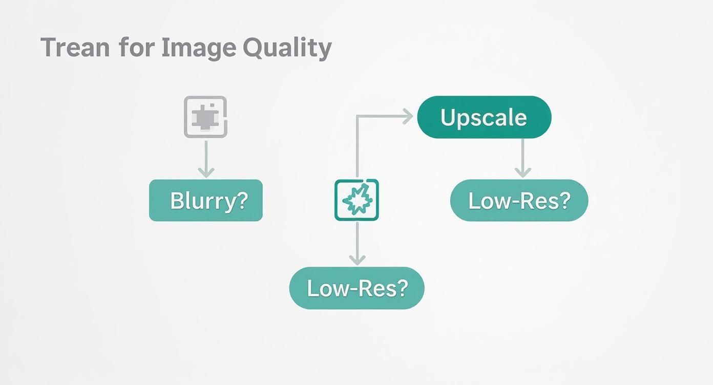
As you can see, if the root of your problem is a lack of pixels or clarity, an online image upscaler is your most direct and effective path forward.
When to Create Something New with AI
But sometimes, no amount of sharpening can fix the core issue. Maybe you need a completely different background, a new product angle, or a lifestyle shot you just don’t have. This is where you pivot from restoration to creation.
Generative AI tools are your go-to when you need to:
- Create Different Angles or Variations: Your photo only shows the front of a product, but your customers want to see a three-quarter view or a close-up of a key feature.
- Change the Background or Setting: You need to transport your product to a new scene—a sun-drenched beach, a modern kitchen, or a clean studio—without an expensive photoshoot.
- Generate Lifestyle Imagery: You want to show your product in action with a model but don’t have the budget or timeline for a live shoot.
- Produce Entirely New Concepts: You need to dream up marketing visuals that don’t exist yet, like a styled flat lay of your product with perfectly matched props.
Key Takeaway: Upscale to perfect what you have. Generate to create what you need. Understanding this distinction saves you time, money, and creative energy, ensuring you always choose the right tool for the task at hand.
For these kinds of creative jobs, a tool like Icona Studio is built for the challenge. While an online image upscaler refines an existing picture, Icona Studio can generate entirely new, photorealistic images from scratch, handing you complete creative control. This balanced toolkit lets you build a smarter, more agile visual strategy for your Shopify store. Just like TryIcona helps customers visualize products before purchase, these tools help them take the next step toward a confident purchase.
Balancing Image Quality and Site Performance
So, you’ve used an online image upscaler and now you have these absolutely stunning, high-resolution product photos. The temptation is to upload them straight to your store, right? Hold on a minute. This is where we need to talk about the delicate dance between breathtaking quality and lightning-fast site performance.
Let’s be real: huge, unoptimized images are the number one killer of a speedy Shopify store. A slow site doesn’t just frustrate your customers—it can absolutely tank your SEO rankings. The secret sauce is making your beautiful upscaled images much smaller in file size without losing that crisp, clear quality you worked so hard to get.
Compressing Images the Smart Way
“Image compression” might sound a bit techy, but the concept is simple. It’s all about shrinking the file size of your picture. There are two main ways to do this, and knowing the difference is crucial for keeping your photos looking great.
- Lossless Compression: This method cleverly reduces the file size by stripping out unnecessary metadata from the image file. Imagine it as cleaning out your file cabinet—all the important stuff (your pixels) is still there, just packed more efficiently. The image quality stays exactly the same, but the file size reduction is usually pretty small.
- Lossy Compression: This approach is a bit more aggressive. It intelligently removes bits of pixel data that the human eye isn’t likely to pick up on anyway. This can lead to a massive drop in file size, but if you push it too far, you’ll start to see the quality degrade.
Your Sweet Spot: For your Shopify product photos, a light touch of lossy compression is almost always the perfect move. It delivers that ideal combination of a significantly smaller file size with a visual quality that still looks sharp and professional to your customers.
The good news is you don’t have to do this manually. Countless free online tools and Shopify apps can find that perfect balance for you. Getting that file size down while keeping your images looking amazing is a critical step in making your store more visible to search engines. If you want to dive deeper, you can find more essential SEO tips for your Shopify store.
Protecting Your Most Valuable Assets
Every time you upload a product photo to an online service, you’re trusting them with a valuable piece of your business. This brings up a really important conversation about privacy and security.
With so many tools out there, it’s vital to know who you’re dealing with. Before you use any online image upscaler, take a few minutes to read their privacy policy.
Here’s what you should be looking for:
- A clear promise that your images will not be used to train their AI models.
- Confirmation that your photos are automatically and permanently deleted after a set period.
- A guarantee that they won’t share or sell your images to anyone else.
Your product photos are your intellectual property, period. Choosing a service that respects that gives you the confidence to improve your visuals without putting your business at risk. This careful approach is how you build a store that isn’t just beautiful and fast, but also secure.
Your Top Questions About Image Upscalers, Answered
Jumping into the world of AI tools can feel like learning a new language. You’ve got questions, and that’s a great sign you’re taking your store’s quality seriously. Let’s clear up some of the most common things Shopify merchants like you wonder about when it comes to online image upscalers.
Will Using an AI Upscaler Make My Images Look Fake?
That’s the big fear, isn’t it? Nobody wants their products to look like they’ve been wrapped in plastic. But you can breathe easy. The best AI upscalers are trained on millions of real-world photos, so they’ve learned what real textures are supposed to look like.
Instead of just adding a fake, glossy finish, a good tool is brilliant at enhancing the details that are already there, like the weave of a fabric or the grain in a piece of wood. The secret is to give it a decent photo to start with and not push it too far—trying to turn a tiny thumbnail into a massive billboard (think beyond a 4x upscale) might reveal some digital weirdness. Always give the final result a quick look to make sure it represents your brand perfectly.
Can I Use an Online Image Upscaler on My Smartphone Photos?
Yes, you absolutely can! Honestly, this is one of the best ways for you to get ahead. Most of us start out snapping product photos on our phones, and while today’s smartphones are amazing, the images sometimes don’t have that super-crisp quality you need for a professional “zoom” feature on your product page.
An online image upscaler is your secret weapon here. It can take those good smartphone shots and make them great, adding the sharpness and clarity that builds customer confidence and makes your products pop. It’s a game-changer for getting high-end results without dropping a ton of cash on professional camera gear.
How Much Does an Online Image Upscaler Cost?
The cost can be all over the place, but many of the best tools run on a “freemium” model. This is perfect for you because it means you can usually upscale a few images for free to see if you like the results before committing.
Once you decide to pay, it’s often based on a credit system, where you might buy a pack of credits or get a certain number with a small monthly subscription. For most Shopify stores, this is incredibly affordable. When you think about the return you get from better conversion rates and a more trustworthy brand image, it’s easily one of the smartest and most cost-effective investments you can make for your store.
Ready to leave blurry photos in the past and start creating visuals that truly sell? Your next step is to audit your own product pages and identify one or two key images you can improve today. Pick a tool, follow the steps in this guide, and see the difference for yourself. A small change in image quality can lead to a big change in your sales.
Explore how Icona Studio can transform your product photography today!
Are you putting endless hours into your Shopify store but struggling to get the traffic you deserve? The solution is often hidden in plain sight: search engine optimization. SEO isn’t just about keywords; it’s about making your store the best possible answer for a customer’s search. Think of it as building a direct bridge between your products and the people actively looking to buy them.
This guide is your blueprint for constructing that bridge. You’re about to learn ten specific SEO tips for Shopify designed to move the needle, from optimizing product pages that convert to fixing the technical details that search engines love. We’ll cover everything from image optimization and structured data to content strategy and earning valuable backlinks. You won’t find vague theories here—just clear, step-by-step instructions to help you climb the search rankings and grow your sales.
By the end of this article, you will have a clear roadmap to attract more qualified buyers, turn your store into a trusted authority, and drive sustainable, organic growth. Let’s start turning those search queries into sales.
1. Optimize Your Product Titles and Meta Descriptions
Your product titles and meta descriptions are your front-line soldiers in the battle for clicks on search engine results pages (SERPs). Think of them as your digital storefront window; they must be compelling enough to entice a potential customer to step inside. This is one of the most fundamental yet powerful seo tips for shopify because it directly influences both your search engine ranking and your click-through rate (CTR). Search engines use these elements to understand what your product is, while you use them to convince shoppers your product is what they need.
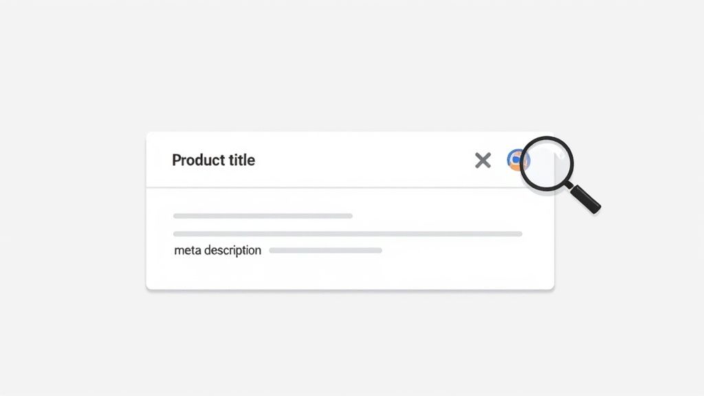
Why It’s Your SEO Power Play
A well-crafted title and description combo doesn’t just describe; it sells. It bridges the gap between a user’s search query and your product page, signaling to both Google and the user that you have the perfect solution. A generic title like “Blue Shirt” is a missed opportunity. A powerful title like “Men’s Coastal Blue Performance Dress Shirt – Wrinkle-Free & Moisture-Wicking” immediately communicates value, features, and target audience, dramatically increasing its relevance and appeal. A Shopify store in the fashion niche saw a 22% increase in organic CTR just by rewriting their top 20 product titles with this benefit-driven approach.
Your Action Plan for 2025
Ready to transform your product listings? Here’s exactly how you can do it:
- Step 1: Structure Your Titles for Impact. Follow a clear formula like Brand – Product Type – Key Feature/Benefit – Keyword. For example, instead of just “Allbirds Shoes,” use “Allbirds – Men’s Wool Runners – All-Day Comfort – Grey.” Place your primary keyword within the first 60 characters to ensure it’s always visible on SERPs.
- Step 2: Write Meta Descriptions that Convert. Your meta description is your 150-160 character sales pitch. Don’t just list features; highlight benefits and include a call-to-action (CTA). Instead of “Made of organic cotton,” try “Experience unmatched softness with our 100% organic cotton tee. Shop now for free shipping!“
- Step 3: Leverage Shopify’s SEO Preview. Use the built-in “Search engine listing preview” on your product pages. This tool is your best friend, allowing you to see exactly how your title and description will appear in Google search results before you even publish.
2. Implement Strategic Internal Linking
Think of your Shopify store as a well-organized library. Your internal links are the signs and pathways that guide both your customers and search engine crawlers from one section to another, creating a seamless and logical journey. Strategic internal linking is one of the most underrated seo tips for shopify because it creates a powerful web of connections that distributes authority, enhances navigation, and helps Google understand the relationships between your products, collections, and content. Without it, you have isolated pages that are much harder for search engines to find and rank.
Why It’s Your SEO Power Play
A smart internal linking strategy does more than just connect pages; it builds a strong site architecture that search engines love. When you link from a high-authority page (like your homepage or a popular blog post) to a key product page, you pass some of that “link equity” or “SEO juice,” boosting the destination page’s ranking potential. For your customers, it means effortlessly discovering related products or helpful guides, which keeps them on your site longer and guides them down the conversion funnel—just as Amazon does with its “Frequently bought together” suggestions.
Your Action Plan for 2025
Ready to build a powerful web of links that boosts your SEO? Here’s your game plan:
- Step 1: Be a Matchmaker. On each product page, manually link to 2-5 highly relevant, complementary products. For example, if you’re selling a “Waterproof Hiking Jacket,” link to your “All-Weather Hiking Boots” and “Moisture-Wicking Base Layers” directly in the description.
- Step 2: Use Descriptive Anchor Text. Avoid generic phrases like “click here.” Instead, use anchor text that clearly describes the destination page, such as “Shop our collection of organic cotton tees.” This gives both your customers and search engines clear context about the linked page.
- Step 3: Create Breadcrumb Navigation. Enable breadcrumbs on your Shopify theme (e.g., Home > Men’s Apparel > Shirts). This simple feature clarifies your site hierarchy for Google and makes it incredibly easy for your customers to navigate back to parent categories, improving their overall experience.
3. Optimize Your Images with Alt Text and File Names
Your product images are often the deciding factor for a sale, but they’re also a goldmine for SEO that many merchants overlook. Image optimization is a critical component of a holistic strategy for seo tips for shopify. It’s not just about making your site look good; it’s about telling search engines what your images represent, improving your chances of appearing in image searches, and ensuring your site loads lightning-fast for a better user experience.
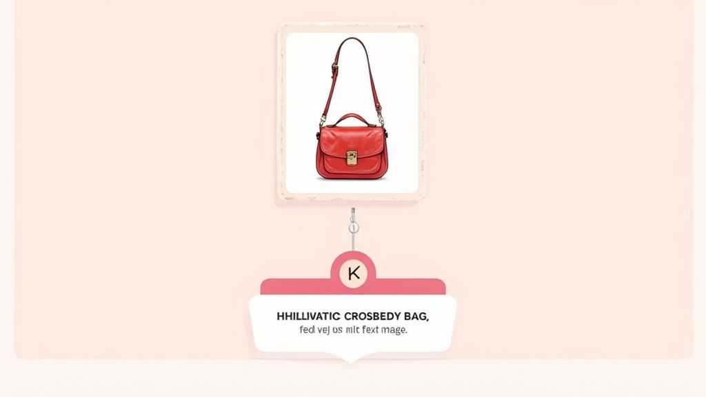
Why It’s Your SEO Power Play
Properly optimized images do double duty: they help Google understand your product’s context, and they make your site accessible to visually impaired users. Instead of a generic file name like IMG_8871.jpg, a descriptive name like red-leather-crossbody-bag-womens.jpg immediately informs search crawlers about the product. This simple change can propel your products into Google Images, a massive source of high-intent traffic, and boost your page’s overall relevance.
Your Action Plan for 2025
Ready to turn your images into SEO assets? Here’s your step-by-step guide:
- Step 1: Create Descriptive File Names. Before uploading, rename your image files to describe the product using keywords separated by hyphens. Think like your customer: what would they search for?
- Step 2: Write Compelling Alt Text. Your alt text should describe the image for someone who can’t see it. Be specific and include your target keyword naturally. Instead of “jacket,” write “Men’s Patagonia down jacket in deep red, front view.” This improves both SEO and accessibility.
- Step 3: Compress and Format for Speed. Use tools like TinyPNG to compress images without losing quality. In Shopify, leverage modern formats like WebP to dramatically decrease load times, a key ranking factor.
- Step 4: Master Your Visuals. High-quality images are non-negotiable for conversions. If you’re looking to elevate your product photography, check out our guide on selecting a professional photography background cloth.
4. Create Unique Product Descriptions & Keyword Strategy
Duplicate content is the silent killer of eCommerce SEO. Relying on generic manufacturer descriptions not only bores your customers but also tells search engines that your page is just a copy of dozens of others. Crafting unique, compelling product descriptions is one of the most impactful seo tips for shopify because it allows you to connect with shoppers, answer their questions, and strategically target valuable keywords that drive conversions.
Why It’s Your SEO Power Play
A truly great product description does more than just list specs; it tells a story and sells a solution. It’s your chance to infuse your brand’s voice, highlight what makes your product superior, and naturally weave in the exact search terms your ideal customers are using. Think of it as your 24/7 digital salesperson. For example, a description for a blanket that targets the long-tail phrase “affordable organic cotton baby blankets” will attract highly qualified traffic with clear purchase intent, leading to higher conversion rates and better search rankings.
Your Action Plan for 2025
Ready to turn your product pages into SEO powerhouses? Here’s your step-by-step guide:
- Step 1: Map Keywords to Products. Before you write a single word, map a primary keyword and 2-3 secondary, long-tail keywords to each product page. Use these to guide your copy, ensuring every description is optimized for relevant search queries.
- Step 2: Structure for Scannability. Start with a benefit-driven opening paragraph. Follow with bullet points covering key features, specifications (materials, dimensions, care instructions), and unique selling points. This scannable format helps both your customers and search engine crawlers quickly understand the product’s value.
- Step 3: Write for Humans, Optimize for Robots. Write in a natural, persuasive tone that speaks directly to your customer’s needs. Avoid “keyword stuffing.” Instead, integrate your target keywords smoothly into your copy, headers, and bullet points. For a deeper dive, explore expert advice on Shopify product page customization to maximize your impact.
5. Build High-Quality Backlinks and Earned Media
If your on-page SEO is the engine of your Shopify store, high-quality backlinks are the high-octane fuel that powers it to the top of the search rankings. Backlinks are essentially votes of confidence from other websites, signaling to Google that your content is credible, authoritative, and valuable. This is one of the most powerful seo tips for shopify because it moves beyond your own site to build external authority, a critical factor in competitive search landscapes.
Why It’s Your SEO Power Play
Each relevant, high-authority backlink you earn acts as a powerful endorsement that boosts your domain authority and improves your search rankings. It’s not about getting hundreds of low-quality links; a single link from a major industry publication like Vogue or a top-tier blog can be more impactful than a thousand links from unknown sites. For example, when the mattress brand Casper was featured in a high-authority sleep blog, they saw a 40% jump in organic traffic to the linked product page within a week. This strategy also drives highly qualified referral traffic directly to your store.
Your Action Plan for 2025
Ready to earn the links that will set your store apart? Here’s how to build a powerful backlink profile:
- Step 1: Create Link-Worthy Content. Develop assets that people want to link to. This could be original research (like a survey on consumer trends in your niche), an ultimate guide (e.g., “The Complete Guide to Sustainable Fashion”), or a viral piece of content like Dollar Shave Club’s famous launch video.
- Step 2: Build Relationships, Not Just Links. Connect with journalists, bloggers, and influencers in your industry long before you need to ask for anything. Engage with their content and offer genuine value. When you have a story or new product, you’ll have a warm audience to pitch to, just as Glossier did by building a community of beauty bloggers.
- Step 3: Leverage Brand Mentions. Use tools like Google Alerts or Mention.com to find unlinked mentions of your brand. When you find one, simply reach out to the author or webmaster and politely ask if they would consider making that mention a clickable link back to your store. It’s one of the easiest link-building wins.
6. Optimize for Mobile and Core Web Vitals
In today’s mobile-first world, your Shopify store’s performance on a smartphone is not just an option; it’s the main event. Google prioritizes mobile-friendly sites, and its Core Web Vitals (CWV) are critical ranking signals that measure user experience. This is one of the most vital seo tips for shopify because it directly impacts how both your customers and search engines perceive your store’s speed, responsiveness, and stability, which heavily influences rankings and sales.
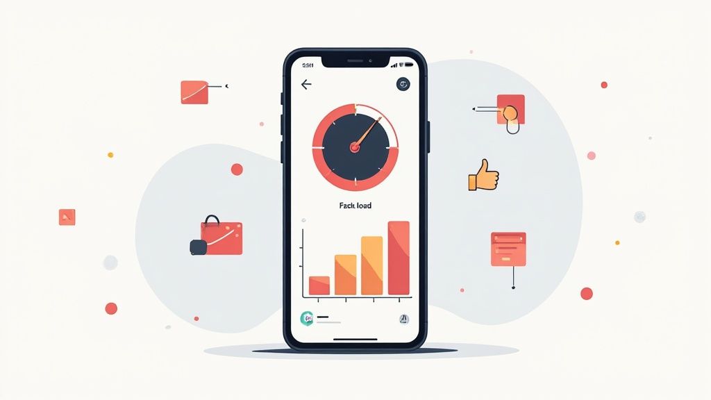
Why It’s Your SEO Power Play
A slow, clunky mobile experience is a conversion killer. Shoppers will abandon a page that takes too long to load or shifts around unexpectedly. By optimizing for mobile and acing your Core Web Vitals (LCP, INP, and CLS), you’re telling Google your site offers a superior user experience. This not only boosts your search rankings but also significantly improves user engagement and reduces bounce rates, turning more mobile browsers into buyers.
Your Action Plan for 2025
Ready to make your store a mobile performance champion? Here’s your game plan:
- Step 1: Audit and Optimize Your Images. This is your quickest win. Compress all product and theme images using tools like TinyPNG before uploading. Use modern formats like WebP and enable lazy loading so images only load as a user scrolls down the page.
- Step 2: Conduct an App Takedown. Unused or poorly coded apps are notorious for slowing down Shopify stores. Audit every app you have installed. If it’s not essential for your customer experience or operations, uninstall it.
- Step 3: Leverage Google PageSpeed Insights. Use this free tool to analyze your store’s performance. It will provide a detailed report on your Core Web Vitals and give you specific, actionable recommendations to improve your score.
- Step 4: Choose a Performance-Focused Theme. Not all themes are created equal. Start with a lightweight, well-coded theme like Shopify’s free Dawn theme, which is built with performance and CWV in mind from the ground up.
7. Implement Structured Data (Schema Markup)
Structured data, or schema markup, is like a secret language you speak directly to search engines. It’s code you add to your Shopify store that translates your content into a format Google understands instantly, allowing it to display enhanced search results called rich snippets. This is one of the most impactful seo tips for shopify because it transforms a standard blue link into a visually appealing, information-packed listing with ratings, price, and availability, directly on the search results page.
Why It’s Your SEO Power Play
Rich snippets make your listings stand out, commanding more attention and earning more clicks than your competitors. When a shopper sees your product with five gold stars, a clear price, and “In Stock” text right in the search results, it builds immediate trust and relevance. This increased click-through rate sends a powerful signal to Google that your page is a valuable result, which can positively influence your overall search rankings over time.
Your Action Plan for 2025
Ready to make your products shine on the SERPs? Here’s your game plan:
- Step 1: Use a Shopify App for Simplicity. Don’t get lost in code. Install a trusted app from the Shopify App Store that handles structured data. These tools automatically generate the necessary JSON-LD code for your products, reviews, and FAQs without you needing to edit your theme.
- Step 2: Focus on Key Schema Types. Prioritize implementing Product schema (price, availability, SKU), Review/AggregateRating schema (star ratings, review count), and FAQ schema for your product pages. If you have a physical location, add LocalBusiness schema.
- Step 3: Test and Validate Everything. Once implemented, use Google’s Rich Results Test to ensure your markup is error-free. Regularly check the “Enhancements” report in Google Search Console to monitor for any issues and see how Google is processing your structured data.
8. Develop a Content Marketing & Blog Strategy
Your Shopify store is more than just a place to sell products; it’s a platform to build a brand and become a trusted voice in your niche. A powerful blog and content marketing strategy is your engine for achieving this. This is one of the most transformative seo tips for shopify because it moves you beyond transactional selling, allowing you to attract customers by solving their problems, answering their questions, and building a community around your brand. It’s how you capture traffic from users who aren’t yet ready to buy but are actively seeking information your expertise can provide.
Why It’s Your SEO Power Play
Content marketing establishes your store’s topical authority. When you consistently publish high-quality content that addresses your customers’ pain points, you signal to Google that you are an expert in your field. This authority helps your entire site, including your product and collection pages, rank higher. Each blog post is a new opportunity to rank for long-tail keywords, create valuable internal links to your product pages, and draw visitors into your marketing funnel. A store selling high-performance running shoes, for example, can attract customers with articles like “5 Best Stretches to Prevent Shin Splints” or “How to Choose the Right Running Shoe for Your Foot Type.”
Your Action Plan for 2025
Ready to turn your store into an authority hub? Here’s your game plan:
- Step 1: Adopt the Topic Cluster Model. Build your content around core themes. Create one comprehensive “pillar page” on a broad topic (e.g., “The Ultimate Guide to Skincare Routines”) and surround it with 10-20 “cluster” posts on related, specific subtopics (e.g., “Best Moisturizers for Dry Skin,” “How to Use Vitamin C Serum”). This structure proves your expertise to search engines.
- Step 2: Target Long-Tail Keywords. Focus your articles on specific, multi-word search phrases like “best eco-friendly yoga mats for beginners.” These queries have lower competition and are often used by searchers with higher purchase intent, making them conversion goldmines.
- Step 3: Publish and Promote Consistently. Create a content calendar and stick to it, aiming for at least one new post per week. Don’t just publish and pray; promote every article to your email list and across your social media channels to drive initial traffic and engagement. Remember to also update your most popular posts annually to keep them fresh and relevant for 2025.
9. Fix Technical SEO Issues & Improve Crawlability
Think of your Shopify store as a massive library and search engines as the librarians trying to catalog every book. If the aisles are blocked, pages are missing, or books are in the wrong section, the librarian gets confused and might give up. Technical SEO is the art of organizing your library perfectly, ensuring search engines can easily crawl, understand, and index your entire store without any friction. This is one of the most crucial seo tips for shopify because it forms the very foundation your entire strategy is built upon.
Why It’s Your SEO Power Play
A technically sound website is a trustworthy website in Google’s eyes. By fixing issues like broken links, duplicate content, or crawl errors, you’re telling search engines that your store is a high-quality, reliable resource. This directly impacts how favorably they view and rank your pages. For example, using a canonical tag on a product page with multiple color variants prevents Google from seeing them as duplicate content, consolidating your SEO authority into a single, powerful URL.
Your Action Plan for 2025
Ready to give your store a technical tune-up? Here’s how you can ensure it’s in peak condition:
- Step 1: Conduct Regular Audits. Use Google Search Console as your primary diagnostic tool. Check the “Coverage” report weekly for errors or warnings that prevent pages from being indexed. A quick fix here can bring a valuable page back into search results.
- Step 2: Master Your Redirects. When you discontinue a product, don’t just delete the page and create a 404 error. Implement a 301 redirect to a similar product or relevant category page. This passes the old page’s SEO value to the new one and keeps the user experience smooth.
- Step 3: Leverage Canonical Tags. Shopify collections with filters can create multiple URLs with the same content, which is a major red flag for duplicate content. Ensure your theme properly uses
rel="canonical"tags to point all filtered versions back to the main category page, consolidating your ranking power.
10. Encourage and Leverage Customer Reviews and Social Proof
Your customers are your most powerful marketing asset. Encouraging and showcasing their reviews is more than just good customer service; it’s a strategic SEO play that builds immense trust and authority. Think of customer reviews as a constant stream of fresh, user-generated content that signals to Google your product pages are active, relevant, and valued by real people. This is one of the most authentic seo tips for shopify because it directly addresses search engine ranking factors like trust, content freshness, and user engagement.

Why It’s Your SEO Power Play
Social proof turns passive browsers into confident buyers. When a potential customer sees genuine reviews and photos from others who love your product, it eliminates doubt and builds credibility far more effectively than any marketing copy ever could. For search engines, this user activity and unique text (filled with natural, long-tail keywords) tells them your page offers significant value. Implementing review schema can also unlock rich snippets like star ratings directly in the SERPs, making your listings stand out and dramatically improving click-through rates.
Your Action Plan for 2025
Ready to turn customer feedback into an SEO goldmine? Here’s how you can get started today:
- Step 1: Automate Your Review Requests. Use a Shopify app to send automated email or SMS requests 1-2 weeks after a customer receives their order. This timing is crucial; it gives them enough time to experience the product but is recent enough that their excitement is still high.
- Step 2: Implement Review Schema. This is a non-negotiable step. Use a review app like Judge.me or Loox that automatically adds the correct structured data to your pages. This technical step is what enables Google to display those eye-catching star ratings in search results, giving you an immediate competitive edge.
- Step 3: Showcase Reviews Strategically. Don’t just leave reviews at the bottom of the page. Feature the best testimonials and user-generated photos directly on your product pages, homepage, and even in your marketing emails. This creates a powerful and immediate trust signal for new visitors.
- Step 4: Engage with Every Review. Make it a policy to respond to all reviews, both positive and negative, within 48 hours. This shows prospective customers you are an engaged and trustworthy brand that values feedback.
10-Point Shopify SEO Comparison
| Item | Implementation Complexity 🔄 | Resource Requirements ⚡ | Expected Outcomes 📊 | Ideal Use Cases 💡 | Key Advantages ⭐ |
|---|---|---|---|---|---|
| Optimize Product Titles and Meta Descriptions | Low 🔄 — simple CMS edits | Low ⚡ — content time, basic SEO tools | ⭐⭐⭐ — Higher CTR and clearer relevance in SERPs | New or small catalogs; quick SEO wins | Improves click-throughs and search relevance |
| Implement Strategic Internal Linking | Medium 🔄 — requires strategy & audit | Medium ⚡ — content updates, SEO tools | ⭐⭐⭐⭐ — Better crawlability, session duration, topical authority | Medium/large sites, stores with many related SKUs | Distributes link equity and improves navigation |
| Optimize Images with Alt Text and File Names | Medium 🔄 — per-image work + compression | Medium ⚡ — image tools, manual edits | ⭐⭐⭐ — Faster pages, accessibility, image search traffic | Image-heavy catalogs, mobile-first stores | Improves load times, accessibility, image SEO |
| Create Unique Product Descriptions & Keyword Strategy | High 🔄 — original copy per product | High ⚡ — writers, research tools, time | ⭐⭐⭐⭐ — Stronger rankings and higher conversions | Differentiated products or high-value SKUs | Provides unique indexable content and conversion lift |
| Build High-Quality Backlinks and Earned Media | High 🔄 — outreach and content creation | High ⚡ — PR effort, relationships, tools | ⭐⭐⭐⭐⭐ — Significant long-term ranking and referral traffic | Competitive niches and brand-awareness goals | Increases authority and drives referral visits |
| Optimize for Mobile and Core Web Vitals | High 🔄 — technical performance work | High ⚡ — developers, audits, performance tooling | ⭐⭐⭐⭐ — Improved rankings, conversions, lower bounce | Mobile-first commerce and high-traffic stores | Direct ranking factor; better UX and conversion rates |
| Implement Structured Data and Schema Markup | Medium 🔄 — JSON-LD or app setup | Low–Medium ⚡ — developer or Shopify app | ⭐⭐ — Higher CTR potential via rich snippets (not guaranteed) | Product pages with ratings, price, FAQ content | Enables rich SERP features and clearer search display |
| Develop a Content Marketing and Blog Strategy | High 🔄 — editorial planning and production | High ⚡ — writers, SEO tools, promotion | ⭐⭐⭐⭐ — Long-term traffic growth and topical authority | Brands aiming to scale organic acquisition | Builds topical authority and internal linking opportunities |
| Fix Technical SEO Issues and Improve Crawlability | Medium–High 🔄 — audits and fixes | Medium ⚡ — dev time, audit tools | ⭐⭐⭐⭐ — Reliable indexation and fewer search issues | Stores with crawl/index problems or large catalogs | Prevents duplicate/content issues and loss of equity |
| Encourage and Leverage Customer Reviews & Social Proof | Low–Medium 🔄 — systems + processes | Medium ⚡ — review apps, email automation | ⭐⭐⭐⭐ — Higher conversions and fresh user content | Consumer products, trust-sensitive categories | Boosts trust, conversion rates, and review-rich snippets |
Your Next Step to Shopify SEO Success
You now have a complete roadmap. This isn’t just a list of ideas; it’s a powerful toolkit filled with actionable SEO tips for Shopify designed to transform your store from just another online shop into a dominant force in your niche. We’ve moved beyond generic advice and delved into the specifics: from structuring your product titles for maximum click-through rates to implementing schema markup that makes your listings irresistible in search results.
The journey to the top of Google’s rankings is a marathon, not a sprint. The sheer volume of information can feel overwhelming, but progress doesn’t require doing everything at once. The key is to start. Choose one single, manageable task from this guide and commit to implementing it this week. Will you start by optimizing the alt text on your top ten product images? Or will you focus on crafting unique, keyword-rich descriptions for a single collection? Small, consistent actions are the engine of sustainable growth.
Remember, you’re not just optimizing for algorithms; you’re optimizing for people. Every technical fix and keyword-optimized blog post you create contributes to building trust with your customers long before they even land on your site. Just like TryIcona helps customers visualize products before purchase, great SEO helps them find your store in the first place.
Pick your first tip, take that initial step, and start building your momentum today.
Ready to boost conversions and reduce returns? While great SEO brings qualified traffic to your store, Icona helps turn that traffic into confident sales. Just as you optimize your site for trust, Icona’s virtual try-on technology gives shoppers the confidence to click “Add to Cart” by letting them visualize your products perfectly. Learn how Icona can elevate your customer experience and increase your conversion rate.
Struggling to turn your visitors into loyal customers? Your newsletter is more than just another marketing task—it’s your direct line to your audience, a personal conversation happening right in their inbox. The goal is to craft something your subscribers actually want to open. When you learn how to write a newsletter that connects, you transform your email list from a simple contact sheet into your most powerful tool for driving repeat business and building a brand people love.
Why Your Newsletter Is Your Most Powerful Sales Tool

Before we jump into the “how-to,” let’s talk about the massive opportunity waiting in your subscribers’ inboxes. A well-written newsletter isn’t just an email; it’s a conversation and your single best channel for building a brand that your customers connect with on a deeper level.
In a world of ever-changing social media algorithms, your email list is one of the few assets you truly own. It’s your most reliable channel for bringing customers back again and again, turning them into advocates who feel like they’re part of your brand’s journey.
The Newsletter Boom Is Real
There’s a reason newsletters are exploding in popularity. Between 2023 and 2024 alone, the number of active newsletters nearly doubled, jumping from around 26,911 to 52,809. This makes perfect sense when you realize there are over 4.5 billion email users worldwide—a figure projected to hit 4.8 billion by 2027.
This isn’t just background noise; it’s a clear signal. People are craving curated, valuable content sent directly to them. For your Shopify store, this is your chance to:
- Build Real Relationships: A social media post has a shelf life of a few hours. A newsletter sits in the inbox, creating a consistent, personal touchpoint that builds trust over time.
- Drive Smarter Sales: You can segment your list to send hyper-relevant offers to the right people at the right time. For example, a Shopify store that segments its audience by purchase history can see a 15% lift in email revenue. Your promotions suddenly feel less like ads and more like helpful recommendations.
- Own Your Audience: You’re not renting space on another platform. This list is yours. It’s a direct line to your most valuable and engaged customers, no algorithm required.
Actionable Tip: Think of your newsletter as the heart of your customer retention strategy. It’s the space where you turn one-time buyers into loyal fans who are genuinely excited to see what you do next.
Ultimately, your newsletter is a critical tool for guiding customers through your sales process. By consistently delivering value, you’re nurturing relationships and moving people closer to making a purchase. It’s essential to see how this fits into the bigger picture of your customer’s journey, which you can explore further in our guide to the eCommerce marketing funnel. Your newsletter is the engine that will power every single stage.
Building Your Newsletter Strategy from the Ground Up
A winning newsletter doesn’t just happen. It’s built on a solid foundation, planned out long before you ever type a single word. Think of your strategy as the blueprint for your store’s growth—get it right, and everything else falls into place. Skip this step, and you’re just sending emails into the void.
So, before we get into writing catchy subject lines, you need to answer one crucial question: What are you trying to achieve?
Step 1: Define Your Newsletter’s #1 Goal
Every single email you send needs a clear purpose. If you don’t know why you’re sending it, your subscribers won’t know why they should open it. Resist the urge to do everything at once. Instead, pick one primary goal to keep your message sharp and effective.
What’s your main objective?
- Drive sales? This is your classic approach: feature a specific product, run a flash sale, or drop an exclusive discount code to get an immediate revenue lift.
- Launch something new? Your newsletter is the perfect place to build buzz and give your most loyal fans the first look at your latest collection.
- Build a community? Go beyond the hard sell. Share your brand’s origin story, offer a behind-the-scenes peek, or showcase customer photos. Make subscribers feel like they’re part of an exclusive club.
- Educate and add value? Position yourself as an expert. Share helpful content like, “How to Style Our New Linen Blazer” or “5 Mistakes to Avoid When Caring for Leather Goods.”
Once you’ve locked in your primary goal, every piece of content—from the headline to the call-to-action—should support it. This clarity makes writing so much easier.
Step 2: Know Exactly Who You’re Talking To
Generic emails are destined for the trash folder. To truly connect, you have to know who’s on the other end. Create a simple subscriber persona—a quick sketch of your ideal customer.
Give them a name, a job, and a few personality quirks. What are their pain points? What gets them excited? For instance, if you sell high-performance running gear, your persona might be “Marathon Mike,” a 35-year-old training for his next big race. He’s obsessed with quality and gear that gives him an edge.
When you sit down to write, you’re not writing to a list. You’re writing to Mike. What subject line will grab his attention? This little mindset shift is a game-changer. It turns a marketing blast into a real conversation.
Step 3: Pick Your Tools and Set a Rhythm
Next up, you need the right tech. There are dozens of fantastic email marketing platforms that integrate perfectly with Shopify, like Klaviyo, Mailchimp, and Omnisend. My advice? Find one with a user-friendly interface and powerful segmentation tools—this will be your secret weapon.
Finally, get on a schedule. Here’s the secret: consistency beats frequency every time. Whether you decide on a weekly, bi-weekly, or monthly send, stick with it. Your subscribers will learn when to expect your emails and, if you do it right, even start looking forward to them. For most Shopify stores, sending once a week is a great starting point. It’s enough to stay top-of-mind without becoming inbox clutter.
Creating Content That Connects and Converts
This is where the magic happens. With your strategy locked in, it’s time to breathe life into your brand and create the stories, images, and offers that will make subscribers genuinely excited to see your name in their inbox.
Let’s start where your reader does: the subject line. This tiny snippet of text does a monumental amount of work. In fact, research shows that 35% of subscribers decide whether to open an email based on the subject line alone. Your mission is to make it absolutely irresistible.
The Art of the Unskippable Subject Line
A great subject line is a perfect blend of clarity, curiosity, and urgency. It’s a promise of what’s inside, and you have to deliver. So, ditch the generic “Weekly Update” and get personal.
Here are a few proven formulas you can use right now:
- Ask a Question: “Is Your Wardrobe Ready for Spring?”
- Create Urgency: “Last Chance: Your 20% Off Ends Tonight”
- Spark Curiosity: “Our Biggest Mistake (and What We Learned)”
- Highlight a Benefit: “The Secret to a Perfect Night’s Sleep”
Actionable Tip: Don’t underestimate the power of emojis. Adding one to your subject line can boost open rates by as much as 56%. It helps your email stand out in a sea of text and injects personality, just make sure it feels true to your brand.
The Anatomy of a High-Converting Newsletter
Once they’re in, the real work begins. A winning newsletter has a natural flow that guides your reader smoothly from your opening line to that all-important call-to-action (CTA).
- The Magnetic Hook: Pull them in immediately with a strong opening. A personalized greeting (“Hey, [First Name]”) followed by a clear statement of what’s in it for them.
- The Valuable Middle: This is the heart of your email where you deliver the goods. Mix it up with a behind-the-scenes story, a glowing customer testimonial, or a spotlight on a new arrival. Always use crisp, beautiful visuals to break up the text. Just like TryIcona helps customers visualize products before they purchase, your images should help them imagine using your products in their own lives.
- The Crystal-Clear CTA: Finally, tell them exactly what to do next. Be direct. Use a bold, action-focused button like “Shop the Collection” or “Claim Your Discount.” Vague phrases like “click here” just don’t cut it. Make their next step obvious.
For any Shopify store, that final CTA is what separates a reader from a buyer. The entire email should build momentum toward that one click. If you need inspiration for win-back campaigns, check out these powerful abandoned cart email examples to see what works.
Your Weekly Newsletter Content Blueprint
To avoid the “what should I write this week?” panic, have a plan. The goal is to build a relationship, not just push sales. A balanced approach keeps your subscribers hooked.
Use this balanced content plan to keep your Shopify subscribers engaged and ready to buy, ensuring you provide value beyond just sales pitches.
| Content Type | Purpose | Frequency (Example for a weekly newsletter) |
|---|---|---|
| Promotional/Sales | Drive immediate revenue with offers, new arrivals, or sales. | 1-2 times per month. This is your direct ask—use it wisely to avoid fatiguing your audience. |
| Educational/Value | Build trust by sharing tips, how-to guides, or industry news. | 1-2 times per month. Think “5 Ways to Style a White Tee” or “Behind the Scenes of Our Design Process.” |
| Community/Story | Create a human connection with user-generated content, stories. | 1 time per month. Feature customer photos, share your brand’s origin story, or introduce your team. |
| Engagement/Feedback | Gather insights and make subscribers feel heard and valued. | Occasionally, as needed. Run a poll, ask for reviews, or survey them on what they want to see next. |
By following a simple blueprint like this, you’ll craft newsletters that not only resonate with your audience but also consistently drive real results for your store.
Making Every Email Feel Personal
The era of the generic email blast is over. Your customers are smart, and your success depends on making each subscriber feel like you wrote that email just for them. It’s not about being intrusive; it’s about being incredibly relevant. This is what transforms a good newsletter into a revenue-generating machine.
The big idea here is simple: instead of shouting at a crowd, you’re having a quiet conversation with small, specific groups. This is called segmentation, and it’s your secret to making emails feel personal.
Start Grouping Your Subscribers
You can start segmenting right away with the data you already have in Shopify. Slicing up your audience into meaningful groups lets you send content that hits home because it’s tailored to their interests and history with your brand.
Here are a few powerful segments you can create today:
- Purchase History: Group customers who bought from a specific collection. Did someone buy a dress? They’re the perfect audience for an email featuring matching shoes.
- Website Behavior: A Shopify store that added an exit-intent popup and targeted visitors who viewed specific product categories increased signups by 32%. A gentle follow-up email featuring that exact item can work wonders.
- New Subscribers: Roll out the red carpet! A warm welcome series with an introductory offer can make an amazing first impression and boost first-time purchases by up to 50%.
- Loyal Customers: Show your VIPs some love. Give them early access to new drops, exclusive content, or a special discount as a thank-you.
The data is clear: sending a targeted campaign to a segmented list can increase revenue by an incredible 760%. If you do one thing to boost your newsletter’s ROI, make it this.
Using Data to Craft Perfect Offers
Once you have your segments, the fun begins. Now you can craft messages that speak directly to what each group cares about.
Imagine sending an exclusive offer for a product someone was just looking at on your site yesterday. That’s powerful. If you sell clothes, you could segment customers by the sizes they’ve purchased before and notify them personally when those sizes are back in stock. This proves you’re paying attention and that you value their business.
This isn’t just a fleeting trend. The future of email marketing is all about this kind of hyper-personalization, as we’re seeing in the top newsletter trends for 2025. To really get this working at scale, check out our guide to the best eCommerce personalization tools. By making every email feel like a one-on-one conversation, you’re building the kind of trust that turns casual subscribers into customers for life.
Measuring What Matters and Optimizing for Growth
You can’t improve what you don’t measure. Writing a great newsletter is one thing, but understanding why it’s working is what separates the top-tier Shopify stores from the rest. This is where you put on your data detective hat and start turning guesses into smart, revenue-driving decisions.
When you hit “send,” your email platform gives you a treasure trove of data. Let’s cut through the noise and focus on the metrics that actually move the needle for your business.
Decoding Your Key Newsletter Metrics
Think of these numbers as the vital signs for your email strategy. They tell you exactly where you’re winning and where you can improve.
- Open Rate: The percentage of people who opened your email. It’s a direct reflection of your subject line’s power. A low open rate is a signal that your subject lines aren’t grabbing attention.
- Click-Through Rate (CTR): How many people clicked at least one link in your email. A healthy CTR means your content and offers were compelling enough to make someone take the next step.
- Conversion Rate: This is the big one—the percentage of subscribers who clicked a link and then made a purchase. This metric ties your newsletter directly to your sales, proving its ROI.
Remember: these metrics tell a story together. A huge open rate is great, but it’s just a vanity metric if no one clicks. A high click-through rate is exciting, but if it doesn’t lead to sales, it might be time to look at your landing pages or the offer itself.
The Simple Power of A/B Testing
One of the most effective ways to boost your numbers is through A/B testing. It sounds technical, but it’s simple: you create two versions of the same email (A and B), change just one single thing, and see which one performs better.
Your subject line is the perfect place to start. For example:
- Version A: “Our New Spring Collection is Here! 🌸”
- Version B: “Get 20% Off Your First Spring Look ✨”
Send Version A to a small part of your list and Version B to another. Whichever subject line gets more opens is the winner, and you send that version to everyone else. You can test anything: your CTA button text, the images you use, or even the time you send the email. This consistent testing is how you learn how to write a newsletter that truly connects with your audience.
This infographic breaks down the core pillars of a data-driven personalization strategy that powers higher engagement.
It highlights how tracking purchase history, understanding site activity, and creating targeted offers all work together to create a winning formula. The data doesn’t lie: 78% of marketers plan to use email in their multichannel approach in 2025. Even more telling? With 57% of marketers now tailoring content based on user behavior, personalization is no longer just a nice-to-have—it’s essential for growth. You can dig into more eye-opening numbers in the latest email marketing statistics at Hostinger.
Your Newsletter Questions Answered
Let’s dive into some of the questions I hear all the time from Shopify merchants. This is where we clear up the confusion and get straight to the practical advice that will help you grow your email list.
How Often Should I Email My Customers?
The key here is consistency over frequency. It’s far better to send one fantastic, thoughtful email every week than to spam your list with three rushed ones.
For most online stores, a great rhythm to start with is once a week or every two weeks. Find a pace you can stick to without burning out. Pay close attention to your open and unsubscribe rates. If you suddenly ramp up sending and see a spike in people leaving, that’s your audience telling you to ease up. Let their actions be your guide.
What Is the Best Length for a Newsletter?
Think short, scannable, and respectful of your customer’s time. They’re juggling a million things, and they’re likely reading your email on their phone.
Get right to the point. A sharp headline, a quick intro that hooks them, and two or three main content sections with great visuals and obvious buttons. For most newsletters, 200-400 words is plenty.
The goal isn’t to write a novel. It’s to deliver a quick hit of value and get them excited enough to click back to your store. Use bold text, short paragraphs, and bullet points to make everything easy to scan.
What’s the Best Way to Get More Subscribers?
You have to offer something genuinely irresistible. Just asking for an email isn’t enough anymore—you need to give them a compelling reason to say yes.
A well-timed popup on your Shopify store is still one of the most effective tools for lead capture. But the offer has to be good. Try one of these:
- A 10% discount on their first purchase is a classic for a reason.
- Free shipping can be a powerful trigger for shoppers on the fence.
- An exclusive guide or another piece of valuable content they can’t find anywhere else.
Make sure you also have signup forms in smart places, like your website footer and order confirmation page. And don’t forget to create a little FOMO on your social channels by talking about the exclusive perks your subscribers get. Make people feel like they’re missing out if they aren’t on the list.
Ready to turn those newsletter clicks into confident purchases? TryIcona adds a virtual try-on button to your product pages, letting shoppers see how your apparel looks on their own bodies. It’s the ultimate conversion booster for your Shopify store. Start your free trial
Ever wonder how some Shopify stores seem to grow effortlessly while others struggle to turn visitors into cash? The secret isn’t a bigger ad budget or a viral TikTok video. It’s a well-oiled ecommerce marketing funnel.
Think of your funnel as the ultimate roadmap for your customer’s journey. It’s the exact path someone takes from being a complete stranger who stumbles upon your store to becoming a loyal fan who buys from you again and again. Getting this right isn’t just about making one sale; it’s about building a predictable, automated system for growth. This guide will show you how to build one, step by step.
Why Your Shopify Store Needs a Marketing Funnel
Trying to market your store without a funnel is like building a house without a blueprint. You can have all the best materials—slick ads, beautiful social posts, killer emails—but without a clear plan, you’re just creating a chaotic mess. You’re wasting time and money because you have no idea what’s actually working.
An ecommerce marketing funnel provides that essential structure. It helps you guide potential customers through a series of logical steps, moving them from “Who are you?” to “I need that now!”
From Buzzword to Your Business Plan
Let’s be real: “funnel” can feel like just another marketing buzzword. But in practice, it’s the most logical way to connect with your customers. A person who just found your brand through a Facebook ad needs a completely different conversation than someone who abandoned their cart ten minutes ago. A one-size-fits-all message just doesn’t cut it anymore.
Here’s what a solid funnel strategy will do for your store:
- Stop Wasting Ad Spend: You’ll deliver messages that actually resonate with people at the right moment, dramatically improving your return on investment (ROI).
- Build Real Relationships: Instead of just shouting “buy now,” you’ll nurture potential customers with helpful content, building trust long before you ever ask for the sale.
- Boost Conversion Rates: By understanding and addressing your customers’ hesitations at each stage, you make the path to purchase incredibly smooth and compelling.
- Create Customers for Life: The journey doesn’t end at the first purchase. A great funnel is designed to turn one-time buyers into repeat customers and brand advocates.
This visual breaks down how a wide audience of potential customers gets narrowed down into a core group of converted buyers.
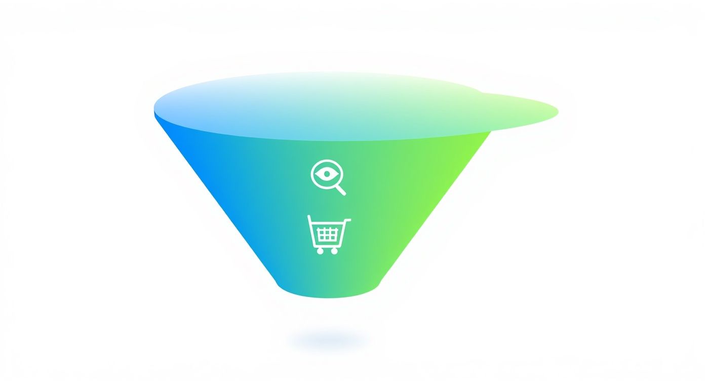
As you can see, it’s all about guiding your most interested and qualified visitors toward that final purchase.
To make this even clearer, here’s a quick overview of how each stage works for your Shopify store.
The Ecommerce Funnel At A Glance
| Funnel Stage | Customer Mindset | Your Marketing Goal | Actionable Steps for Your Store |
|---|---|---|---|
| Top of Funnel (TOFU) | “I have a problem or a desire, but I’m just exploring.” | Attract: Grab their attention and introduce your brand. | Run awareness ads, post helpful blog content, create engaging social media videos. |
| Middle of Funnel (MOFU) | “I’m comparing options and looking for the best choice.” | Nurture: Build trust, educate, and showcase why you’re the best option. | Use email popups to capture leads, send a welcome email series, retarget visitors with ads. |
| Bottom of Funnel (BOFU) | “I’m ready to buy, but I need a final push.” | Convert: Overcome last-minute objections and make the purchase irresistible. | Send abandoned cart emails, optimize your checkout, offer upsells and cross-sells. |
This table shows the shift in your customer’s mindset and how your marketing needs to adapt. It’s a simple but powerful way to frame your entire strategy.
The Real Impact on Your Bottom Line
So, what kind of difference can this really make for your store? The average ecommerce conversion rate across all industries sits somewhere between 1.9% to 3.65%. That means for every 100 visitors, only two or three actually make a purchase. It’s a tough game.
But here’s the inspiring part: stores that master their ecommerce marketing funnels often see conversion rates of 4–5% or even higher. They’re not just getting more traffic; they’re effectively doubling their sales from the same amount of traffic. If you’re curious about where you stand, you can explore more detailed eCommerce conversion benchmarks to see how your store stacks up.
Key Takeaway: An ecommerce marketing funnel isn’t an abstract concept—it’s a practical framework for sustainable growth. It forces you to get inside your customer’s head, creating a shopping experience that feels intuitive, persuasive, and leads directly to more sales for your Shopify store.
Stage 1: Attracting Visitors at the Top of the Funnel (TOFU)
This is where your customer’s journey begins. The top of your ecommerce marketing funnel (what we call TOFU) is your grand introduction. You’re reaching out to a huge audience of potential customers—people who have a problem your product solves, but they probably haven’t even heard of you yet.
Forget the hard sell. Seriously. Your only job right now is to attract and engage.
Think of it like hosting a great party. You don’t shove a sales pitch in your guests’ faces the moment they walk in. You welcome them, make them feel comfortable, and show them why they’ll have a great time. Your goal here is simple: drive quality traffic to your Shopify store and get your brand name stuck in their heads.
Actionable Steps for TOFU:
1. Win the Social Media Game: In 2025, your social media profiles are your new front door. Just posting sterile product shots won’t cut it anymore. You have to create content that stops the endless scroll and actually gives people something valuable.
- Instagram & TikTok: These are visual playgrounds. Think short-form video. If you sell apparel, create quick “style hack” Reels. If you’re a kitchenware brand, post those oddly satisfying recipe tutorials. Show your products in the wild, making life better or more beautiful.
- Pinterest: This isn’t just a social network; it’s a discovery engine. People come here actively looking for ideas. A home decor brand could create boards like “2025 Cozy Living Room Inspo,” strategically featuring their products. It’s about inspiring, not just selling.
- Influencer Partnerships: Find creators who genuinely love what you’re about. Partnering with them puts your brand in front of an audience that already trusts them. For example, a skincare brand could team up with an influencer for an authentic “get ready with me” video. It’s instant credibility.
2. Get Smart with Paid Ads: Organic reach is amazing, but it can be a slow burn. Paid ads on platforms like Facebook, Instagram, and Google are your fast-pass to getting in front of your exact ideal customer.
At this awareness stage, your ads should focus on grabbing attention, not making a direct sale. Instead of a pushy “Buy Now” button, use a softer call-to-action like “Learn More” or “Discover the Collection.”
Actionable Tip: User-generated content (UGC) is pure gold for top-of-funnel ads. An ad featuring a real customer’s photo or video review feels less like an ad and more like a trusted recommendation. It just works. For instance, a Shopify store selling pet supplies saw a 28% lower cost-per-click using UGC ads compared to their studio shots.
3. Build Authority with Your Blog: Search Engine Optimization (SEO) is the ultimate long game for your store. It’s how you attract free, high-intent traffic for years to come. By creating blog content that answers the specific questions your audience is typing into Google, you become the go-to expert in your niche.
Imagine you sell sustainable home goods. An article titled “10 Simple Swaps for a Greener Kitchen in 2025” is going to attract exactly the right kind of person—someone already interested in the lifestyle you support. They’re not just visitors; they’re qualified leads.
Success at the top of the ecommerce marketing funnel comes down to one thing: making a memorable first impression on the right people.
Stage 2: Nurturing Leads in the Middle of the Funnel (MOFU)

Alright, you’ve grabbed their attention. So, now what? Welcome to the middle of the funnel (MOFU), that critical space where casual browsers decide if you’re the real deal.
They aren’t strangers anymore. They’re actively looking for solutions, and you’ve made their shortlist. Your job isn’t to go for the hard sell just yet. Instead, it’s all about building a genuine relationship, proving your value, and making them want what you have.
Actionable Steps for MOFU:
1. Turn Visitors into Subscribers with a Popup: One of the smartest moves you can make is getting their email address. Why? Because an email list is an asset you actually own. Unlike social media followers, this is a direct, unfiltered line to your most promising prospects. But people are protective of their inboxes, so you need to give them a great reason to subscribe. This is where a simple popup form comes in.
- Discount Popups: A classic for a reason. An exit-intent popup offering 10% off their first order can work wonders. It’s a simple, high-value trade that feels like a win for the shopper. A Shopify beauty store recently implemented an exit-intent popup and captured 32% more emails in the first month.
- Exclusive Content: Selling skincare? Offer a beautifully designed PDF guide like, “The 5-Step Morning Routine for Glowing Skin” in exchange for their email. This instantly positions you as a trusted expert, not just another retailer.
- Quiz Funnels: These are incredibly engaging. A fashion brand could build a “Find Your Signature Style” quiz using a Shopify app. To get their results and personalized recommendations, they just need to enter their email. Simple and effective.
2. Craft a Welcome Email Series That Wows: Once you have that email, the clock is ticking. The first few messages a new subscriber gets are your golden opportunity to make a lasting impression. Your welcome series is where you tell your brand’s story and gently guide them toward that first purchase. Here’s a simple, proven three-part flow you can set up with any email marketing app:
- Email 1 (Immediate): The Welcome & Reward. Deliver that discount code or guide you promised right away. Add a short, heartfelt thank you and a brief intro to your brand’s mission.
- Email 2 (Day 2): Showcase Your Best. This is where you introduce your heavy hitters—your best-selling products. Use stunning images and pull quotes from 5-star customer reviews to build that all-important social proof.
- Email 3 (Day 4): Share Your Story. Why did you start this brand? People connect with purpose. Sharing your “why” builds an emotional bond that goes way beyond a simple transaction.
3. Use Retargeting Ads to Stay Top-of-Mind: Not everyone will subscribe on their first visit, and that’s okay. For this segment, retargeting ads are your secret weapon. By placing a pixel on your Shopify store, you can serve up highly relevant ads to people who visited specific pages but left without buying. Imagine someone browsed a particular blue dress. You can then show them a Facebook or Instagram ad featuring that exact dress, maybe even with a testimonial from someone who loves it. This isn’t just advertising; it’s a helpful, personalized reminder.
Expert Insight: Personalization isn’t just a buzzword; it’s the engine of a high-performing ecommerce marketing funnel. It’s about making every single shopper feel like you’re speaking directly to them.
The middle of the funnel is all about building trust. When you deliver real value, share your story, and create personalized moments, you give shoppers the confidence they need to finally click “Add to Cart.”
Stage 3: Driving Conversions at the Bottom of the Funnel (BOFU)
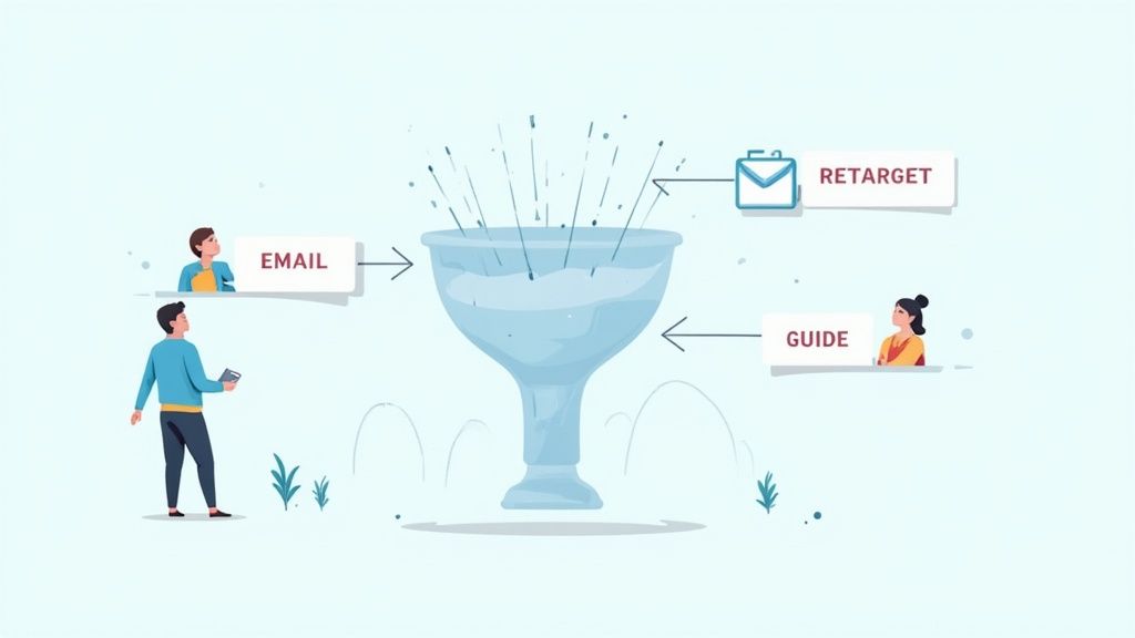
This is it. The moment of truth. After all your hard work guiding them through the ecommerce marketing funnel, your potential customer is at the finish line, credit card in hand. They’ve done their research, they feel a connection to your brand, and they’re ready to make a choice.
Your job now is to make it incredibly easy—and totally compelling—for them to choose you. It’s time to iron out every last bit of friction, quiet any lingering doubts, and give them that final, confident nudge they need to hit “Complete Purchase.”
Actionable Steps for BOFU:
1. Recover Lost Sales with Abandoned Cart Emails: Let this sink in: the average cart abandonment rate hovers right around 70%. That’s a jaw-dropping number, but I don’t see it as a loss. I see it as a massive opportunity. This is where automated abandoned cart emails become your secret weapon. A thoughtfully timed sequence can recover a huge chunk of that potential revenue.
Here’s a powerful three-part flow you can automate:
- Email 1 (1 hour after abandon): The Gentle Reminder. Keep it simple and helpful. A subject line like “Did you forget something?” works wonders. Show them a picture of the item they left behind. No discounts yet—just a friendly tap on the shoulder.
- Email 2 (24 hours after abandon): Add Social Proof. Now, gently dial up the persuasion. Remind them of the product again, but this time, feature a glowing 5-star review or a snippet of UGC with that exact item. Seeing that other people love it is powerful validation.
- Email 3 (48 hours after abandon): The Final Offer. If they’re still on the fence, it’s time for a small, strategic incentive. A modest discount like 10% off or free shipping can be the final push that overcomes price sensitivity and closes the deal.
2. Optimize Your Product and Checkout Pages: Think of your product page as your final sales pitch. It needs to be so clear and convincing that the customer has no reason to leave. This means stunning images, compelling descriptions, and crystal-clear shipping and returns info. You also need to build unshakable trust. Just like TryIcona helps customers visualize products before purchase, your product page needs to help them feel confident in their decision. If you want to really dig in, we have a complete guide on https://tryicona.com/shopify-product-page-customization/ that will help you nail every last detail.
Once they hit “Add to Cart,” the journey must be seamless.
Key Takeaway: A complicated checkout is the ultimate conversion killer. Research shows that about 17% of shoppers ditch their carts just because the process was too long or confusing. Your goal is to make it so simple they barely have to think.
Here’s how to design a checkout that converts:
- Offer Guest Checkout: Don’t force people to create an account. For 24% of shoppers, this is an immediate dealbreaker.
- Display Trust Badges: Make sure security seals (like SSL certificates) and familiar payment logos (Visa, PayPal, Apple Pay) are front and center.
- Keep It Simple: Strip it down to the essentials. Cut out any unnecessary form fields or extra steps.
3. Increase Average Order Value with Upsells: Getting the sale is fantastic. But getting a bigger sale? That’s even better. Upsells and cross-sells increase your Average Order Value (AOV) by suggesting relevant products at just the right moment.
- Upsell: Suggesting a better, more premium version of the product they’re already considering. (Think: “Upgrade to the deluxe version for just $10 more.”)
- Cross-sell: Recommending complementary items that enhance their purchase. (For example: “Customers who bought this dress also loved these earrings.”)
You can place these offers on the product page, in the cart, or on the post-purchase thank you page using various Shopify apps. This isn’t just a small tweak; it’s a fundamental growth lever.
Stage 4: Creating Loyalty and Repeat Purchases
A lot of Shopify owners breathe a sigh of relief when a customer clicks “buy.” Funnel complete, right? Wrong. The most profitable brands know that sustainable growth happens after the first sale.
This is your moment to transform a one-time buyer into a lifelong fan. The game now shifts from acquisition to retention. Think about it: it costs five times more to land a new customer than to keep an existing one. By going the extra mile, you don’t just make another sale; you create brand ambassadors who do your marketing for you.
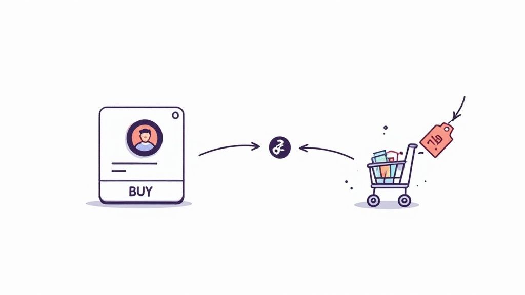
Actionable Steps for Loyalty:
1. Nurture New Customers with a Post-Purchase Email Flow: The time right after a purchase is pure potential. Your new customer is excited for their order to arrive. Your inbox is the perfect place to reinforce that they made a brilliant choice.
Here’s a simple, effective sequence you can automate:
- Email 1 (Immediately): The Enthusiastic Thank You. This shouldn’t look like a receipt. Send a beautifully designed email that genuinely thanks them for joining your community and reminds them of your brand’s mission.
- Email 2 (When Shipped): The Anticipation Builder. Their order is on its way! Include the tracking link, but also add value. If they bought a dress, link to a blog post on “Three Ways to Style Your New Dress.”
- Email 3 (A Week After Delivery): The Check-In & Review Request. Ask them how they’re loving the product. This is the perfect time to ask for a review—and make it dead simple by linking them directly to the product page.
2. Build a Community with a Loyalty Program: You want your customers to feel like they’re part of an exclusive club. A loyalty program is one of the best ways to foster that feeling. Data shows a huge 79% of customers are more likely to stick with a brand that has a loyalty program.
Actionable Tip: Don’t just reward purchases. Use a Shopify loyalty app to give out points for things like following you on social media, writing a product review, or referring a friend. This creates a powerful feedback loop of engagement that fuels your entire funnel.
3. Re-Engage Past Customers to Fuel Growth: Your list of past customers is one of your most valuable marketing assets. These are people who already know, like, and trust you. Create email segments for customers who haven’t shopped in 60 or 90 days. Hit them with a friendly “We Miss You” campaign that includes an exclusive offer to tempt them back. This turns your funnel into a self-sustaining cycle, where past buyers become your next wave of revenue.
Your Ecommerce Funnel Questions Answered
Building your first ecommerce marketing funnel can feel like a big project, but it’s really just a series of small, intentional steps. Let’s tackle the most common questions so you can move forward with confidence.
How Long Does It Take To Build A Funnel?
You can get a basic funnel up and running in a single afternoon. Seriously. With the right Shopify apps, you can launch the essential pieces—like a simple lead capture popup and an automated three-part email welcome series—in just a few hours.
The real work isn’t the initial setup; it’s the ongoing optimization. Think of your funnel as a living part of your business. A foundational funnel can go live today, but a high-performing one is built through constant testing and learning.
Which Stage Of The Funnel Is Most Important?
The honest answer is: they all are. A funnel is a connected system. A weak link at any stage will impact the whole process.
- You could have the most amazing products (BOFU), but if nobody knows you exist (TOFU), you’ll never make a sale.
- You could drive a ton of traffic (TOFU), but if you don’t build trust and capture leads (MOFU), that ad spend is wasted.
Instead of asking which stage is most important, ask yourself: “Where is my funnel weakest right now?” That’s the spot that deserves your immediate attention.
What Is A Good Conversion Rate For A Funnel?
You’ll see the average ecommerce conversion rate floating around 2-3%, but that number can be misleading. A “good” conversion rate depends entirely on your industry, price point, and traffic source. For instance, you’d expect traffic from an email campaign to loyal customers to convert at a much higher rate than cold traffic from a brand awareness ad on TikTok.
My Advice: Don’t get obsessed with hitting a universal benchmark. Focus on improving your own baseline. If your site-wide conversion rate is 1.5% today, getting it to 2% is a massive win. That’s the game.
How Do I Know If My Funnel Is Working?
Your funnel’s health is about more than just final sales. To truly understand what’s going on, you have to track key metrics at each stage.
- Top of Funnel (TOFU): Are you seeing a healthy increase in website traffic and social media engagement?
- Middle of Funnel (MOFU): What’s your email signup rate from popups? How many people are opening your welcome emails?
- Bottom of Funnel (BOFU): What percentage of visitors add a product to their cart? And how many of those abandoned carts are you successfully recovering?
By keeping an eye on these specific KPIs, you can pinpoint exactly where potential customers are dropping off. This data-driven approach turns optimization from a guessing game into a clear, actionable strategy for your store.
Ready to boost conversions on your product pages? With Icona, you can add a virtual try-on experience to your Shopify store in minutes. It’s the confidence boost shoppers need to click “Add to Cart.” Start converting more visitors into happy customers by exploring our plans.
SEO Meta Description:
Ready to grow your Shopify store? This guide breaks down the ecommerce marketing funnel into 4 actionable stages to attract visitors, capture leads, and boost sales.
Featured Image Idea:
A Shopify store owner looking at a laptop screen that shows a visual diagram of the 4-stage ecommerce marketing funnel (Attract, Nurture, Convert, Loyalty).
Are you watching potential sales vanish from your Shopify store every day? It’s a frustratingly common problem. A customer meticulously fills their cart, gets to the final step, and then… radio silence. You’re left staring at a growing list of almost-customers, wondering what went wrong. But what if you could automatically win back a significant chunk of that lost revenue?
That’s where a powerful abandoned cart email strategy transforms your business. These aren’t just simple “you forgot something” nudges; they are your secret weapon for turning hesitation into a confident purchase. A well-crafted email can remind, persuade, and build trust, directly addressing the friction that caused your shopper to pause. It’s one of the highest-leverage activities you can focus on to immediately boost your bottom line.
In this guide, you’ll find 15 proven abandoned cart email examples you can adapt for your store today. You won’t just see pretty pictures; you’ll get the psychology behind why they work and actionable steps to build a recovery sequence that drives sales. We’ll explore everything from crafting the perfect subject line to using advanced personalization, just like how TryIcona’s virtual try-on helps customers visualize products before purchase, eliminating doubt at the source.
Let’s turn those abandoned carts into your next wave of completed orders.
1. The Simple Reminder Email
The Simple Reminder is your foundational first step in any effective abandoned cart sequence. It’s exactly what it sounds like: a clean, direct, and friendly nudge to your customer that they’ve left something behind. This email isn’t about high-pressure tactics or deep discounts; its power lies in its simplicity and perfect timing.
Sent within the first 1-2 hours after a shopper leaves your site, this email catches them while your brand and their purchase intent are still fresh. Life is full of distractions—a phone call, a forgotten password, a cat walking across the keyboard. The Simple Reminder gracefully brings your customer back, assuming the best and making it incredibly easy for them to complete their purchase. Think of it as a helpful store associate tapping a customer on the shoulder and saying, “Did you forget this?”
Strategic Breakdown
Companies like Zappos and Amazon have perfected this approach. Their emails are models of clarity, focusing on three core elements: a visual of the product, a clear price, and a single, unmissable call-to-action (CTA). There are no competing offers or confusing messages, just a straight path back to the checkout.
Key Insight: The goal of the first email is not to persuade, but to remind. Overcomplicating it with discounts or complex messaging can dilute its primary purpose and reduce its effectiveness. The highest conversion rates for this email type come from its speed and simplicity.
Actionable Steps for Your Store
Here’s how you can replicate this effective strategy for your Shopify store:
- Time it Right: Set up your automation to send this email 30-60 minutes after abandonment. This is the sweet spot where the purchase is still top-of-mind.
- Keep it Visually Simple: Prominently display a high-quality image of the abandoned item. Let the product itself do the selling.
- Write a Clear, Low-Pressure Subject Line: Use subject lines that are helpful, not pushy.
- Example: “Your Shopping Cart is Waiting for You”
- Example: “Did You Forget Something?”
- Example: “Complete Your Order at [Your Store Name]”
- Craft a Bold CTA: Your call-to-action button should be the star of the show. Use action-oriented text like “Return to Your Cart” or “Complete My Purchase”. Make it big, bright, and impossible to miss.
2. The Incentivized Offer Email
When a simple reminder isn’t enough to bring a shopper back, the Incentivized Offer Email steps in as your most persuasive tool. This strategy directly addresses one of the biggest reasons for cart abandonment: unexpected costs. By offering a compelling discount, free shipping, or a special gift, you provide a powerful, tangible reason for your customers to overcome their hesitation and complete the purchase.
This email is typically the second or third in a sequence, sent 24-48 hours after abandonment. It acknowledges your customer’s interest and sweetens the deal, creating a sense of urgency and value that can tip the scales in your favor. It’s less of a gentle nudge and more of a friendly invitation, saying, “We really want you as a customer, and here’s a little something to make it happen.”

Strategic Breakdown
Brands like Gymshark and Glossier are masters of this tactic, turning potential lost sales into conversions with perfectly timed offers. Their emails go beyond just showing the product; they introduce an irresistible financial benefit. The key is to present the offer clearly and create urgency, often with a countdown timer or explicit mention of the code’s expiration. This transforms the decision from “Should I buy this?” to “Should I buy this now and save money?”
Key Insight: The power of an incentive is rooted in reciprocity and urgency. When you offer something of value, customers feel more inclined to reciprocate by completing their purchase. Adding a time limit prevents them from delaying the decision and letting the offer (and the sale) expire.
Actionable Steps for Your Store
Here’s how you can create a high-converting incentivized offer for your Shopify store:
- Strategize Your Offer: Don’t give away margin unnecessarily. Test what resonates with your audience: Is it 10% off, free shipping, or a specific dollar amount? Free shipping often converts better than a small percentage discount, even if the value is the same.
- Create Scarcity: Add a clear expiration date to your offer, usually 24-48 hours. Use language like “Your 15% discount expires tonight!” to prompt immediate action.
- Craft an Enticing Subject Line: Your subject line must communicate the value inside.
- Example: “Still thinking it over? Here’s 15% off.”
- Example: “Good News! Your order now has free shipping.”
- Example: “A Special Treat Just For You”
- Make the Code Unmissable: Display the discount code prominently near the CTA. Use a bold, easy-to-copy format and place it above the fold so your customer sees it immediately upon opening the email.
3. The Social Proof & FOMO Email
If the simple reminder is a gentle tap on the shoulder, the Social Proof & FOMO Email is the enthusiastic friend whispering, “Everyone loves this, and it’s about to sell out!” This email moves beyond a basic reminder by introducing powerful psychological triggers: social validation and scarcity. It reassures your customer that they made a great choice while creating a sense of urgency to complete the purchase.
By showcasing positive reviews, star ratings, or low stock alerts, you shift the customer’s mindset from “Do I want this?” to “I might miss out on something amazing.” This is one of the most effective abandoned cart email examples for converting hesitant shoppers into confident buyers. It validates their taste and gently pressures them to act before it’s too late.
Strategic Breakdown
Companies like Warby Parker and Sephora masterfully integrate social proof into their cart recovery flows. Their emails often feature snippets of glowing customer reviews or highlight the product’s average star rating directly beneath the item image. Similarly, retailers like Best Buy and Nike effectively use FOMO by adding “Low in Stock” or “Selling Fast” badges to abandoned items, signaling high demand and potential scarcity.
Key Insight: People trust other people more than they trust brands. By showcasing genuine reviews or indicating popularity, you borrow credibility from existing happy customers to persuade a new one. The combination of social proof (quality validation) and FOMO (scarcity) creates a compelling one-two punch that is difficult for shoppers to ignore.
Actionable Steps for Your Store
Here’s how to build a powerful social proof and FOMO email for your store:
- Time it Right: Send this email 24 hours after abandonment. It gives your customer time to consider, and the added social proof can be the final push they need.
- Showcase Your Best Reviews: Integrate a 5-star rating graphic or a short, impactful customer quote directly into the email template. Ensure it’s authentic and relevant to the abandoned product.
- Create Urgency with Scarcity: Use clear, honest language to indicate low inventory.
- Example: “Hurry! Only 3 left in stock.”
- Example: “Selling fast! Don’t miss out.”
- Example: “Your item is popular and might sell out.”
- Write a Compelling Subject Line: Spark curiosity and a fear of missing out.
- Example: “Your item is getting a lot of attention”
- Example: “Don’t miss out! Your cart is selling fast”
- Example: “See what others are saying about your item”
- Combine It with a Strong CTA: Your call-to-action should reinforce the urgency. Use phrases like “Claim My Item Now” or “Buy It Before It’s Gone”.
4. The Educational/Benefit-Focused Email
When your customer hesitates over a complex or high-ticket item, the barrier isn’t usually the price alone—it’s a lack of confidence in the product’s value. The Educational/Benefit-Focused Email tackles this head-on, shifting from a simple “buy now” message to a “here’s why this will change your life” approach. It’s designed to build trust and justify the investment by educating the customer on the product’s unique benefits, features, and problem-solving capabilities.
This email is perfect for products that require a bit more consideration, like advanced software, high-performance fitness equipment, or specialized skincare. Instead of just reminding them about the item in their cart, you’re giving them the final pieces of information they need to feel great about their decision. You’re turning a sales pitch into a valuable resource, reassuring them that their potential purchase is a smart one.
Strategic Breakdown
Companies like Peloton and Adobe excel at this strategy. They understand that customers buying a premium stationary bike or a creative software suite aren’t just buying a product; they’re investing in a new lifestyle or professional skill. Their abandoned cart emails often feature compelling video testimonials, clear infographics breaking down complex features, or stories of how existing customers achieved their goals. This content addresses unspoken objections and builds an emotional connection.
Key Insight: For considered purchases, the biggest obstacle is often purchase anxiety. This email’s goal is to eliminate that anxiety by arming your customer with knowledge and social proof, making them feel confident and excited about the value they’re about to receive.
Actionable Steps for Your Store
Here’s how you can build a powerful educational email for your store:
- Time it Strategically: Send this email 24-48 hours after abandonment. This gives your customer time to think and makes your follow-up feel like a helpful consultation rather than a rushed reminder.
- Highlight 3-5 Key Benefits: Don’t just list features. Frame them as direct solutions to your customer’s problems. Instead of “16GB of RAM,” say “Effortlessly edit 4K video without any lag.”
- Leverage Visual Education: Embed a short video that showcases the product in action. A quick demo, a customer testimonial, or an animated explainer can be far more persuasive than text alone.
- Write a Value-Driven Subject Line: Focus on the outcome, not just the cart.
- Example: “Here’s How the [Product Name] Works”
- Example: “Still thinking it over? See what you’re missing.”
- Example: “Unlock Your Potential with [Product Name]”
- Include Social Proof and FAQs: Add a top-rated customer review or a mini FAQ section addressing common concerns (e.g., “Is it easy to set up?”, “What’s the return policy?”). This preemptively answers their hesitations, a crucial step when you want to learn more about tips for selling clothes online.
5. The Multi-Step/Automated Sequence Email
While a single reminder can be powerful, the Multi-Step/Automated Sequence is where you build a true conversion engine. This isn’t just one email; it’s a strategic series of messages sent over several days, each with a unique angle and purpose. It’s designed to overcome different customer hesitations at just the right time, escalating from a gentle nudge to a compelling offer and, finally, a touch of urgency.
This approach acknowledges that not all your customers abandon their carts for the same reason. Some just need a reminder, others are price-sensitive, and many need a boost of confidence. By creating a sequence, you address each of these potential roadblocks methodically, maximizing your chances of winning back the sale without giving away a discount to someone who didn’t need one.
Strategic Breakdown
The beauty of a multi-step sequence lies in its escalating persuasion. The first email is a simple reminder. The second, sent a day later, might introduce a small discount to tackle price objections. The third could leverage social proof like reviews or best-seller tags to build trust. A final email might create urgency by mentioning low stock or an expiring offer.
This tiered approach respects the customer journey. You’re not hitting them with your best offer immediately; you’re building a conversation. This strategy allows you to learn more about your customers’ motivations while systematically breaking down the barriers to purchase, a key tactic in reducing cart abandonment. To dive deeper into this, explore some advanced strategies to reduce cart abandonment on your store.
Key Insight: A sequence allows you to test different psychological triggers. The first email tests the power of simple reminding. The second tests price sensitivity. The third tests the influence of social proof. By analyzing which email in the sequence gets the conversion, you gain valuable data about what truly motivates your shoppers.
Actionable Steps for Your Store
Here’s how you can implement a powerful automated sequence for your Shopify store:
- Map Your Sequence: Plan a 3-4 email series. A common, effective flow is:
- Email 1 (1 hour): Simple Reminder (“Did you forget something?”)
- Email 2 (24 hours): Introduce a small incentive (“Here’s 10% off to help you decide.”)
- Email 3 (48-72 hours): Build trust with social proof or create urgency (“Don’t miss out! Your items are selling fast.”)
- Vary Your Subject Lines and Content: Each email should feel fresh. Don’t just resend the same message. Change the subject line, the header image, and the core message to reflect the new angle (reminder vs. incentive vs. urgency).
- Keep the Series Short: Stick to 3-5 emails maximum. Anything more risks annoying your potential customer and can lead to higher unsubscribe rates.
- Monitor Performance at Each Step: Pay close attention to the open, click, and conversion rates for each email in the flow. If your second email (the incentive) has a massive conversion lift, you know your audience is price-sensitive. If the third email (urgency) performs best, you can lean into that tactic more often.
6. The Personalized & Dynamic Content Email
This is where your abandoned cart emails evolve from a simple reminder into a powerful, data-driven sales tool. The Personalized & Dynamic Content email goes far beyond just using a customer’s first name. It leverages their unique browsing history, past purchases, and real-time data to create an email that feels like a personal shopping session crafted just for them.
Sent in the later stages of a recovery sequence, perhaps 24-48 hours after abandonment, this email reignites interest by showcasing not just what was left behind, but what could be. By displaying complementary items, recently viewed products, or popular alternatives, you transform a forgotten cart into a new discovery opportunity. It’s like a skilled stylist saying, “I see you liked this jacket; have you considered these items that would complete the look?”
Strategic Breakdown
Masters of this strategy, like Amazon and Sephora, have built their empires on the back of hyper-personalization. Their abandoned cart emails are sophisticated engines that dynamically pull in product recommendations tailored to the individual. If you leave a camera in your cart, they’ll show you lenses, tripods, and memory cards. This anticipates the customer’s needs and significantly increases the average order value.
Key Insight: The goal here is to re-engage by demonstrating that you understand the customer’s tastes and needs. By showing them relevant, interesting products beyond their initial cart, you provide value and create a compelling reason to return, even if their initial intent has faded.
Actionable Steps for Your Store
Here’s how you can implement this advanced strategy for your Shopify store:
- Leverage Behavioral Data: Use an app or platform that tracks customer browsing behavior. This data is the fuel for your dynamic content blocks. For deeper insights, explore the landscape of eCommerce personalization tools that can integrate with your email service provider.
- Segment Your Recommendations: Don’t just show random “bestsellers.” Create smart segments.
- Example: If a user abandons a running shoe, show them performance socks, running shorts, and fitness trackers.
- Example: For a high-value item, recommend premium accessories or care products.
- Write an Intriguing, Data-Infused Subject Line: Use personalization to create curiosity.
- Example: “Still thinking about it? These might go perfectly.”
- Example: “We Picked These Just For You”
- Example: “Your Next Favorite [Product Category] Awaits”
- Design a Dynamic Layout: Your email template needs clearly defined sections for the abandoned item, a “You Might Also Like” block, and a “Recently Viewed” section. Ensure these blocks update in real-time to avoid showing out-of-stock products.
7. The Empathy & Objection Handling Email
The Empathy & Objection Handling Email moves beyond a simple reminder to address the why behind a customer’s hesitation. This strategic email acknowledges potential concerns head-on, such as shipping costs, sizing doubts, or product quality questions. It’s a proactive customer service touchpoint disguised as a marketing email, designed to build trust and dismantle purchase barriers.
Sent 24-48 hours after abandonment, this email gives the customer space and then re-engages them with reassurance. Instead of just saying, “You left this,” it says, “We understand you might have questions, and we’re here to help.” By showing empathy and providing solutions, you transform a moment of doubt into an opportunity to reinforce your brand’s value and commitment to customer satisfaction, making it one of the most effective abandoned cart email examples for thoughtful brands.
Strategic Breakdown
Companies like Warby Parker and Zappos are masters of this approach. Warby Parker anticipates the fear of buying glasses online by prominently featuring its “Home Try-On” program in recovery emails. Zappos neutralizes concerns about shoe fit and feel by constantly highlighting its legendary free shipping and 365-day return policy. They don’t just sell a product; they sell confidence in the purchase.
Key Insight: The most powerful way to overcome cart abandonment is to identify the biggest point of friction in your checkout process and address it directly. This email’s goal is to replace a customer’s uncertainty with a feeling of security and support.
Actionable Steps for Your Store
Here’s how you can replicate this trust-building strategy for your Shopify store:
- Identify Common Objections: Use customer surveys or analyze support tickets to find out why your shoppers hesitate. Is it shipping costs? Return policies? Sizing issues?
- Lead with the Solution: Make your key reassurance the star of the email. If free returns are your biggest strength, feature that benefit prominently near the top.
- Use Empathetic Subject Lines: Frame your subject lines around providing help and removing risk.
- Example: “Still Deciding? Let Us Help”
- Example: “No-Hassle Returns on Your [Product Name] Order”
- Example: “We Saw You Were Looking… Any Questions?”
- Provide Multiple Support Channels: Add links to your FAQ page, embed a size guide directly in the email, or include a clear link to your live chat or customer support email. Make it incredibly easy for customers to get the answers they need to feel confident enough to complete their purchase.
8. The Gamified & Interactive Email
In a crowded inbox, sometimes the best way to stand out is to offer an experience, not just a message. The Gamified & Interactive Email transforms a simple reminder into a fun, engaging micro-experience for your customer. Instead of just showing them what they left behind, you invite them to play, discover, or win something, turning the passive act of reading an email into an active brand interaction.
This forward-thinking strategy uses elements like spin-to-win discount wheels, interactive quizzes, or even product configurators directly within the email. It works because it leverages human psychology: our love for games, our curiosity, and the thrill of earning a reward. By breaking the monotony of standard marketing emails, you create a memorable moment that can re-ignite purchase intent far more effectively than a static message alone.

Strategic Breakdown
Brands like Fashion Nova and Sephora are pioneers in this space, using gamification to make their abandoned cart emails feel less like a sales pitch and more like a gift. Fashion Nova’s “Spin to Win” wheel is a classic example, offering a variable discount that encourages a click-through just to see what prize you’ll get. It’s a brilliant way to introduce a discount without devaluing the product, as the customer feels they’ve “earned” it.
Key Insight: Gamification shifts the dynamic from “we want you to buy” to “we want you to win.” This small change in framing can dramatically increase engagement and click-through rates because it taps into a customer’s sense of fun and anticipation, making the path back to the cart feel like a reward in itself.
Actionable Steps for Your Store
Here’s how you can bring this innovative strategy to your Shopify store:
- Choose the Right Game: The game should match your brand. A “Spin to Win” wheel works great for fashion and accessories, while a “Beauty Profile Quiz” is perfect for cosmetics. The goal is simple, fast engagement.
- Offer an Irresistible Prize: The reward must be worth the interaction. Offer a compelling discount (e.g., 15-25% off), free shipping, or a small gift with purchase. The perceived value is key.
- Write Playful, Action-Oriented Subject Lines: Your subject line needs to hint at the fun inside without giving everything away.
- Example: “Feeling Lucky? A Special Offer is Waiting…”
- Example: “Spin to Reveal Your Mystery Discount!”
- Example: “Don’t Just Complete Your Order, Win It!”
- Ensure Mobile-First Design: Interactive elements must work flawlessly on mobile devices, where most emails are opened. Use technologies like AMP for Email for the best experience, but always include a static fallback version (e.g., a simple discount code) for email clients that don’t support interactivity.
Your Next Step: From Abandoned Carts to Loyal Customers
You’ve just walked through a gallery of powerful abandoned cart email examples, each a masterclass in turning hesitation into conversion. We’ve dissected everything from the simple, polite nudge to the FOMO-driven, social-proof-packed powerhouse. You now have the strategic blueprints to build a cart recovery engine that not only recaptures lost revenue but also strengthens customer relationships.
The most crucial takeaway is this: your abandoned cart emails are not just about a single sale; they are about understanding the ‘why’ behind the hesitation. Did your customer get distracted? Were they surprised by shipping costs? Or, were they simply unsure about the fit or style? The examples we’ve explored are all tools to address these underlying questions. Your goal is to move beyond a generic “You left something behind!” message and evolve into a helpful guide, gently leading your customer back to a confident purchase decision.
From Inspiration to Implementation
So, where do you begin? Don’t try to implement all these strategies at once. The path to mastery is iterative. Here are your actionable next steps to transform this inspiration into a revenue-generating asset for your Shopify store:
Start with a Foundation: If you have nothing in place, begin with a simple two-step sequence. Launch a “Simple Reminder” email that goes out within 1-3 hours of abandonment. Follow it up 24 hours later with an “Incentivized Offer,” like a 10% discount or free shipping. This foundational sequence is your safety net, catching a significant portion of would-be lost sales with minimal effort.
Analyze Your ‘Why’: Dig into your customer feedback, survey results, and product reviews. What are the most common reasons your customers hesitate? If you sell complex products, an “Educational/Benefit-Focused” email could be your most powerful tool. If you sell fashion, addressing fit and appearance is paramount. Use this insight to choose your next email strategy.
Inject Personality and Proof: Your brand’s voice should shine through. We saw how humor, empathy, and urgency can transform a mundane reminder into a memorable brand interaction. Once your foundational sequence is running, look to incorporate social proof. Add customer reviews, star ratings, or user-generated photos directly into your emails. Showcasing that others love the item in their cart is one of the most effective ways to dissolve doubt.
Building a Proactive Conversion Strategy
Ultimately, the best abandoned cart email strategy is part of a larger approach to the customer journey. While these emails are incredibly effective at reacting to an abandoned cart, you should also be thinking about how to prevent abandonment in the first place. This means building confidence and removing friction before a customer even considers leaving.
For many eCommerce stores, especially in fashion, that friction is uncertainty. Customers can’t try things on, so they hesitate. This is where you can be proactive. By integrating tools that help customers visualize products on themselves, you answer their biggest unasked question: “How will this actually look on me?” This preemptive confidence-building drastically reduces the likelihood of cart abandonment.
You are now equipped with the strategies and abandoned cart email examples to build a system that works tirelessly for your brand. Start small, test relentlessly, and always listen to your customers. Every recovered cart is more than just a sale; it’s a customer relationship saved.
Ready to reduce cart abandonment before it even happens? By helping shoppers visualize how clothes will fit on their unique body, Icona builds the purchase confidence needed to click “Buy Now” instead of closing the tab. Learn how our AI-powered virtual try-on can slash your abandonment rates and boost conversions at Icona.
In eCommerce, your product photos are your most valuable asset. A high-quality photography background cloth is the secret weapon behind stunning images that stop the scroll, build trust, and drive conversions for your Shopify store. This simple tool is the foundation for creating professional, compelling visuals that turn casual browsers into loyal customers.
Why a Simple Backdrop Is Your Most Powerful Sales Tool

Stop thinking of a backdrop as just an accessory; it’s the stage where your product becomes the star. For Shopify store owners, the mission is to showcase your products with absolute clarity to build credibility and encourage that “Add to Cart” click. A clean, professional backdrop isn’t just a good idea—it’s the first and most critical step in that journey.
This is about more than aesthetics; it’s about customer psychology. A busy, distracting, or unprofessional background can instantly make a shopper question your brand’s quality. Conversely, a smooth, neutral backdrop sends a powerful signal of professionalism and care before they even zoom in on the product. It frames their perception of your entire business.
How a Backdrop Builds Your Brand and Boosts Conversions
Choosing the right backdrop isn’t an expense—it’s a strategic investment in your brand’s success. The global photo backdrop market was valued at around USD 1.32 billion in 2024 and continues to grow, a trend fueled by the explosive rise of eCommerce. This statistic alone proves how vital this tool has become for online sellers who want to compete effectively in 2025. You can discover more insights about the photo backdrop market and its projected growth.
The right background sets the visual tone for your entire store. It creates a consistent, polished look across your product catalog, which is essential for building a recognizable and memorable brand.
Actionable Step: By removing all distractions, a clean backdrop forces the customer’s eye to focus on what matters most—the details, texture, and quality of your product. This single element can dramatically improve your entire Shopify product page customization efforts, leading to higher engagement and more sales.
It also simplifies your post-production workflow. Editing becomes faster, color correction is more accurate, and you have a perfect canvas for creating lifestyle shots or using advanced AI tools for virtual try-ons, where a consistent background is key to achieving realistic results. For any serious eCommerce brand, it’s simply non-negotiable.
Choosing the Right Photography Background Cloth for Your Products
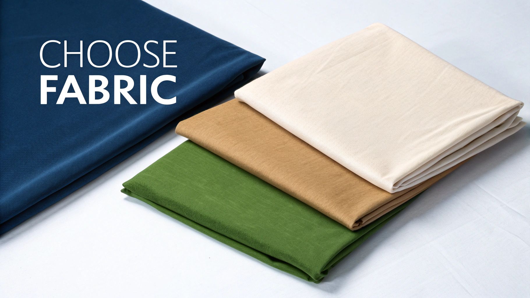
The material of your photography background cloth is a critical choice that directly impacts how customers perceive your products. The right fabric can make your colors pop and textures feel tangible, while the wrong one can create distracting glare or make your brand look amateur.
Think of it this way: a delicate necklace appears more precious against soft, light-absorbing velvet. Rugged hiking boots look ready for adventure on a textured canvas. Your backdrop sets the mood before a shopper even focuses on the product itself.
A Practical Comparison of Backdrop Materials
Let’s walk through the most common materials available. Each has unique strengths, and understanding them will help you make a smart investment for your Shopify store.
| Material | Best For | Pros | Cons | Price Range |
|---|---|---|---|---|
| Muslin | Apparel, portraits, soft goods | Lightweight, non-reflective, drapes beautifully | Wrinkles easily, can be thin | $25 – $70 |
| Canvas | High-end goods, furniture, food | Highly durable, paintable, rich texture | Heavy, stiff, can be expensive | $60 – $200+ |
| Polyester | Electronics, cosmetics, anything needing a clean look | Wrinkle-resistant, durable, easy to clean | Can have a slight sheen if not lit properly | $20 – $60 |
| Velvet | Jewelry, watches, luxury items | Deeply non-reflective, adds instant opulence | Attracts dust/lint, can be delicate | $40 – $150 |
Example in action: A dropshipper selling high-tech gadgets would benefit from a wrinkle-resistant polyester cloth for a clean, modern look that requires minimal setup time. Meanwhile, a fashion entrepreneur selling bespoke silk scarves should invest in a velvet or muslin backdrop to convey luxury and quality.
The demand for high-quality visuals has caused the photography props market to skyrocket, with over 200 million units of props produced annually. Fabric backdrops are a huge part of this trend. If you’re curious, you can explore the full report on the photography props market to see what’s driving the industry in 2025.
Selecting the Right Size for Your Space: An Actionable Guide
Once you’ve chosen a material, the next step is size. This decision comes down to what you sell and how much space you have.
Pro Tip: When in doubt, go bigger. It’s always easier to crop an image or have extra fabric to work with than to digitally fix a background that’s too small. A poorly extended background is a clear sign of an amateur photo.
Here’s how to choose the right size:
For Small Products (Jewelry, Cosmetics, Accessories): A tabletop size of 5 x 7 feet is perfect. It provides ample room for creative flat lays and detailed close-ups without taking over your workspace.
For Medium Products (Handbags, Shoes, Apparel on Mannequins): Step up to 6 x 9 feet for more flexibility. This size is large enough to cover the floor and sweep up into a seamless curve behind a mannequin, creating the classic “infinity” look.
For Full-Body Model Shots (Fashion, Apparel): Don’t compromise here. You’ll need a 10 x 20 feet backdrop at a minimum. This ensures you have enough fabric to cover the entire frame from head to toe, giving your models freedom to pose without you worrying about the background edges showing.
How to Create a Flawless Backdrop Setup
You’ve chosen your photography background cloth. Now comes the critical part: the setup. How you hang and prepare your backdrop is what separates an amateur snapshot from a professional, studio-quality image that drives sales. Your goal is to create a perfectly smooth, seamless surface that makes your product the undeniable hero.
Even on a tight budget, a flawless setup is achievable. You don’t need a massive studio—just a reliable way to hang your backdrop and pull it taut. This is the secret to eliminating distracting wrinkles and folds, giving your products the polished, high-end look they deserve.
Step 1: Build Your Support System
The foundation of a great product shot is a sturdy support system for your backdrop. While a dedicated stand is the professional standard, you can get creative, especially when you’re starting your business in 2025.
- Professional Stand: This is your best long-term investment. A good kit includes two adjustable stands and a crossbar, offering stability and flexibility. They are portable and make on-the-fly adjustments easy.
- DIY Solution: On a budget? A trip to the hardware store is all you need. You can build a support system with two sturdy light stands and a PVC pipe or wooden dowel. For a permanent setup, strong, removable wall hooks can be used to clamp the backdrop directly against a wall.
Whatever method you choose, the objective is the same: ensure the fabric is held taut without sagging in the middle.
A sagging or wrinkled background is one of the fastest ways to signal “amateur” to a potential customer. Investing a small amount of time to get this right pays huge dividends in brand perception and trust.
Step 2: Achieve the Perfect Smooth Surface
Wrinkles are the enemy of professional product photography. They cast tiny shadows and create lines that pull the eye away from your product, cheapening the overall image. Getting rid of them is non-negotiable.
Here’s the actionable process:
- Hang your backdrop: Secure it on your stand or support system.
- Use a garment steamer: This is your most valuable tool. Working from top to bottom, the steam will relax the fabric fibers and release creases. This works wonders on both muslin and polyester.
- Stretch and clamp: For a final, professional touch, use A-clamps (spring clamps) to pull the sides of the cloth taut against the stand’s vertical poles. This adds tension to eliminate any remaining ripples and keeps the backdrop perfectly flat.
This simple two-step process—steam, then stretch—is the most reliable way to create that coveted seamless “infinity cove” look that makes products pop. It’s a small effort that delivers a massive visual upgrade.
Mastering Light to Make Your Products Shine
Your photography background cloth and your lighting are a team; one can’t succeed without the other. Mastering your lighting is how you transform a good product photo into a great one—the kind that creates depth and dimension, making customers stop scrolling and pay attention.
Think of light as a sculptor’s chisel. It carves out the shape of your product, highlights its best features, and sets the mood. Get it right, and your products will leap off the screen. Get it wrong, and you’re left with flat, unappealing images plagued by harsh shadows and distracting glare.
The Power of Three-Point Lighting: A Simple How-To
One of the most effective techniques for eCommerce photography is three-point lighting. It sounds technical, but the concept is simple and delivers incredible results. Here’s how to do it:
- Key Light: This is your main, brightest light source. Place it to one side of your product (at about a 45-degree angle) to create shape and define its form.
- Fill Light: Positioned on the opposite side, this light is softer and less intense. Its job is to “fill in” the dark shadows created by the key light, revealing details that would otherwise be lost.
- Back Light: Placed behind your product and pointing toward it, this light is your secret weapon. It separates your item from the background, creating a subtle halo that adds depth and prevents it from looking like a flat cutout.
This classic setup gives you complete control to sculpt your product with light. You can achieve this with professional studio lights, but affordable LED panels work just as well. Once you understand these principles, you can use any light source more effectively, even natural window light.
The goal is to illuminate your product and your background independently. A common mistake is blasting everything with light from the front, which flattens the scene. By lighting your backdrop separately, you create a sense of space that makes your product the clear hero.
The infographic below shows the simple steps to prep your backdrop before you even think about lighting.
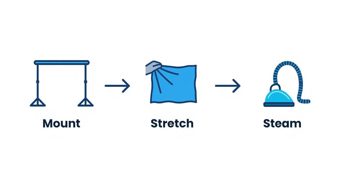
This mount, stretch, and steam process is the foundation for a professional shot. It ensures your light falls on a perfectly smooth surface, which makes all the difference. The global photography services market was valued at $55.6 billion in 2023 and is projected to hit $81.83 billion by 2032, showing just how vital high-quality images are for brands in 2025.
Even small lighting adjustments can have a huge impact, so experiment! For more hands-on guidance, check out our tips for selling clothes online.
Unlocking AI and Post-Production Potential
Think of your photography background cloth as the clean canvas your digital tools need to perform their magic. A smooth, evenly lit backdrop is the secret ingredient that makes post-production faster, easier, and more powerful. It’s the difference between effortless editing and hours of frustrating work.
When your backdrop is free of wrinkles and shadows, tasks like background removal become nearly instant. Your software can easily identify the uniform color and perfectly isolate your product with a single click. This saves a staggering amount of time, especially when processing hundreds of photos for your Shopify store.
Fueling the AI Revolution in eCommerce for 2025
The real game-changer in 2025 is how a clean backdrop prepares your images for artificial intelligence. AI tools are no longer a novelty; they are a competitive advantage for eCommerce brands. But here’s the catch: these powerful tools require clean, simple input to deliver incredible results. A consistent, professional background provides exactly that. It acts as a green screen for your products, giving the AI a perfect starting point.
For an AI, a busy or inconsistent background is just noise. By providing a clean slate, you’re telling the algorithm, “Ignore everything else and focus only on the product.” This leads to cleaner, more accurate, and more believable results.
This is especially crucial for fashion entrepreneurs. When you photograph a model against a clean cloth and remove the background, you create a perfect digital asset. That asset can then be used in countless ways to market your products.
The Foundation for Virtual Try-On and AI Models
This is where your initial effort pays off exponentially. A clean digital asset unlocks next-level customer experiences that were once reserved for major retailers. For apparel stores, the benefits are immediate and powerful:
- Virtual Try-On: A perfectly isolated product image allows technologies like Icona to map a garment onto a customer’s photo with stunning realism. The AI can accurately find the product’s edges and drape it naturally—a feat that’s impossible with a cluttered background. This directly helps reduce returns and improve the shopping experience.
- AI-Generated Lifestyle Shoots: Forget booking expensive photoshoots. You can take your isolated product and place it into any AI-generated scene imaginable, creating an endless supply of on-brand lifestyle images for a fraction of the cost and time.
For dropshippers and Shopify store owners looking to get ahead, mastering the physical backdrop is the first step to winning in the digital arena. Starting with a flawless photography background cloth prepares your brand for the powerful tools shaping the future of online retail. A great next step is to see how an AI fashion model can generate incredible on-model imagery from your product photos.
Your Top Photography Backdrop Questions, Answered
Starting with product photography can bring up a few questions. Here are straightforward answers to common queries from Shopify merchants, so you can start shooting with confidence.
What’s the Best Background Color for My Products?
For eCommerce beginners, a neutral color is your safest and most effective bet.
Pure white is the industry standard for a reason. It creates a clean, distraction-free canvas that makes your product the hero. It’s also a requirement for selling on major marketplaces like Amazon.
A light grey is another excellent choice. It offers a slightly more modern, sophisticated feel and can make colorful products pop. Sometimes pure white can cause glare, and light grey is a great way to avoid that while maintaining a professional look. Stick with a neutral, and you’ll have a versatile setup that works for nearly any product.
How Do I Get Wrinkles Out of My Fabric Backdrop?
Nothing signals “amateur” faster than a wrinkled backdrop. A smooth background is essential, and the best tool for the job is a handheld garment steamer.
Actionable Step: Hang your backdrop on its stand and steam it from top to bottom. It’s quick, easy, and removes most creases in minutes. For very stubborn folds, you can use an iron on a low heat setting, but always test it on a small corner first to avoid damaging the fabric.
The best way to fight wrinkles is to prevent them. When you’re done shooting, roll your backdrop carefully around a cardboard tube instead of folding it. This simple habit will save you a ton of time and frustration.
Can I Just Use a Bedsheet for a Backdrop?
While tempting for a quick DIY solution, using a bedsheet is a bad idea. Bedsheets are typically too thin, slightly transparent, and hold onto wrinkles tenaciously. You’ll spend far more time trying to fix the image in post-production than you would setting up a proper backdrop.
Even worse, most bedsheets have a subtle sheen that creates hotspots and ugly glare under lights. Investing in a proper, non-reflective material like muslin or polyester will pay for itself many times over in saved editing time and will give your Shopify store the polished, professional look it needs to succeed.
By mastering your photography background, you’re not just taking better pictures—you’re building a stronger brand and creating assets that can fuel next-generation shopping experiences. Ready to take those crisp product shots to the next level? Try Icona’s virtual try-on to boost your conversions.
Explore Icona and see how it works
SEO Meta Description:
Discover how to choose and use a photography background cloth to create stunning product photos that boost sales. This 2025 guide for Shopify stores covers materials, lighting, and setup.
Featured Image Idea:
A split-screen image. The left side shows a cluttered, unprofessional product photo taken at home. The right side shows the same product looking polished and premium against a smooth, grey photography background cloth with perfect lighting.
Let’s be honest: asking customers to guess their size from a few glossy photos is a broken model. Is it any surprise that returns are a constant headache for fashion brands? It’s time to fix the core problem by turning your Shopify store into a try on haul website, capturing the addictive, shareable energy of social media and bringing it right to your product pages.
This guide provides actionable steps to integrate virtual try-on technology, helping you boost conversions, reduce returns, and create a shopping experience that customers will love and share.
The Future of Shopping: Why a Try On Haul Website Wins in 2025

Think about why “try on haul” videos go viral on TikTok and YouTube. It’s not just about the clothes; it’s about seeing them on a real person. Viewers see how a dress hangs, how jeans move, and how different pieces can be styled together. That genuine experience builds an incredible amount of trust and desire.
For too long, replicating that feeling on an eCommerce site felt impossible. But static size charts and perfectly posed model shots just don’t cut it anymore. Shoppers in 2025 have higher expectations. They crave the confidence to know an item will look amazing on them before they even add it to their cart.
How to Close the Gap Between “I Like It” and “I’ll Take It”
This is exactly where the concept of a try on haul website makes all the difference. You’re not just showing a product; you’re creating an interactive fitting room. By integrating a virtual try-on tool, you give shoppers the power to see your collection on a model that reflects their own body type.
This technology tackles the single biggest obstacle in online fashion: doubt. It instantly turns a passive product page into an active, fun, and personal styling session. This isn’t just a fleeting trend; it’s a fundamental shift in how people shop. A recent market analysis projects the virtual try-on market to grow from $9.17 billion in 2023 to an incredible $46.42 billion by 2030. This guide will show you exactly how to get ahead of that curve.
Key Benefits for Your Shopify Store
Implementing virtual try-on offers a powerful solution to some of the most persistent challenges in eCommerce. By directly addressing customer uncertainty, you can see tangible improvements across key business metrics.
| Business Challenge | Actionable Virtual Try-On Solution | Expected Outcome in 2025 |
|---|---|---|
| High Cart Abandonment | Let customers visualize fit and style on a model, increasing purchase confidence before they commit. | Boosted Conversion Rates |
| Costly & Frequent Returns | Empower shoppers to make more informed sizing decisions, drastically reducing fit-related returns. | Significantly Reduced Return Rates |
| Low Customer Engagement | Create an interactive, game-like fitting experience that keeps shoppers on-site longer and exploring more items. | Enhanced Customer Engagement & LTV |
By implementing these features, you’re not just solving logistical problems; you’re building a more engaging and trustworthy brand that customers will return to again and again.
When you transform your product pages, you stop selling just clothes and start selling confidence. You’re giving every customer the green light they need to hit “buy now,” fully assured they’ve found something perfect for their body and their style.
Step 1: Set Up Your Virtual Fitting Room on Shopify
Jumping into virtual try-on is far easier than you might think. You don’t need to hire a developer or get tangled up in complex code. The best tools today are built for entrepreneurs who need solutions that just work. They plug right into Shopify with a few simple clicks, turning your store into a genuine try on haul website.
The mission here isn’t just to bolt on a new feature. It’s about crafting an experience that feels completely natural and aligned with your brand. The first step is to head to the Shopify App Store and choose a solution. An app like Icona is designed specifically for this, letting you get started quickly without technical headaches.
How to Get Started: An Actionable Walkthrough
Once you’ve installed the app, the process begins right inside your Shopify dashboard.
- Select Your Products: Kick things off by choosing which products to activate for virtual try-on. Actionable Step: Start small. Pick a curated collection of 5-10 items—perhaps your latest arrivals or all-time best-sellers—to get a feel for the process. For example, a new Summer 2025 collection could feature a hero dress, a linen blouse, and wide-leg trousers.
- Upload Your Images: Next, upload your product photos. High-quality shots on a clean background or even on a mannequin are perfect. The app’s AI does the heavy lifting from there, preparing the image for the virtual fitting room.
- Activate the Feature: With your products selected and images uploaded, simply toggle the feature on for those items.
Here’s a glimpse of how an app like Icona looks on the Shopify App Store, emphasizing ease of use and immediate benefits.
The interface makes it clear how seamlessly the tool embeds the virtual try-on feature into your product pages, making it feel like an organic part of the shopping journey.
Step 2: Customize the Experience to Match Your Brand
A generic, out-of-the-box button isn’t going to cut it. To make this feel like your store, you need to customize the look and feel of the try-on button itself.
Most apps give you simple but powerful options. You can—and absolutely should—tweak these elements:
- Button Text: Ditch the boring “Try On.” Use microcopy that echoes your brand’s voice. Actionable Step: Test phrases like “See it on You,” “Try it On Virtually,” or “Find My Fit.”
- Button Colors & Style: Match the button’s color, font, and shape to your store’s theme. It should look like it was designed for your site, not just tacked on.
- Placement: Think strategically about where the button will make the biggest impact. The best location is typically right below the size selector and near the “Add to Cart” button. It’s the perfect spot to answer that last-minute doubt before a customer commits.
These small adjustments make a world of difference. It’s what turns a third-party tool into a trusted, integral part of your brand’s unique shopping experience.
Pro Tip: Think of the virtual try-on button as your store’s most helpful sales associate. It needs to be visible, inviting, and clearly communicate what it does. A well-placed, on-brand button practically begs to be clicked, building instant confidence.
Step 3: Launch Your First Virtual Collection
With your products selected and button styled, you’re ready to go live. But launching is more than just flipping a switch—it’s about introducing this fantastic new feature to your customers.
Actionable Step: Create buzz around your launch. Send an email to your subscribers with a subject line like, “No More Guesswork! Try On Our New 2025 Collection From Home.” You could also create a quick, fun video for social media showing just how easy the feature is to use.
This initial push educates your audience and drives targeted traffic to your most important product pages. By guiding shoppers through their first virtual try-on, you’re proving your commitment to a better, more confident shopping experience.
Step 4: Design a Seamless Try-On Haul Website Experience

Now that the technology is in place, it’s time to weave it into your customer’s journey so it feels completely natural. This isn’t about just adding another button; it’s about strategically integrating this feature to boost engagement and make shopping feel like an exciting discovery.
The best try on haul website experience is both intuitive and inviting. It gently guides shoppers toward a confident purchase without ever feeling pushy. The secret lies in thoughtful design and smart user experience (UX) choices.
How to Optimize Your Product Page Layout
Think of your product page as the main stage. Where you place your virtual try-on button can make or break its success. It needs a prime spot where it can catch a shopper’s eye at the precise moment of decision.
The sweet spot is directly beside or just below the size selector, right above the “Add to Cart” button. This location is psychologically powerful. It intercepts the customer exactly when they’re second-guessing the size or fit, offering an immediate solution to their biggest worry.
A shopper’s natural eye movement follows a path: they see the product, check the price, select a size, and then… they hesitate. That hesitation is your golden opportunity. A well-placed virtual try-on button transforms that moment of doubt into a moment of confident action. You can learn more about elevating your pages with our guide on Shopify product page customization.
The Power of Compelling Microcopy
Words matter, especially the small ones. The text on your try-on button—what we call microcopy—is a critical piece of this puzzle. “Try It” is okay, but it doesn’t inspire. You want to use language that connects with your customer’s mindset.
Actionable Step: Try out some of these more powerful alternatives:
- See it on a model like you: This speaks directly to the need for personal representation.
- Visualize Your Fit: This focuses on the practical benefit of solving the sizing dilemma.
- Try it On Virtually: This is clear, modern, and sets the expectation for a cool, tech-forward experience.
The right microcopy makes the feature feel more personal and less like a clunky piece of software. It’s an open invitation to play, experiment, and ultimately, find something they truly love.
In 2025, customers aren’t just buying a product; they are buying an experience. Your try-on feature is the gateway to that experience, and its design should communicate ease, fun, and confidence from the very first click.
Go Beyond the Button: Build Immersive Haul Pages
A truly exceptional try on haul website thinks bigger than just one product page. Actionable Step: Build dedicated landing pages that capture the thrill of a social media haul. This is where you can elevate the experience from a simple tool into an immersive shopping event.
For example, a boutique owner could create a “Complete the Look” collection page. Instead of just showing individual items, they curate an entire outfit—the blazer, the blouse, the trousers. With a tool like Icona, you can empower shoppers to virtually try on the entire ensemble at once.
This strategy simplifies styling for your customer and is a natural way to increase average order values (AOV). You could create dedicated haul pages for different styles or events:
- The 2025 Weekend Getaway Haul: A curated mix of casual dresses, comfy jeans, and versatile tops.
- The Work-From-Anywhere Wardrobe: A collection of blazers, blouses, and pants that are professional yet comfortable.
- The Ultimate Wedding Guest Edit: A selection of dresses and accessories that shoppers can mix and match virtually.
By building these dedicated experiences, you’re not just selling clothes anymore. You’re selling a vision and a level of convenience that will keep customers coming back.
Step 5: Generate On-Model Photos with AI
Professional photoshoots are a huge barrier for many brands. The cost of hiring models, photographers, and renting a studio can feel out of reach, especially when you’re just starting out. But what if you could bypass all of that and still get stunning, diverse model photography? This is where an AI fashion model generator changes the game.
From a Flat Lay to a Full Campaign in Minutes
The concept is refreshingly simple. Actionable Step: Take a photo of your product—it can even be on a plain mannequin—and upload it to a tool like Icona Studio. The AI masterfully places your item onto a wide range of AI-generated models.
The result? A collection of images ready for your product pages, Instagram feed, and email campaigns. This isn’t just about saving money; it’s about agility. You can generate an entire season’s worth of lifestyle shots in a single afternoon.
AI model photography breaks down the biggest obstacles to creating professional eCommerce visuals. You no longer need a massive budget to build a beautiful, inclusive, and high-converting online store.
Craft a Brand That Reflects Your Customers
One of the most meaningful benefits of using AI is the power to show your products on models who genuinely represent your audience. Inclusivity isn’t just a buzzword; it’s a core business strategy for 2025. Shoppers want to see themselves in the brands they buy from.
With AI, you have the creative control to select models from a diverse spectrum of:
- Ethnicities and skin tones, making your brand feel welcoming to everyone.
- Body types and sizes, showing how your clothing looks and fits on real bodies.
- Ages and styles, helping you connect with different customer demographics.
This representation is incredibly powerful. When a shopper sees a model who looks like them confidently wearing your product, it creates an immediate personal connection and builds the trust needed to click “add to cart.”
Fueling Your “Try-On Haul” Experience
This technology is the perfect engine for your “try-on haul” experience. Instead of being limited to one or two model photos, you can now generate dozens.
Case Study: The Floral Blouse Transformation
- Before AI: A dropshipper has a simple flat-lay photo of a new floral blouse. It shows the pattern but lacks life.
- After AI: The product page now features a vibrant gallery. That same blouse is shown on three different models—one enjoying coffee at a bustling city cafe, another walking through a sunlit park, and a third against a clean, minimalist studio backdrop.
Suddenly, it’s no longer just a blouse. It’s a story. It’s an aspirational moment that customers can immediately imagine for themselves, turning your store into a destination.
Step 6: Measure Your Success and Optimize for Growth
Getting your virtual try-on feature live is a fantastic first step, but the real magic begins when you start analyzing the data. By diving into the analytics, you can transform raw numbers into a clear roadmap for growth, making smart decisions to enhance your try on haul website experience.
Most virtual try-on apps, including Icona, come with a built-in analytics dashboard. You don’t need to be a data scientist to understand the story in the numbers.
Key Metrics to Watch in Your Dashboard
Actionable Step: Zero in on these core metrics to understand your performance.
- Try-On Engagement Rate: The percentage of visitors on a product page who click the “Try It On” button. A high rate means your button’s design and placement are working.
- Conversion Rate with Try-On: The percentage of shoppers who bought an item after using the virtual try-on. Compare this to the conversion rate of those who didn’t—the difference is your uplift.
- Return Rate Reduction: Keep a close watch on the return rates for products with the feature enabled. Over time, you should see a healthy decline in returns citing fit issues.
- Average Order Value (AOV): Are people who use the feature adding more to their carts? The confidence gained from one item often inspires them to buy more.
Tracking these pillars creates a powerful feedback loop. You can instantly see what’s working and prove the value of this technology with hard data.
How to A/B Test Your Way to Higher Conversions
Once you have your baseline numbers, it’s time to experiment. A/B testing is your secret weapon for optimization. It’s a method where you show two different versions of an element—like a button—to different segments of your audience to see which one performs better.
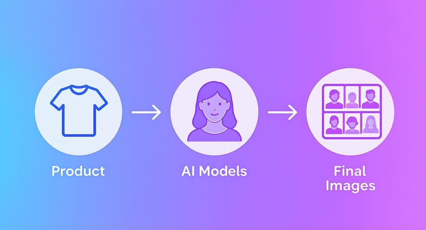
The market for this technology is exploding. Detailed industry reports show the virtual try-on market value is set to skyrocket from USD 14.2 billion in 2025 to an incredible USD 128.1 billion by 2035, growing at a staggering CAGR of 24.6%. You can dig deeper into this trend by exploring the full market growth projections at Fact.MR.
To help you get started, here are some practical A/B tests you can run right away.
A/B Testing Ideas for Your Virtual Try-On Feature in 2025
| Test Element | Variation A (Control) | Variation B (Test) | Key Metric to Track |
|---|---|---|---|
| Button CTA Text | “Virtual Try-On” | “See It On You” or “Try It On Now” | Click-Through Rate (CTR) on button |
| Button Color | Matches brand’s secondary color | High-contrast, attention-grabbing color | Click-Through Rate (CTR) on button |
| Button Placement | Below the “Add to Cart” button | Next to the “Add to Cart” button | Engagement Rate & Conversion Rate |
| On-Page Prompt | No pop-up or banner | A subtle banner: “Unsure of the fit? Try it on!” | Try-On Engagement Rate |
Remember, the goal is to build a culture of continuous improvement, where every small tweak gets you closer to a frictionless, high-converting customer journey.
The goal of A/B testing isn’t just to find a single “winner.” It’s to cultivate a mindset of continuous improvement, where every small tweak is a step toward a more seamless, high-converting customer journey.
Common Questions About Virtual Try-On
Diving into new technology always stirs up a few questions. We talk to Shopify merchants every day, and most of their concerns boil down to the same things: time, money, and performance. Here are the honest answers to the questions we hear most about creating a try on haul website experience.
Do I need to be a coder to set this up?
No. Not at all. Modern tools like Icona are designed as simple, one-click Shopify apps. If you can install an app from the Shopify App Store, you’re already overqualified. You never have to dig into your theme code.
Will a virtual try-on app slow down my site speed?
It’s a valid concern, as a slow site is a conversion killer. Reputable virtual try-on apps are built to be lightweight and have a nearly invisible impact on your load times. They use a technique called asynchronous loading, which means your essential page content (product photos, “Add to Cart” button) loads first and instantly. The try-on experience then loads a split second later in the background, ensuring a snappy, seamless experience.
Expert Takeaway for 2025: Performance is everything. Before committing to any app, check recent reviews for comments on site speed. Always choose a solution that prioritizes a fast, optimized experience for your customers.
Is this technology affordable for a small business?
Yes, it’s more accessible today than ever before. Most modern apps are built for growing brands, with flexible pricing that scales as you do. Many services, Icona included, offer a free plan or a trial period. This lets you test the waters with zero risk. When you weigh the small monthly cost against what you lose to returns, the investment often pays for itself almost immediately.
What kind of products are best for virtual try-on?
This technology shines with products where fit and style are a huge part of the buying decision.
- Apparel: Tops, t-shirts, dresses, sweaters, and jackets are the sweet spot.
- Accessories: Sunglasses, hats, and scarves are also brilliant for this, as it helps people visualize how an accessory completes their outfit.
The core goal is to help a customer see an item on a body similar to their own. This is what makes it so powerful for creating curated collections, like a “Summer 2025 Lookbook” or “Weekend Getaway Essentials” page. You’re not just selling a product; you’re selling a complete look and the confidence to go with it.
Takeaway: Building a try on haul website is no longer a futuristic concept—it’s an essential strategy for 2025. By following these actionable steps, you can create an immersive, confidence-building experience that drives sales and delights customers.
Ready to turn “I wonder how this will look” into “I have to have this”? Try Icona’s virtual try-on to boost your conversions. Explore Icona and start your free trial today.
SEO Meta Description:
Build a high-converting try on haul website on Shopify. Our 2025 guide offers actionable steps to reduce returns and boost sales with virtual try-on.
Featured Image Idea:
A split-screen image. On the left, a frustrated shopper looks at a sizing chart on a laptop. On the right, a happy shopper uses a virtual try-on tool on a tablet, smiling confidently at the result. The text “From Guesswork to Confidence in 2025” is overlaid.