
Remember when every pop-up was an instant close? We’ve all been there, reflexively hunting for the tiny ‘X’. But what was once the internet’s most annoying guest has quietly become one of the smartest tools for Shopify merchants. Today, they’re personal, timely, and actually helpful.
So what changed? In a word: intelligence. The pop-up didn’t just get a facelift; it got a new brain. It’s time to rethink what a small box on a screen can do for your store.
The Unexpected Comeback Of The Pop-Up Notification
Let’s be honest. For years, the term “pop-up” was basically a curse word. It felt like a digital door-to-door salesperson who wouldn’t take no for an answer, shoving a loud, irrelevant offer in your face.
They were clumsy, intrusive, and completely out of touch with what you were actually trying to do. But somewhere along the line, something shifted. The best pop-ups today feel less like an ad and more like a helpful store associate who appears at the perfect moment. This isn’t just about better design; it’s a complete rethinking of what a pop up notification can be.
From Annoying To Astute
So, what fueled this comeback? A mix of smarter tech and a much deeper understanding of the customer journey. Modern pop-ups aren’t one-size-fits-all interruptions anymore. They’re driven by context, timing, and real value.
Smart Targeting: Instead of shouting at everyone who walks through your digital door, they whisper to the right person at the right time. Pop-ups now appear based on specific behavior—whether it’s a visitor’s first time on your site, they’re a loyal returning customer, or they’re about to click away forever.
True Personalization: They’ve moved beyond generic messages. A great pop-up can greet a customer by name, mention the exact items in their cart, or offer a deal tailored to what they’ve been browsing. It feels human, not robotic.
Value-Driven Offers: The modern pop-up doesn’t just ask for an email. It earns it by offering something compelling in return—a killer discount, first dibs on a new collection, or an exclusive invite to a unique experience.
This comeback story is all about turning a potential frustration into a meaningful connection. It’s proof that a small box, when used with thought and care, can become a powerful way to build relationships and grow your brand.
Your Modern Pop-Up Playbook
The pop-up notification has come a long way. It’s no longer a single, annoying tool but a sophisticated kit, with different instruments perfectly suited for specific moments in the customer journey. The secret isn’t just using them; it’s knowing which one to use and when. That’s how you make them feel helpful, not intrusive.
Let’s break down the essential types every Shopify merchant needs to understand. Think of each one as having a unique personality and purpose, like the specialist staff in a high-end boutique.
This is the journey we want to take our pop-ups on—from an irritation to a genuinely helpful part of the shopping experience.
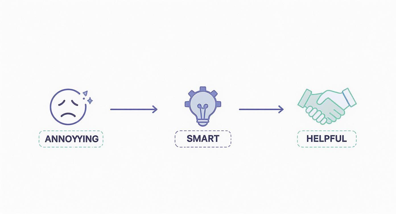
The goal is to move past disruptive tactics and embrace smart, value-driven interactions that actually build relationships with your customers.
The Main Players On Your Stage
Here are the most common pop-up types you’ll encounter and how to think about them for your store.
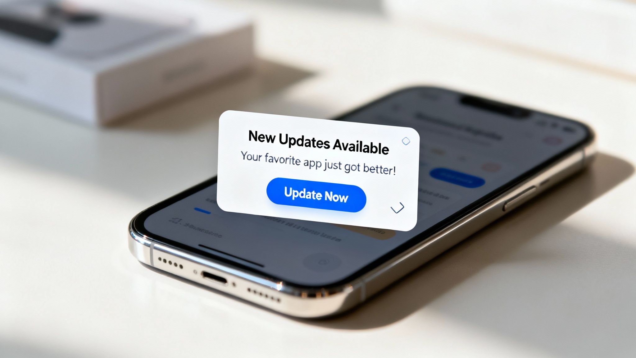
Modal Pop-Ups (The Welcome Mat)
This is the classic pop-up you know best. It appears right in the center of the screen, dimming the background to demand focus. It’s your store’s welcome mat. When a new visitor arrives, a well-timed modal is the perfect way to present a compelling, can’t-miss offer, like a first-time shopper discount.
But its biggest strength is also its biggest risk. Because it demands immediate attention, the offer has to be undeniably valuable. If it feels irrelevant or premature, it just becomes an irritating roadblock.
Slide-Ins (The Subtle Nudge)
A slide-in is a far more polite interruption. Instead of taking over the whole screen, it gracefully appears from the side or bottom corner. Think of it as a helpful store associate who subtly points out a special promotion while you’re browsing a specific aisle.
This format is fantastic for contextual offers. You can use it to highlight free shipping once a customer adds something to their cart or suggest a related blog post as they read an article. It guides without commanding.
Gamified Pop-Ups (The Fun Surprise)
Who doesn’t love a game? Gamified pop-ups, like a “spin-to-win” wheel, inject a dose of fun and excitement into the shopping experience. They transform the boring act of signing up for a newsletter into an interactive, rewarding moment.
The psychological trigger here is incredibly powerful. The chance to “win” a better discount than the standard offer feels exciting and personal, making customers far more willing to engage and hand over their email.
This tactic creates a positive first impression and can seriously boost your email sign-up rates compared to a plain old static form. It’s a small moment of delight that makes your brand stick.
Choosing Your Pop Up Notification Type
Deciding which pop-up to use depends entirely on your goal and your customer’s context. This table breaks down the key players to help you make a strategic choice for your Shopify store.
| Pop Up Type | Best Use Case | Pros | Cons |
|---|---|---|---|
| Modal | Capturing emails from new visitors with a strong welcome offer (e.g., 15% off). | High visibility, impossible to ignore, great for critical calls-to-action. | Can be highly disruptive and lead to high bounce rates if the offer isn’t valuable. |
| Slide-In | Providing contextual help, promoting related content, or announcing free shipping thresholds. | Less intrusive, feels more helpful, can be triggered by specific user actions. | Lower visibility means it can sometimes be missed by less engaged shoppers. |
| Gamified | Growing your email or SMS list in a fun and memorable way. | High engagement rates, creates a positive brand interaction, feels less transactional. | May not fit every brand’s aesthetic; can feel gimmicky if not designed well. |
Ultimately, the best approach is to test different types and see what resonates with your audience. Start with the one that best matches the specific action you want users to take.
A Quick Note On Push Notifications
Another key player in this world is the push notification opt-in. This is a browser-level request asking for permission to send updates directly to a user’s device, even when they aren’t on your site. While incredibly powerful for re-engagement, getting that initial “yes” is tougher than ever.
The landscape for push permissions has changed dramatically due to new privacy policies. For example, Android’s historically high opt-in rate dropped from 85% to 67% after recent updates, bringing it much closer to iOS’s 56%. This has settled the global average to around 61%. You can read the full research about these push notification trends to see just how much things have shifted.
Choosing the right format for your message is the first crucial step. It’s what turns your pop-up from an unwelcome interruption into the start of a welcome conversation.
Why Smart Pop-Ups Are Your Unfair Advantage
So, we’ve seen what a modern pop-up looks like. But why should you, a busy Shopify merchant, invest your precious time getting them right? The answer is simple. When done well, they’re less of an interruption and more of a conversation starter—a conversation that directly grows your business.
At their core, smart pop-ups are masters of timing. They meet customers in crucial moments with the perfect message, turning hesitation into action and browsers into buyers. It’s not about shouting louder; it’s about whispering the right thing at the right time.
Build Relationships, Not Just Lists
The most obvious benefit is growing your audience. A well-crafted pop-up is still the single most effective way to build your email and SMS lists, which are communication channels you own completely. But it’s so much deeper than just that. You’re not just collecting contacts; you’re starting a relationship.
By offering genuine value—a discount, exclusive content, or early access—you earn their trust from the very first interaction. This simple exchange transforms a passive visitor into an engaged member of your brand community.
A great pop-up makes a customer feel understood. It anticipates their needs and offers a solution before they even think to ask, building a foundation of trust that pays off long after the initial sale.
Drive Revenue in Critical Moments
Beyond list building, pop-ups are your secret weapon for boosting revenue at key decision points in the customer journey. Think of them as your best salesperson, always ready with the perfect offer.
- Reduce Cart Abandonment: An exit-intent pop-up that offers free shipping or a small discount just as someone is about to leave can be the exact nudge they need to finish their purchase.
- Increase Average Order Value (AOV): You can use a subtle slide-in to suggest a perfect product pairing or a special bundle offer once a customer has added an item to their cart.
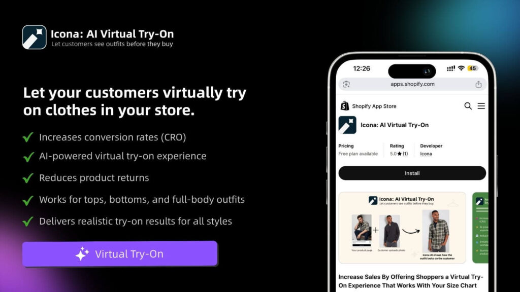
- Guide and Inform: Use a pop-up to introduce first-time visitors to a unique feature, like a virtual try-on tool, turning a simple notification into an engaging, confidence-boosting experience. In a store powered by TryIcona, this kind of interaction feels less like an ad and more like a helpful service.
This targeted approach is absolutely essential as mobile shopping continues to dominate. With so much web traffic now coming from smartphones, your pop-up notification strategy must be sharp, concise, and perfectly timed for smaller screens.
Ultimately, a smart pop-up isn’t just a marketing tactic. It’s one of the best ecommerce personalization tools you have, turning anonymous traffic into loyal customers by making every interaction feel personal and valuable.
Crafting Pop-Ups That Convert Without Annoying Customers
A great pop-up notification is part art, part science. It’s an exercise in empathy—figuring out what your customer needs and delivering it at the exact moment they need it most. Get this wrong, and you’re just another annoying interruption. But get it right? You create a loyal customer for life.
The secret isn’t some complex mystery. It really just comes down to four key pillars that work together to create an experience that feels genuinely helpful, not intrusive. Think of this framework as your blueprint for turning a simple box on a screen into one of your most powerful conversion tools.
Pillar 1: The Timing
When you show a pop-up is just as important as what it says. Interrupting a customer mid-thought is a surefire way to get them to slam that ‘X’ button and maybe even close the tab. The key is to focus on moments of transition or hesitation.
- On Entry: Perfect for welcoming first-time visitors. A friendly offer can make a fantastic first impression, but give them a moment to breathe. Consider a slight delay of 5-10 seconds so they can get a feel for your store before you jump in.
- On Exit-Intent: This is your last chance to make a connection. When a user’s cursor moves toward the back button or the top of the browser, triggering a compelling offer can be incredibly effective at preventing a lost sale. Knowing how to recover these almost-lost sales is a game-changer; you should dig into more strategies for reducing abandoned carts on Shopify.
- On Scroll-Depth: This is a brilliant way to gauge interest. Show your pop-up only after a visitor has scrolled 50% or more down a page. This tells you they’re already engaged and far more likely to be receptive to your message.
Pillar 2: The Targeting
Let’s be honest: one-size-fits-all messages almost always get ignored. The real magic happens when you show the right message to the right person. Thankfully, modern pop-up tools allow you to segment your audience with incredible precision.
Think about crafting different offers for:
- New vs. Returning Visitors: Welcome new shoppers with a “Take 15% off your first order!” message. For your regulars, try something like, “Welcome back! Here’s free shipping on us.”
- Geographic Location: Promote region-specific deals or special shipping offers based on a visitor’s country. It shows you’re paying attention.
- Referral Source: Did they click through from an Instagram ad? Greet them with a pop-up that directly reflects the campaign they just saw. It creates a seamless, personalized journey.
Pillar 3: The Offer
Your pop-up is a value exchange. You’re asking for their attention (or their email), so you need to offer something truly worthwhile in return. A discount is classic and often effective, but don’t be afraid to think bigger.
An irresistible offer goes beyond the price tag. It can be exclusive access, a solution to a problem, or a moment of delight that makes your brand unforgettable.
Consider offers that genuinely help your customers:
- Exclusive Content: A free style guide, an early-access link to a new collection, or a helpful checklist they can actually use.
- An Enhanced Experience: Instead of another discount, invite them to an interactive experience. A pop-up on a dress product page could say, “Not sure about the fit? Try this on virtually with Icona.” This builds confidence and solves a real, tangible pain point for the shopper.
- A Community Invite: Offer exclusive access to a VIP Facebook group or a newsletter with insider tips. Make them feel like part of the club.
Pillar 4: The Copy
Finally, how you ask matters. Ditch the corporate jargon and write like a real person. Your copy should be crystal clear, concise, and perfectly aligned with your brand’s unique personality.
Always focus on the benefit to the customer. Instead of a dry “Sign Up for Our Newsletter,” try something like, “Get 10% Off & Insider Style Tips.” The first is a command; the second is a promise of real value.
By mastering these four pillars, your pop-ups will stop being frustrating interruptions and start becoming welcome, valuable conversations.
Measuring Success And The Art Of The A/B Test
Launching your new pop-up isn’t the finish line—it’s the starting gun. The real growth begins when you stop guessing and start listening to what your customers’ actions are telling you. This isn’t about becoming a data wizard overnight; it’s about staying curious, paying attention, and making small, smart adjustments along the way.
Think of measurement as your feedback loop. It’s the mechanism that tells you what’s hitting the mark, what’s falling flat, and where your golden opportunities are hiding. It’s the difference between hoping you know what your customers want and actually knowing.
Key Metrics Beyond The Click
The conversion rate—the percentage of people who take the action you want—is definitely the star of the show. But it doesn’t tell the whole story. To get the full picture of your pop-up’s performance, you need to look at a few other critical numbers.
- View Rate: What percentage of your total visitors even see the pop-up in the first place? If this number is surprisingly low, your timing or targeting triggers might be off.
- Engagement Rate: Of the people who see the pop-up, how many interact with it—by clicking a button or filling out a form—versus just closing it? This is a direct reflection of how compelling your offer and design truly are.
- Impact on Bounce Rate: Keep a close eye on your page’s bounce rate after you launch a new pop-up. A sudden, sharp spike could be a red flag that your message is too intrusive, annoying visitors before they even have a chance to look around.
The Simple Art Of The A/B Test
“A/B testing” can sound intimidating, but the idea behind it is incredibly simple: you test two versions of something to see which one works better. You have a “Version A” (your control, the original pop-up) and a “Version B” (which has one single change). Then, you show each version to a different slice of your audience and see which one wins.
The golden rule? Only change one thing at a time. Seriously. If you change the headline, the offer, and the button color all at once, you’ll have no clue which change actually moved the needle.
Testing isn’t a one-and-done hunt for the “perfect” pop-up. It’s a cycle of continuous improvement: Launch, measure, learn, and optimize. Every test offers a new piece of the puzzle, a fresh insight into your customers’ minds.
Not sure where to start? Begin with simple tests on high-impact elements:
- The Headline: Pit a question against a bold statement.
- The Offer: See what resonates more: “15% Off” or “Free Shipping.”
- The Button Copy: Does “Get My Discount” pull in more clicks than “Sign Up”?
To get even better at this, diving into broader A/B testing methodologies will give you a stronger foundation. Remember, every test—no matter how small—gets you one step closer to a pop-up that truly connects with your audience and drives real results.
Thinking Beyond The Click To Build Lasting Trust
A great pop-up strategy respects one thing above all else: the customer. The smartest pop-up isn’t designed just for a click—it’s built to create a moment of trust. This means embracing transparency, especially when it comes to privacy.

Your pop-ups should be clear, honest, and fully compliant with regulations like GDPR and CCPA. Tell customers exactly what they’re signing up for and make your privacy policy incredibly easy to find. This isn’t just about ticking a legal box; it’s a powerful way to show you genuinely care about their data.
Accessibility And Respect
Beyond privacy, a trustworthy pop-up is an accessible one. Think about it from their perspective: can a customer easily find the ‘X’ to close it? Does it function flawlessly on all devices, especially mobile?
Forcing someone to hunt for a tiny exit button or trapping them in an inescapable pop-up on their phone is the fastest way to lose a sale and shatter their trust.
The real goal isn’t just to capture an email or prevent an exit. It’s to prove that you’re a brand that values your customer’s experience, even in the smallest interactions.
This is where your pop-up becomes part of a larger conversation with your customer. Each notification is a fresh chance to guide, help, and even delight them, moving them smoothly through your ecommerce marketing funnel.
When you shift your mindset from simply getting a click to building genuine trust, your entire pop-up strategy transforms. It becomes less about interruption and much more about connection—one helpful, respectful message at a time.
Your Top Pop-Up Questions, Answered
Even with the best strategy in place, questions will pop up (pun intended). That’s a great sign—it shows you’re thinking deeply about how to create a genuinely good experience for your customers. Let’s dig into a few of the most common questions we hear from Shopify merchants.
How Many Pop-Ups Are Too Many?
There’s no single right answer here, but a fantastic rule of thumb is always less is more. The goal is to add value, not create a wall of interruptions.
A smart approach is to start with one primary pop-up tied to your most important goal, like growing your email list. You could then add a secondary, much less intrusive pop-up, like a small slide-in banner announcing a free shipping threshold. The golden rule? Never stack pop-ups on top of each other, and for heaven’s sake, don’t interrupt someone when they’re trying to check out.
Do Pop-Ups Actually Hurt Your SEO?
They absolutely can, but only if they’re obnoxious and poorly timed. Google is all about the user experience, especially on mobile. If a visitor clicks through from a search result only to have their screen immediately blocked by a giant, hard-to-close pop-up, Google will notice—and you might see a penalty.
The secret to keeping Google happy is simple: make your pop-ups easy to close. On mobile, ensure they don’t dominate the whole screen. Even better, trigger them based on user behavior—like when they’ve scrolled down the page or are about to leave—instead of ambushing them the moment they arrive. A pop-up that’s genuinely helpful and respectful of the user’s journey won’t hurt your SEO at all.
What’s a Good Conversion Rate for a Pop-Up?
Across the board, you’ll see an average conversion rate of around 3-4%, but that number is just a starting point. It can swing dramatically based on your industry, your audience, and—most importantly—how compelling your offer is.
Don’t get hung up on hitting a specific number. A “good” conversion rate is one that’s better than it was last month because you’re constantly testing and learning what resonates with your customers.
We’ve seen brands with razor-sharp targeting and killer copy hit conversion rates of 10% or even higher. Use the average as your initial benchmark, but then shift your entire focus to beating your own numbers through smart A/B testing.
Ready to make your pop-ups an experience, not an interruption? With Icona, you can invite shoppers to a virtual try-on straight from a pop-up, giving them the confidence to click “add to cart.” See exactly how Icona works and transform your pop-up strategy.