
We’ve all done it. Landed on a store, seen something we liked, and then… clicked away. Maybe the shipping cost was a surprise, or the product photos left us guessing. It’s that tiny moment of friction, that flicker of doubt, that stops a sale cold.
If you’re a Shopify merchant staring at your analytics, you know this story all too well. The traffic is there, but the sales aren’t keeping up. You don’t have a traffic problem; you have a conversion puzzle. And in 2025, solving it is about creating a shopping experience so smooth and confident, clicking “buy” feels like the most natural next step.
Your Store Has Traffic but Not Enough Sales—Here’s Why
It’s a frustratingly common story. You see the visitor numbers climbing, but the sales just aren’t there. This isn’t about slapping on a few generic “best practices.” It’s about getting into the head of the modern shopper—someone whose attention is gold and whose trust must be earned with every single click.
Uncovering Conversion Friction
The number one reason your traffic isn’t converting is something called conversion friction. Think of it as a series of invisible speed bumps scattered throughout your store. Each one creates a moment of hesitation that can kill a sale before it even gets to the cart.
This diagram paints a perfect picture of how friction stands between your hard-earned traffic and your revenue goals.
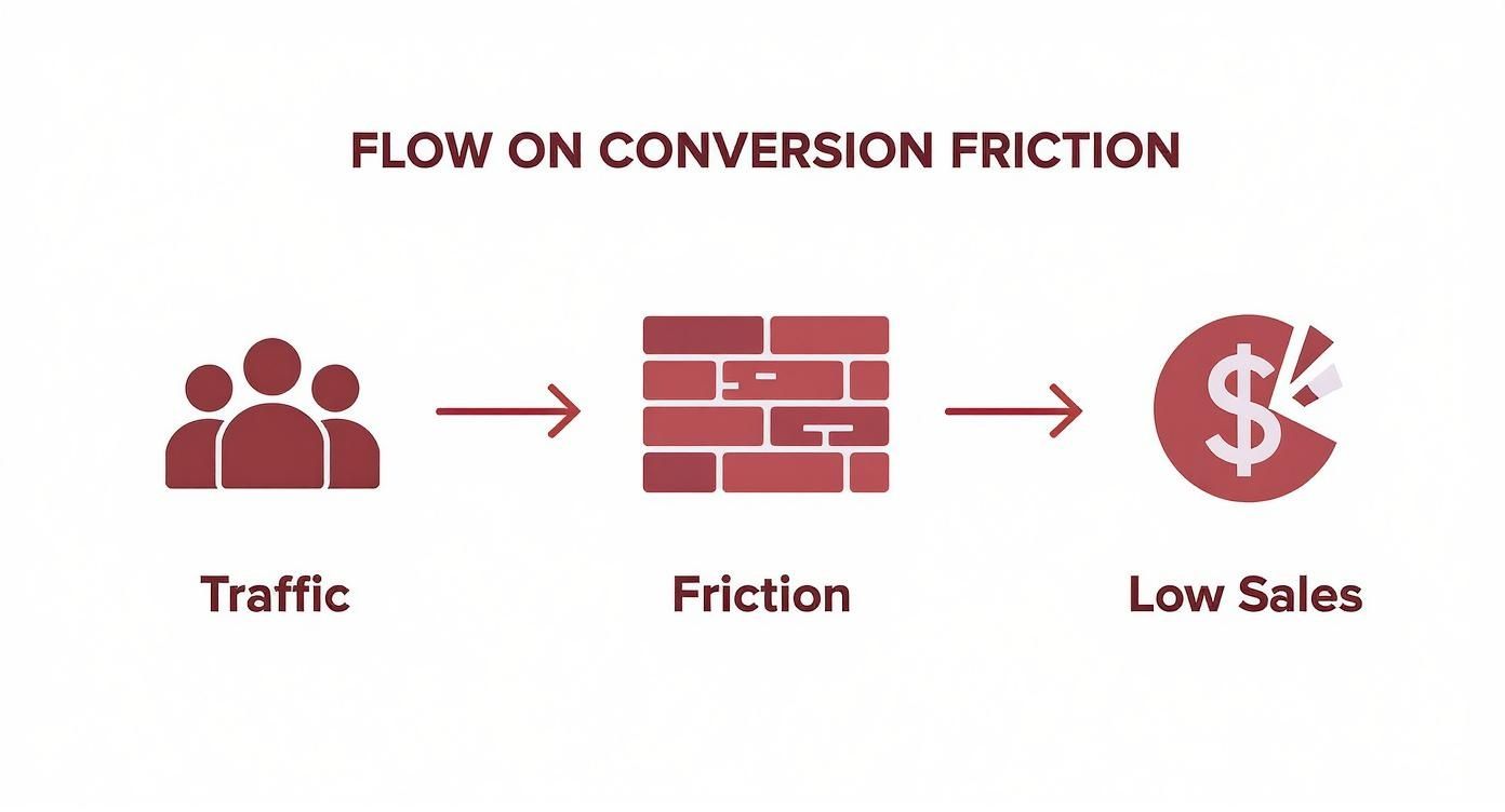
As you can see, friction is a direct roadblock on the path from visitor to customer. Every piece of friction you can smooth over makes that journey easier and more enjoyable.
First things first, you need to know where you stand. In 2025, the global average ecommerce conversion rate hovers between 2% and 4%. It’s a solid benchmark, but it’s not the whole story. Beauty and wellness brands can see rates as high as 6.8%, while fashion stores might average between 1.5% and 2.5%. Knowing your industry’s average gives you a realistic target to aim for and surpass.
This guide will help you see your store differently—not as a digital catalog, but as a carefully guided experience designed to build confidence from start to finish. We’ll focus on the areas that deliver the biggest wins:
- Product Page Experience: Are your pages just spitting out specs, or are they telling a story that makes someone need your product?
- Checkout and Funnel Flow: How many frustrating clicks are you putting between “I want it” and “Thank you for your order”?
- Trust and Social Proof: Are you giving shoppers overwhelming proof that buying from you is a safe and smart decision?
- Personalization and Messaging: Is your communication tailored and helpful, or does it feel like a generic megaphone blast?
By systematically tackling these core areas, you can begin to tear down the walls that are holding your sales back. For a deeper dive, our complete guide on e-commerce optimization strategies has you covered.
Let’s get started and turn those browsers into buyers.
Transforming Product Pages into Conversion Engines
Your product page is your star salesperson. It works 24/7 and has the power to be your biggest asset. But is it just listing facts, or is it telling a compelling story that makes a customer feel like they need your product?
Let’s turn those passive listings into active conversion machines.
Forget about just uploading a photo and a price. To truly increase ecommerce conversion rates, your product page has to close the “imagination gap.” This is the mental hurdle a shopper has to jump over to picture your product in their life. Your job is to make that jump as small and effortless as possible.
From Bland Descriptions to Benefit-Driven Stories
Let’s be honest: most product descriptions are boring. They list features like “100% organic cotton” or “stainless steel hardware.” While true, these details don’t connect with a customer’s real desires. A feature is what something is; a benefit is what it does for them.
Instead of just stating facts, translate them into emotional outcomes. It’s a simple but powerful shift.
- Feature: 100% organic cotton.
- Benefit: “Breathe easier in clothes that are incredibly soft on your skin—and kinder to the planet.”
- Feature: Stainless steel hardware.
- Benefit: “Built to last through countless adventures, so you can trust it won’t let you down.”
See the difference? This small change in language moves the focus from the product to the customer’s experience. You’re no longer selling an item; you’re selling a feeling.
“Your product page is where a customer’s logical brain and emotional heart meet. If you can satisfy both—with clear details and a compelling story—the sale becomes the natural next step.”
Visuals That Build Unshakeable Confidence
Words are powerful, but visuals close the deal. In a world where customers can’t touch your products, your imagery has to do all the heavy lifting. High-quality, zoomable photos are the absolute baseline. To stand out in 2025, you need to go further.
Think about weaving these into your visual strategy:
- Lifestyle Shots: Show your product in a real-world context. A dress on a mannequin is one thing; that same dress at a sunny brunch tells a story. Brands like Anthropologie do this beautifully.
- Scale References: For products like furniture or bags, showing them next to a common object or on a person helps customers instantly understand their true size.
- Short Videos: A 15-second clip showing the flow of a fabric or the clasp on a necklace can answer dozens of unasked questions in an instant.
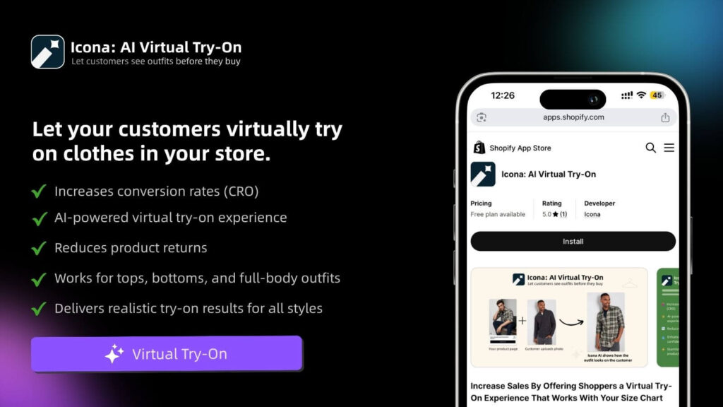
But the real game-changer is technology that lets shoppers place the product directly into their own lives. This is where tools like Icona’s virtual try-on become essential.
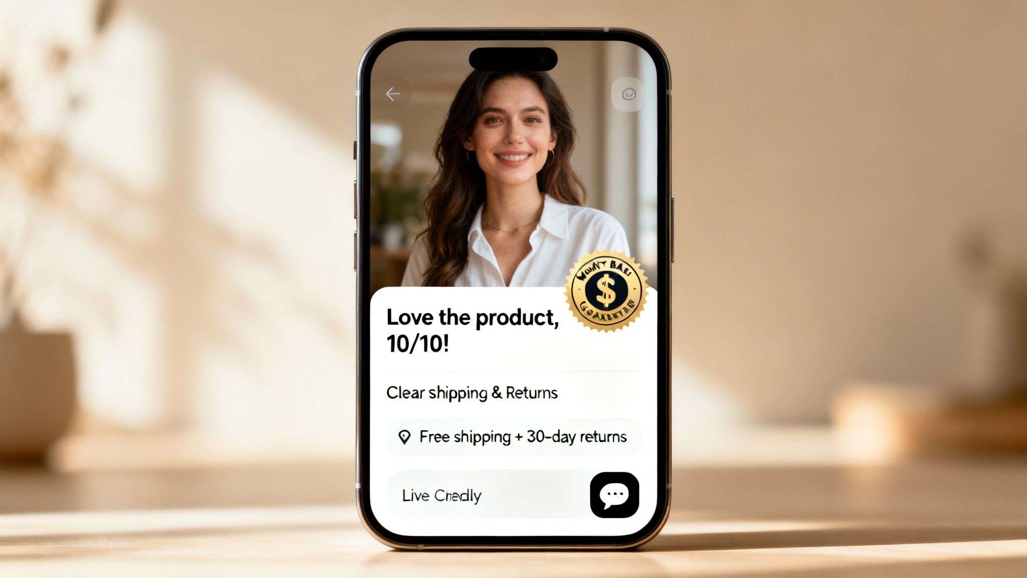
Here’s a look at how seamless this experience can be, right on your product page.
By adding a simple “Try It On” button, you invite shoppers to move from passive browsing to active engagement. This single feature demolishes purchase anxiety by answering the biggest question they have: “Will this actually look good on me?”
The Confidence Boost of Virtual Try-On
Virtual try-on technology is more than just a cool feature; it’s a powerful conversion tool. It bridges that final, crucial gap between online browsing and in-store confidence. When a customer can upload a photo and see your dress, necklace, or sunglasses on their own body, their uncertainty melts away.
This isn’t just about visuals; it’s about psychology. It builds an immediate sense of ownership. They’re no longer just looking at an item in a catalog; they’re seeing a future version of themselves. This deepens their emotional investment and makes clicking “Add to Cart” feel like a confident, informed decision. For a deeper look into creating this kind of experience, our guide on Shopify product page customization offers a ton of actionable ideas.
Let’s break down the key elements of a high-performing product page and why they’re so critical.
Product Page Elements That Drive Conversions
| Element | Why It Matters | Actionable Tip for 2025 |
|---|---|---|
| High-Quality Visuals | These are your digital “hands.” They let customers inspect quality and detail when they can’t physically touch the product. Poor visuals scream low quality. | Use a mix of studio shots, lifestyle photos, and 15-30 second product videos. Show every angle and feature. |
| Benefit-Driven Copy | Shoppers buy outcomes, not features. Your copy needs to connect product specs to the customer’s life, desires, or problems. | For every feature you list, ask “so what?” and write down the answer. That answer is the benefit. Lead with it. |
| Virtual Try-On (VTO) | This technology directly answers the #1 purchase hesitation: “How will this look on me?” It builds immense confidence and reduces returns. | Integrate a tool like Icona to offer a seamless VTO experience. Promote it as a key benefit of shopping with you. |
| Social Proof (Reviews) | 93% of consumers say online reviews influence their purchase decisions. Reviews build trust and validate a shopper’s choice. | Feature a mix of star ratings, written reviews, and user-generated photos directly on the product page. Don’t hide them. |
| Clear Call-to-Action (CTA) | The “Add to Cart” button should be impossible to miss. Its color, size, and placement guide the customer’s next step without them having to think. | Make your primary CTA button a contrasting color that stands out from your site’s color scheme. Test a sticky CTA on mobile. |
| Urgency/Scarcity Cues | Gentle nudges like “Only 3 left in stock” or “Low Stock” can encourage decisive action and combat cart abandonment. | Use these cues honestly. A simple, text-based low-stock indicator is often more effective than a flashy, countdown timer. |
Ultimately, by combining benefit-driven storytelling with immersive visuals and confidence-building technology, you create a product page that does more than just present information. It builds trust, sparks desire, and inspires action.
Sealing the Leaks in Your Sales Funnel
An abandoned cart isn’t just a lost sale; it’s a story about a customer who was almost yours. They liked your product enough to add it to their cart, but something in that final stretch gave them pause. This is where you can make some of the biggest and fastest gains to increase ecommerce conversion rates.

Think of your sales funnel like a pipeline. A leak anywhere—a confusing checkout field, a surprise shipping cost—causes you to lose sales. Plugging these holes is about making the path from cart to confirmation so smooth that clicking “Complete Purchase” feels like the only natural next step.
From Cart to Checkout: A Masterclass in Flow
The moment a customer adds an item to their cart, a delicate journey begins. Your job is to make this transition seamless. Don’t immediately redirect them to a full checkout page; that’s like asking for a commitment way too soon.
A much better approach is using a slide-out cart or a mini-cart drawer. This confirms their action without yanking them out of their shopping flow. It gives them the control to keep browsing or proceed to checkout when they are ready.
Inside the cart itself, clarity is everything. Reinforce their great decision with clear details:
- The Essentials: A crisp thumbnail, product name, size, and color.
- The Numbers: Show the item price, any discounts, and a clear subtotal.
- The Next Steps: An unmissable “Checkout” button alongside a “Continue Shopping” option.
This is also a golden opportunity for a smart upsell. Ditch random suggestions and offer products that genuinely complement what they’re already buying. Think of a protective case for a new phone or a conditioning treatment for a new hair color.
The Psychology of Trust at Checkout
Once a shopper hits the checkout page, their mindset shifts. They’re no longer just browsing; they’re actively evaluating risk. Is this site secure? Can I trust them with my credit card? Am I getting a fair deal?
Your checkout design needs to answer these questions before they’re even consciously asked.
The final moments before a purchase are the most fragile. Every single element on your checkout page should be designed to build confidence and remove doubt, not create it.
This is where trust signals become non-negotiable. Prominently display security badges like SSL certificates (that little padlock icon) and familiar payment logos like Visa, Mastercard, and PayPal. These are visual shortcuts that scream, “your information is safe here.”
Transparency is another huge trust-builder. The number one reason for cart abandonment is unexpected costs. Don’t ambush your customers with shipping fees at the very last second. Show an estimated shipping cost or a calculator right in the cart so there are no surprises.
Ruthlessly Eliminating Friction
Every extra field, every unnecessary click, and every moment of confusion is friction. And friction is the enemy of conversion. Your job is to sand it all down until the process is perfectly smooth.
Here’s a quick “checkout audit” you can run on your own Shopify store:
- Offer Guest Checkout: Forcing someone to create an account is a massive roadblock. In fact, 24% of shoppers will ditch their cart if you make them. Always have a prominent guest checkout option.
- Embrace Express Payments: Make it easy for them to give you money! Integrate options like Apple Pay, Google Pay, and Shop Pay. These one-click wonders bypass manual address and credit card entry, which is a lifesaver on mobile.
- Simplify Your Forms: Only ask for what you absolutely need to fulfill the order. Use auto-fill wherever possible and label every field clearly. If a shopper has to stop and think, you risk losing them.
Even with a flawless funnel, some people will still leave. That’s where powerful abandoned cart email strategies come into play. A well-timed, helpful email can be the gentle nudge they need to come back and finish.
Building Unshakable Trust Before the Buy Button
In the endless digital aisle of online shopping, trust is the single most valuable currency you have. It’s the silent handshake that happens before anyone even thinks about entering their credit card details. If a shopper feels a hint of uncertainty, they’re gone.
So, how do you build that confidence? It’s not about one magic badge. It’s about weaving trust signals into the fabric of your website, making your store feel like a safe, reliable, and human place to shop.
Go Beyond Star Ratings with Authentic Social Proof
Let’s be honest: star ratings are table stakes now. To truly stand out, you need to show proof from real people in ways that feel genuine. This isn’t just about showing off; it’s about validating a potential customer’s choice before they even make it.
Think of it as building layers of reassurance:
- User-Generated Photos: A dress looks great on a model, sure, but it’s infinitely more relatable on a real customer. Brands like Gymshark build entire communities around this idea.
- Detailed Video Testimonials: A short, heartfelt video from a happy customer is pure gold. It feels raw, believable, and is far more powerful than any marketing copy you could write.
- Press Mentions & Features: If you’ve been featured in a blog or magazine, showcase those logos! This “as seen in” section lets you borrow authority and tells new visitors that you’re a legitimate, respected brand.
By showcasing these different kinds of social proof, you’re not just saying “our product is great.” You’re letting an entire community of happy customers say it for you.
Turn Your About Us Page into a Story
Most ‘About Us’ pages are a corporate snooze-fest—and a massive missed opportunity. People don’t connect with faceless companies; they connect with other people, their missions, and their stories.
Your ‘About Us’ page should be the heart of your brand. Share your origin story. Why did you start this business? What problem are you passionate about solving? Introduce your team with real photos. This transparency builds an emotional bridge and shows there are passionate people behind the products.
“Trust isn’t built on a perfect, polished corporate image. It’s built on authenticity, transparency, and the willingness to show the real humans behind the brand.”
A compelling brand story gives customers something to believe in, not just something to buy. This is especially true in crowded markets like the United States, which is projected to surpass $1.17 trillion in ecommerce sales in 2025. With an average conversion rate of just 2.58%, building a memorable, trustworthy brand is how you capture your share. You can learn more about the latest ecommerce benchmarks for 2025 to see where you stand.
Embrace Radical Transparency
Nothing destroys trust faster than a nasty surprise. Unexpected shipping costs, a confusing return policy, or hard-to-find support are instant red flags.
The antidote is radical transparency. Be upfront and crystal clear about the things that matter most to customers after the purchase:
- Shipping Policy: Don’t make people wait until the final checkout step to see shipping costs. Clearly state your rates and delivery times on a dedicated page or a simple banner.
- Hassle-Free Returns: Your return policy should be easy to find and even easier to understand. Frame it with confidence-building language like, “Love it or send it back, no questions asked.”
- Accessible Support: Make it incredibly easy for customers to contact you. A visible email address, a chat widget, or a phone number proves you stand behind your products, ready to help.
When you operate with this level of honesty, you remove the final barriers of doubt. You’re not just selling a product; you’re making a promise of a great experience.
Using Smart Messaging to Guide Every Visitor
We’ve all been there. A popup explodes on the screen, our mouse instinctively flies to the “X,” and then a split-second later, we think—wait, that might have been useful. It’s a classic online annoyance, but one that’s getting a major rewrite in 2025. Smart messaging today isn’t about interrupting people; it’s about guiding them.
When done right, popups, emails, and even chatbots stop being irritating. They become intelligent, personal, and genuinely helpful guides. This is about mastering messaging that feels less like a marketing blast and more like a real conversation.
The goal is simple: use these tools to answer questions before they’re asked, overcome objections in real-time, and make every visitor feel seen. When you pull that off, you don’t have to push for a sale—you just naturally lead people to it.
The New Era of Exit-Intent Popups
Popups used to be annoying. But today? They’re personal, smart, and actually helpful. Instead of a generic “10% Off!” that feels like a bribe, today’s popups are context-aware. They use behavioral triggers to offer something of real value at the precise moment of hesitation.
Imagine these scenarios on your Shopify store:
- A shopper has spent five minutes comparing three different dresses. As they move to leave, a popup appears: “Can’t decide? Take our 30-second style quiz to find your perfect fit.”
- A first-time visitor is about to bounce from your skincare site. Instead of a discount, they see: “New here? Download our free guide to building your perfect skincare routine.”
- Someone is about to abandon a cart with a high-value item. The popup offers a link to a live chat: “Have a question before you buy? We’re here to help.”
This shift from interruption to assistance is everything. You’re not trying to stop them from leaving; you’re giving them a compelling reason to stay and feel more confident.
Emails That Feel Like One-to-One Conversations
Email marketing is still a powerhouse for one big reason: it’s personal. And yet, so many brands treat their email list like a faceless crowd. To truly increase ecommerce conversion rates, your email campaigns need to feel like they were written for an audience of one.
Your inbox is a sacred space. If a customer invites you in, respect that by sending them messages that are genuinely valuable and relevant to them—not just to your sales targets.
This all starts with smart segmentation. Group your audience based on their actual behavior. A first-time buyer needs a completely different welcome series than a loyal customer who has purchased five times. DTC brands like Bombas are masters at this, sending content that feels tailored to your journey with them.
The numbers don’t lie. Email marketing remains one of the most effective channels, boasting an average conversion rate of around 10.3% in 2025. This rate crushes the general ecommerce average of 2% to 4%, showing just how powerful targeted communication is.
Turning Automation into Authentic Connection
Creating this level of personalization might sound like a ton of work, but it’s more accessible than you think. Here’s how you can start today:
- Welcome Series That Build Relationships: Don’t lead with a sale. Your first few emails should tell your brand story and offer genuinely helpful content. Build a connection first; the sales will follow.
- Abandoned Cart Flows That Solve Problems: Go beyond “You left this behind!” If someone abandoned a dress, your email could include a size guide or link to customer photos. Be helpful.
- Proactive Customer Support with Chatbots: Modern chatbots are incredible tools for instant engagement. They can answer common questions about shipping, guide users to the right product, or offer personalized recommendations. To see what’s out there, you can explore the best chatbots for ecommerce and find one that fits your store.
By combining intelligent automation with a human-first approach, your messaging becomes an invaluable part of the customer journey. You’re not just selling products; you’re building a brand that listens and helps—and that’s a brand people will come back to again and again.
Your Ecommerce Conversion Questions Answered
Jumping into the world of conversion optimization always sparks a ton of questions. I get it. To help you out, here are some quick, no-fluff answers to the things Shopify merchants ask me all the time.
What Is a Good Ecommerce Conversion Rate in 2025?
This is the big one, isn’t it? Everyone wants that magic number. But the honest answer is, “it depends.” While you’ll see global averages floating around the 2-4% mark, a “good” rate is all about your specific niche.
For example, a beauty brand might see conversion rates as high as 6.8%, while a merchant selling high-ticket custom furniture would be thrilled with 1%. They’re both successful.
Instead of getting hung up on a universal benchmark, the best goal is to beat your own numbers. Focus on consistent, month-over-month growth. That’s a far more powerful indicator of success.
The best conversion rate is one that’s better than last month’s. Focus on your own momentum, not just industry averages. Your store, your rules.
What Is the Single Biggest Factor That Hurts Conversions?
If I had to pick one silent killer of sales, it’s decision friction. It’s that moment of doubt, that flash of confusion, that whisper of uncertainty a shopper feels right before they’re about to click “Buy Now.”
This friction isn’t caused by one big thing, but a dozen little ones that add up:
- Surprise Costs: Nothing kills a sale faster than an unexpected shipping fee popping up at the last second.
- Lack of Trust: A product page with no reviews or a checkout process that just feels a bit off.
- Unanswered Questions: A product description that doesn’t say what a shirt is made of or how it’s supposed to fit.
Your job is to make the journey from browsing to buying as smooth, clear, and trustworthy as possible. Every piece of friction you sand down directly boosts your bottom line.
How Long Should I Run an A/B Test for Reliable Results?
The answer here isn’t about time; it’s about traffic. The goal isn’t just to run a test for a week or two, but to reach statistical significance—that’s the point where you can trust the results aren’t just a fluke.
As a solid rule of thumb, you want at least 100–200 conversions for each version you’re testing. For a store with tons of visitors, you might get that in a few days. For a smaller, growing shop, it could take a month or more. It’s always better to let a test run a little longer than to end it early with data you can’t really count on.
A pro tip: always run your tests in full seven-day cycles. This smooths out any weirdness from weekday vs. weekend shopping habits and gives you a much truer picture of performance.
Can AI Tools Like Virtual Try-On Really Increase Conversions?
Yes, absolutely. And it’s not just a cool tech gimmick; it’s a direct solution to one of the oldest problems in ecommerce. AI tools like virtual try-on tackle the biggest question shoppers have: “But will this actually look good on me?”
When you close that “imagination gap,” you’re not just showing someone a product—you’re helping them see it in their life. That builds an incredible amount of confidence right when they need it most.
That confidence translates directly into higher conversion rates. And as a huge bonus, it almost always leads to lower return rates, because customers already know exactly what to expect. That’s why we built Icona—to give every Shopify store an easy way to offer this experience, melt away purchase anxiety, and build trust that converts.
Ready to turn shopper hesitation into confidence? With Icona, you can add a powerful virtual try-on experience to your Shopify store in minutes, helping you increase conversions and reduce returns.