
Struggling to turn your store visitors into paying customers? You’re in the right place. E-commerce optimization is the key to transforming your Shopify store from a simple online catalog into a powerful sales machine. This isn’t about chasing temporary tricks—it’s about building a solid, strategic foundation that consistently lifts your store’s performance.
Your Blueprint for E-commerce Success
Think of your online store as a physical shop. If the aisles are cluttered, the checkout line is a mile long, or the lighting is poor, you know people will leave without buying. It’s the exact same online. E-commerce optimization is the craft of refining every single touchpoint—from the moment a visitor lands on your site to the final “thank you” page—to make their journey effortless and inspiring.
This guide is your roadmap to getting it done right. We’ll skip the vague advice and dive straight into actionable steps that move the needle. You’ll discover how to audit your store, pinpoint the hidden roadblocks killing your conversions, and roll out the technical and user experience upgrades that directly impact your bottom line.
Why Optimization Is Non-Negotiable in 2025
Every visitor to your store is a potential sale. But the journey from discovery to purchase is fragile. In 2025, the global e-commerce conversion rate hovers around a sobering 2.27%. That means for every 100 visitors, only two or three will actually buy something.
This statistic isn’t meant to discourage you; it’s a call to action. It proves how crucial it is to get every detail right. Every improvement you make gives you a better shot at capturing those other 97 visitors. You can find more details on e-commerce benchmarks to see how your store stacks up.
This guide is built on the essential pillars of a high-converting store. Together, we’ll walk you through how to:
- Audit Your Performance: Find out exactly where and why you’re losing people in your sales funnel.
- Strengthen Your Technical Foundations: Nail your site speed, perfect the mobile experience, and build a rock-solid SEO base.
- Craft Persuasive Content: Learn to write copy and use visuals that resonate deeply with your audience and drive them to act.
- Implement and Test: Create a smart, repeatable process for continuous improvement driven by real data, not guesswork.
Key Pillars of E-commerce Optimization
To get a bird’s-eye view of our journey, this table breaks down the core areas we’ll be diving into. Think of each one as a foundational block; when they work together, they create an incredibly powerful system for your growth.
| Optimization Pillar | Primary Goal | Actionable Tactic |
|---|---|---|
| Performance Audit | Identify conversion leaks and user friction points. | Use heatmaps to see where users get stuck on your product pages. |
| Technical & UX | Ensure your store is fast, mobile-friendly, and easy to navigate. | Compress product images to improve your page load speed by 50%. |
| Conversion Copy & Visuals | Persuade visitors to purchase with compelling text and imagery. | Rewrite a product description to focus on benefits instead of features. |
| Analytics & Testing | Make data-driven decisions to continuously improve performance. | A/B test the color of your “Add to Cart” button to see which converts better. |
Each pillar builds on the last, creating a holistic strategy that turns your store into the best version of itself.
Ready? Let’s start transforming your approach and unlock the sales you know your store is capable of.
Finding and Fixing Your Hidden Conversion Killers
Your store might look fantastic, but small, nearly invisible snags could be draining your sales every day. I’m talking about conversion leaks—those little moments of friction in the customer journey that convince a potential buyer to walk away. Real e-commerce optimization begins when you put on your detective hat to hunt down where these leaks are and, more importantly, why they’re happening.
Before you can build a high-converting powerhouse, you need to map out what’s actually broken. This isn’t about guesswork; it’s about digging into the data to see your store through your customers’ eyes for the first time.

1. Start with the Hard Numbers: Your Funnel Audit
A goldmine of insights is already waiting for you in Google Analytics 4 (GA4). This is your command center. Your first job is to trace the exact path your visitors take from the moment they land on your site to the second they (hopefully) check out.
Where do they come in? And where do they give up and leave? The mission here is to pinpoint the specific pages where you’re losing the most people.
- Homepage Bounce Rate: Are people taking one look and leaving? This could signal a confusing message, a design that doesn’t resonate with your audience, or sluggish load times.
- Product Page Exits: Do shoppers browse a product but bail before adding it to their cart? Maybe your photos aren’t compelling or your product descriptions fall flat.
- Checkout Abandonment: This is the big one. A huge drop-off here almost always points to surprise shipping costs, a clunky form, or not enough payment options.
By digging into your GA4 funnel report, you stop asking vague questions like, “Why aren’t people buying?” and start asking specific, actionable ones like, “Why are 35% of our mobile users dropping off between the cart and the payment page?” That kind of specificity is where real progress is born.
2. Go Beyond the Numbers with Visual Insights
Analytics tells you what is happening, but it rarely tells you why. For that, you need to see your site in action through your customers’ eyes. This is where tools like heatmaps and session recordings from platforms like Hotjar or Microsoft Clarity become your secret weapon. They give you the visual proof of user frustration that numbers simply can’t.
- Heatmaps show you exactly where users click, move, and scroll. Are they clicking on images that aren’t actually links? Are they completely ignoring your main call-to-action button?
- Session Recordings are like having a screen recording of a user’s entire visit. You can watch them rage-click a broken button, struggle to fill out a form on their phone, or get lost in your navigation menu.
This kind of qualitative data is priceless. One Shopify store owner discovered from a single session recording that a promotional popup’s “close” button was nearly impossible to tap on mobile, causing a massive bounce rate. Analytics showed the drop-off; the recording showed the culprit.
3. Prioritize Your Fixes for Maximum Impact
After your audit, you’ll probably have a long list of potential improvements. Don’t get overwhelmed. The key is to prioritize ruthlessly, focusing on the leaks that are costing you the most money and are the easiest to fix first.
- Identify the Biggest Leaks: Start with the drop-off points that impact the largest number of users, like your checkout flow or your top-selling product page.
- Form a Hypothesis: For each leak, make an educated guess about the cause. For example: “I believe users are abandoning their carts because the shipping costs are a surprise at the very end.”
- Brainstorm a Solution: Based on that hypothesis, define a clear, simple fix. “I will add a shipping cost estimator right on the cart page.”
This structured approach turns a vague goal like “improve conversions” into a series of clear, manageable tasks. You’re no longer just changing things and hoping for the best. You’re performing targeted surgery on your sales funnel, armed with real data and ready to make changes that deliver tangible results.
Mastering Your Technical SEO and Mobile Experience
Let’s be honest. You can have the most beautiful store in the world, but if its technical foundation is shaky, you’re building on sand. A slow, clunky site is the fastest way to lose a sale, especially on a phone.
This is where your technical SEO and mobile experience become your secret weapons. We’re not just talking about aesthetics here. We’re talking about building a store that’s lightning-fast, a joy to use on any device, and a magnet for search engines like Google.
Speed Isn’t a Luxury, It’s a Feature
So, how fast is fast enough? The data doesn’t lie. An e-commerce site that loads in one second has a conversion rate 2.5 times higher than one that takes five seconds. Think about that. Every single second you can shave off your load time puts real money back into your pocket.
In a world of instant gratification, a loading spinner is the digital equivalent of a locked door. Your potential customers will simply turn around and leave. So, where do you even begin?
- Tackle Your Images First: Huge, unoptimized product photos are the number one culprit behind slow Shopify stores. Use a tool like TinyPNG to shrink those file sizes without turning your beautiful shots into pixelated messes.
- Do an App Audit: Every app you install adds more code, and more code can mean more drag on your site’s speed. Be ruthless. Go through your app list and ask yourself: “Does this directly help me make sales or improve my customer’s experience?” If the answer is no, it might be dead weight.
- Embrace Browser Caching: This simple technique tells a visitor’s browser to save parts of your site, like your logo and navigation. When they click to another page, those elements load instantly, creating a much snappier browsing experience.
The Mobile-First Mindset is Everything
The shift to mobile commerce isn’t a future trend; it’s your reality right now. By 2025, mobile is projected to account for 46% of all global e-commerce sales, with an incredible 77% of all retail site traffic coming from phones. You can see the bigger picture with these online shopping statistics.
This means your store isn’t just a website that also needs to work on phones. It’s a mobile experience, period. The desktop version is secondary.
A true mobile-first approach means you design every single element—from buttons to checkout forms—with a thumb in mind. If it’s hard to tap, confusing to navigate, or forces someone to pinch and zoom, you’re creating friction. And friction kills conversions.
Here’s a quick checklist to get your mobile experience on the right track:
- Simplify Your Navigation: A clean, obvious mobile menu (the classic “hamburger” icon) is your best friend. Make sure your search bar is front and center.
- Make Forms Effortless: Keep your checkout process as short as possible. Use features like address autofill and ensure the correct numeric keypads pop up for phone numbers and credit cards.
- Design for “Thumb-Friendliness”: Your “Add to Cart” and “Buy Now” buttons need to be big, bold, and easy to tap without accidentally hitting something else.
Building a Rock-Solid SEO Foundation
Once your site is fast and mobile-friendly, you need to make sure Google can actually find you. A speedy site that’s invisible to search engines won’t do you much good.
A clean site architecture is the bedrock of good SEO. This is all about organizing your products and collections in a way that’s logical for both your customers and search engine bots. A clear path like Homepage > Women's Apparel > Dresses > Summer Dresses is infinitely better than a chaotic mess.
Finally, you absolutely need to be using structured data (schema markup). This is special code that helps Google understand exactly what’s on your page—the product name, price, stock status, and those all-important customer reviews. When you do this, Google often rewards you with “rich snippets” right in the search results, making your listings stand out and practically begging to be clicked.
If you want to go deeper, our guide on essential SEO tips for Shopify stores is a great place to start. By getting these technical elements right, you’re creating an incredible experience that both your customers and search engines will love.
Bringing Your Products to Life with Killer Copy and Visuals
With your store’s technical foundation solid, we can now get to the fun part—the art of persuasion. This is where you move beyond a functional website and start building a brand that connects, inspires, and sells. All the e-commerce optimization in the world won’t matter if your words and images fall flat.
Think of your product pages as your best salespeople. They need to be charming, convincing, and ready to answer every unspoken question a customer might have. It’s not about listing specs; it’s about telling a story where your customer is the hero.
Write Product Descriptions That Actually Sell
Here’s a mistake I see all the time: stores describe what a product is instead of what it does for the customer. People don’t buy a drill because they want a drill; they buy it for the hole it creates. Your job is to connect the dots between your product’s features and the real-world benefits your customer is chasing.
A feature is a fact. A benefit is the feeling or outcome that fact delivers.
Every shopper is silently asking, “What’s in it for me?” Your product descriptions need to scream the answer, painting a vivid picture of how their life is about to get better.
Get to the heart of the problem you’re solving. A waterproof jacket has a GORE-TEX lining—that’s a feature. The benefit is the freedom to enjoy a hike in the pouring rain, staying perfectly warm and dry. Sell that feeling of worry-free adventure, not the fabric technology.
Conversion Copywriting Techniques
Here’s how you can transform standard, feature-focused descriptions into compelling, benefit-driven copy.
| Technique | Standard Approach (Feature-Focused) | Optimized Approach (Benefit-Focused) |
|---|---|---|
| Focus Shift | “This coffee maker has a 12-cup capacity.” | “Brew enough coffee for the whole family morning after morning, without anyone waiting.” |
| Emotional Appeal | “Our skincare serum contains hyaluronic acid.” | “Wake up to skin that feels plump, hydrated, and has a radiant, youthful glow.” |
| Problem/Solution | “These noise-canceling headphones have a 20-hour battery life.” | “Silence the distractions of your commute and enjoy your favorite podcast all day long on a single charge.” |
| Sensory Language | “Made from 100% cashmere wool.” | “Wrap yourself in the unparalleled softness and lightweight warmth of pure cashmere.” |
This simple shift from talking about yourself to talking about your customer is one of the most powerful changes you can make to your copy.
Weave in Psychological Triggers
Great copy isn’t just well-written; it’s smart. By tapping into a bit of human psychology, you can gently nudge your customers toward making a purchase.
- Social Proof: We’re wired to follow the crowd. Prominently feature customer reviews, testimonials, and user-generated photos. A simple banner stating “Over 5,000 happy customers” instantly builds credibility.
- Scarcity and Urgency: Phrases like “Only 3 left in stock!” or “Sale ends tonight” trigger a fear of missing out (FOMO). Just be sure to use them honestly, or you’ll erode trust.
- Authority: Have you been featured in a popular blog or won an award? Showcase those “As Seen In” logos. They act as a powerful third-party endorsement.
For a deeper dive into layout and design, our guide on Shopify product page customization has a ton of great ideas.
Master the Art of Visual Commerce
On the internet, your photos have to do all the heavy lifting. Customers can’t touch, feel, or try on your products, so your visuals need to bridge that sensory gap. Grainy, poorly lit images from one angle are a guaranteed conversion killer.
Invest in professional, high-resolution photography. Show your product from every conceivable angle, and don’t forget lifestyle shots. A backpack on a white background is fine. That same backpack on a smiling hiker at a scenic viewpoint? That’s what sells the dream.
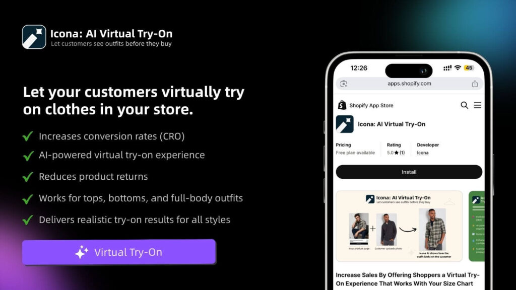
But you can go even further to eliminate that “I wonder if this will work for me” hesitation. This is where modern tools are changing the game. Just like TryIcona helps customers visualize products before purchase, amazing visuals help them take the next step. Virtual try-on technology, for instance, can completely transform the buying experience, allowing shoppers to see how an outfit looks on their own body. This gives them the confidence to buy and dramatically cuts down your return rate.
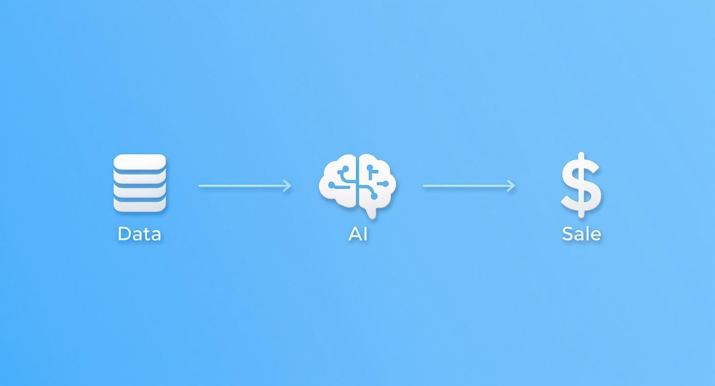
Weaving in AI and Personalization for Explosive Growth
In a sea of look-alike stores, a generic, one-size-fits-all experience just doesn’t cut it anymore. It’s the fast track to being forgotten. Your customers crave a connection; they want to feel understood. The secret to making them feel truly seen is personalization.
The real magic in modern e-commerce optimization comes from tech that can anticipate what a customer wants and reshape their experience on the fly. It’s all about delivering the right message, to the right person, at exactly the right moment.
Dynamic Product Recommendations
Ever been on Amazon and seen those “Customers who bought this also bought…” carousels? That’s not a lucky guess—it’s smart AI in action. By looking at a shopper’s browsing history, past purchases, and even what’s in their cart, you can surface products they are genuinely going to love.
- Upsells on Product Pages: Gently suggest a premium version or a bundle. For example, “Complete the look with these matching accessories.”
- Cross-sells in the Cart: Before they check out, offer something complementary, like a protective case for a new phone.
- “Trending Now” on the Homepage: Use what everyone else is loving to show shoppers with similar tastes what’s hot right now.
These small, automated nudges are brilliant for increasing your average order value because they make product discovery completely effortless for your customers.
Hyper-Personalized Marketing That Actually Works
Your email list is a goldmine, but only if you stop treating it like a faceless crowd. Blasting the same generic newsletter to everyone is the quickest way to get ignored. AI gives you the power to slice your audience with incredible precision and send automated messages that actually hit home.
Personalization isn’t just a “nice-to-have” feature anymore; it’s a core expectation. When you make customers feel like you’re speaking directly to them, you build the kind of trust and loyalty that fuels repeat business for years to come.
Imagine this: a customer who bought running shoes a few months ago gets an email letting them know new-arrival running socks just dropped. That’s the kind of relevance that turns a passive subscriber into a passionate buyer.
The numbers don’t lie. By 2025, a staggering 92% of top e-commerce firms will be using AI tools for these tailored experiences. Brands who get this right are seeing up to a 20% increase in sales, and email marketing—the king of personalization—delivers an incredible average ROI of $38 for every dollar spent. Discover more key insights on e-commerce trends.
The Power of Smart Automation
It goes way beyond recommendations and emails. A new generation of AI-powered tools is here to make your store smarter and your life easier. For a deep dive into the specific apps making this happen, check out our guide on the top ecommerce personalization tools available right now.
Consider putting these powerful applications to work for you:
- AI-Powered Chatbots: Offer instant, 24/7 customer support by answering common questions about shipping, returns, or product details.
- Personalized Popups: Ditch the generic 10% off coupon. Instead, create popups that react to user behavior—like offering a special discount on an item they’ve been viewing, right as they’re about to leave your site.
- Dynamic Pricing: Some advanced AI tools can even analyze market demand and competitor pricing to suggest the perfect price in real time, helping you maximize your profit margins.
When you start integrating these smart technologies, you create a store that doesn’t just react to what your customers do—it anticipates what they need.
Your Implementation and Testing Roadmap
All this knowledge is great, but it’s just trivia until you put it into practice. We’ve walked through the pillars of world-class e-commerce optimization, from deep technical audits to crafting copy that sells. Now, it’s time to bring it all to life.
The key is to avoid the temptation to overhaul everything overnight. Instead, you’re going to build momentum through smart, iterative changes. You make a change, you measure the result, you learn, and you repeat. This creates a feedback loop of continuous improvement that makes your store smarter and more profitable over time.
Start With High-Impact Wins
First things first: you need to prioritize. Pull out your audit notes and pinpoint the changes that promise the biggest reward for the least amount of work. These are your “low-hanging fruit,” and they’re the perfect place to start.
Not sure where to begin? These quick wins can deliver big results:
- Compressing product images: An instant, store-wide speed boost is hard to beat.
- Clarifying shipping costs: Simply moving the shipping calculator to the cart page can dramatically cut down on abandoned checkouts.
- Rewriting your top product’s headline: A small tweak that focuses on a core benefit can give your add-to-cart rate a serious lift.
This is all about using data to inform your actions, which in turn drives growth.
True optimization always starts with understanding what your customers are doing, using that insight to refine their experience, and then measuring how it affects your bottom line.
Embrace the Power of A/B Testing
Guesswork is the enemy of growth. Your secret weapon for making data-driven decisions is A/B testing (or split testing). The idea is beautifully simple: you show two different versions of a page—an A and a B—to different groups of visitors and see which one performs better.
You can test just about anything, from the color of your “Buy Now” button to the entire layout of your checkout flow.
The golden rule of A/B testing is to only test one thing at a time. If you change both the headline and the main image in your test, you’ll never know which change actually caused the result.
A solid A/B testing process always follows these steps:
- Form a Hypothesis: Start with an educated guess. For example: “I believe that adding customer testimonials right below the ‘Add to Cart’ button will increase conversions because it builds trust.”
- Choose Your Tool: While Shopify has some native features, dedicated tools like Google Optimize or VWO offer more powerful capabilities.
- Run the Test: Be patient. You need to let the test run long enough to collect statistically significant data.
- Analyze and Implement: Once you have a clear winner, roll it out to 100% of your audience. If the results are flat, that’s still a win—you’ve learned something valuable. Form a new hypothesis and go again.
The journey to a fully optimized store starts with a single, decisive step. Take what you’ve learned here, pick just one high-impact change, and commit to testing it this week.
Still Have Questions?
You’re putting in the work to build an incredible Shopify store, so it’s only natural to have a few questions about making it the best it can be. Let’s tackle some of the most common ones.
What’s the One Thing I Should Focus on First?
If you only have time to fix one thing, make it your mobile experience and page speed. Seriously. It’s the bedrock of everything else.
Most of your customers are probably scrolling on their phones. If your site is slow or clunky on a small screen, you’ve lost them before they even see your amazing products. A fast, smooth mobile journey is non-negotiable—it influences your bounce rate, session duration, and ultimately, your sales.
How Often Should I Be Looking for Ways to Improve?
Optimization isn’t a “set it and forget it” task; it’s a rhythm you get into. I recommend a deep-dive audit of your entire store at least quarterly. This is when you step back and look at the big picture.
On a weekly basis, you should have a quick pulse-check on your key numbers. Keep an eye on your conversion rate, cart abandonment, and bounce rate. This regular check-in helps you catch any issues early and see what’s working (or what’s not) from the changes you’ve made.
Can I Really Do This Myself, or Do I Need to Hire Someone?
You can absolutely get started on your own. Many of the most powerful improvements don’t require you to be a tech wizard. Things like rewriting your product descriptions to connect with customers, compressing images to speed up your site, or setting up a simple email capture popup can move the needle in a big way.
Down the road, you might want to bring in a specialist for heavy lifting, like deep technical SEO or custom coding. But don’t let that stop you from starting now. Grab the low-hanging fruit, build some momentum, and grow your skills right alongside your store.
Ready to turn window shoppers into happy customers? Icona adds a virtual fitting room right on your product page, letting people see how your clothes will actually look on their body. It’s a game-changer for building confidence, boosting conversions, and dramatically cutting down on returns.
Give your customers the “try on” experience for free with Icona.