
We’ve all been there. You land on a Shopify store, excited about a product, only to be met with that little loading spinner where a beautiful photo should be. A few seconds feel like an eternity, and poof—you’re gone. For you, the store owner, this isn’t just a tech glitch; it’s a silent conversion killer. Every second of delay sends a potential customer straight to your competition.
That frustration is real, and it’s costing businesses sales they never even knew they lost.

This guide is here to shift your perspective. Finding the “best photo size for websites” isn’t about memorizing a magic number. In 2025, it’s about mastering a feeling—the feeling of a lightning-fast, visually stunning store that builds trust from the first click.
Think of it like preparing the perfect meal. You need the right ingredients, the right portions, and the right cooking method. It’s the same with your store’s images. The three pillars are:
- Dimensions (the frame): The actual width and height of your image, measured in pixels.
- File Size (the weight): How “heavy” the image is, measured in kilobytes (KB).
- Format (the file type): The digital wrapper for your image, like JPG, PNG, or the game-changing WebP.
Get this trio right, and you’ll build a store that doesn’t just attract visitors—it captivates them and turns them into loyal customers.
The Real Cost of Heavy Images
It’s so easy to upload a gorgeous photo from your camera roll and call it a day. But those big, unoptimized images carry a hidden cost that hits your bottom line. Your store’s performance isn’t just a nice-to-have; it’s the foundation of the entire customer experience.
Here’s a quick look at what this really means for your business.
Your Quick Guide to the Three Pillars of Image Optimization
| Pillar | What It Means for Your Store | The Impact on Your Sales |
|---|---|---|
| Dimensions | Sizing your images to fit their specific containers on the page—not too big, not too small. | Prevents wasted loading time on oversized images, keeping customers engaged. |
| File Size | Keeping your image files as lightweight as possible without sacrificing quality. | Directly boosts page speed, which can increase conversion rates and slash bounce rates. |
| Format | Choosing the most efficient file type (like WebP) for the best quality-to-size ratio. | Faster-loading, high-quality images build trust and make your products look incredible. |
Mastering these areas isn’t about tweaking pixels—it’s about creating a better, faster, and more profitable shopping experience.
Believe it or not, images often make up a staggering 40-44% of a webpage’s total weight. They are the single biggest factor in how quickly your site loads. And when that’s ignored, the consequences are real. Slow-loading images can increase bounce rates by up to 32%—that’s nearly a third of your hard-won visitors leaving before they even see what you have to offer.
On the flip side, the payoff for speed is huge. Sites that load in under two seconds can see a 15% higher conversion rate. This isn’t just about tech specs; it’s about respecting your customer’s time. A fast, seamless experience signals professionalism and care, encouraging shoppers to stick around.
Your product photos are your digital salespeople. If they’re slow to show up for work, you’re losing sales you never even knew you had.
Getting your images right is one of the most powerful SEO tips for your Shopify store you can put into action today. Let’s dive in.
Matching Image Dimensions to Your Store’s Layout
Forget trying to memorize a laundry list of pixel dimensions. Honestly, it’s not about the numbers. The real secret is to simply fit the frame you’re given.
Think about it like this: would you hang a tiny 4×6 photo in a massive, wall-sized frame? It would look lost, amateurish, and just plain awkward. The same principle applies directly to your website.
One of the most common speed-killing mistakes we see is someone uploading a massive 5000-pixel photo straight from their camera to fill a banner space that’s only 1800 pixels wide. That’s like trying to shove a king-size mattress through a mail slot. It slows everything down to a crawl before your customer even lays eyes on a single product.
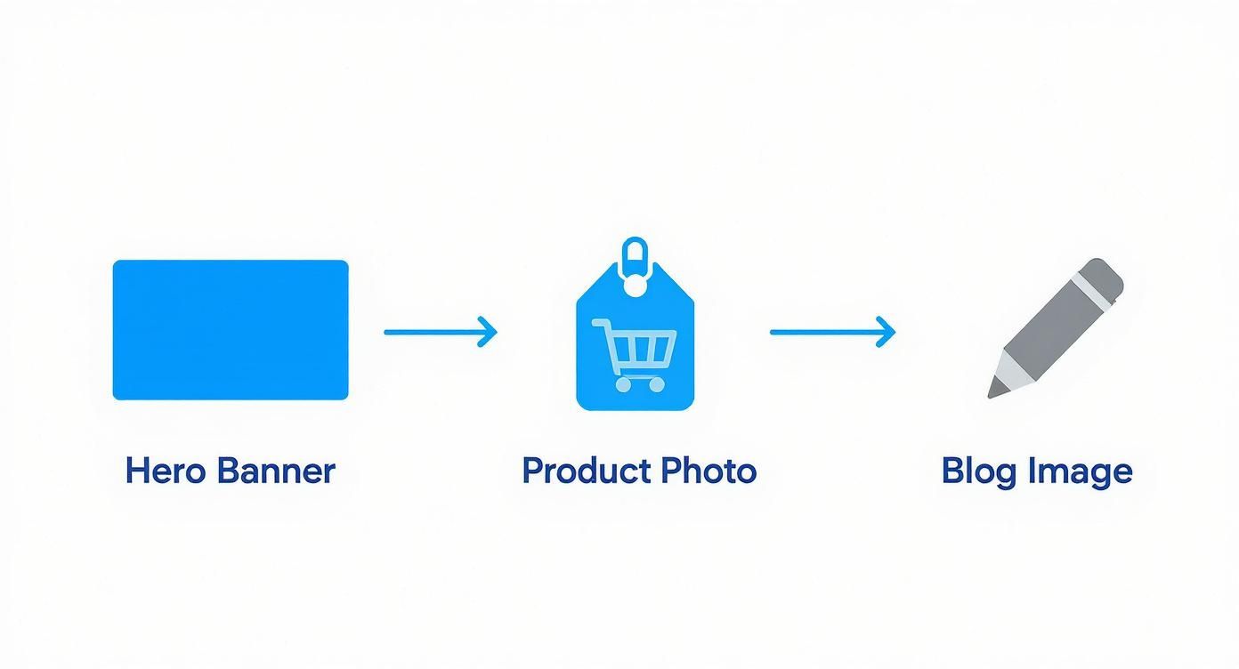
So, let’s talk about the practical dimensions you’ll actually need for the most important parts of your Shopify store.
Your Store’s Visual Blueprint
Think of these as your starting lineup, not an unbreakable set of rules. Your specific Shopify theme might have its own preferences, but these dimensions will give you a rock-solid foundation for a store that’s both gorgeous and lightning-fast.
- Hero Banners: This is your grand entrance. Aim for a width between 1800 and 2500 pixels. This is the sweet spot that keeps your main banner looking crisp on big desktop screens without bogging down your site.
- Product Photos: Here, clarity and consistency are king. A square format is the gold standard for a reason—it creates a clean, predictable grid. Shoot for dimensions between 800 x 800 pixels and 1200 x 1200 pixels. This size is perfect for letting Shopify’s zoom feature shine, giving shoppers that up-close detail they crave.
- Blog & Collection Images: These are your supporting actors, adding flavor and context. A width of around 1200 pixels is perfect. It’s detailed enough to draw people in without adding unnecessary weight.
Of course, getting the final image right starts with a great initial shot. If you want to level up your photography game from the very beginning, our guide on good cameras for product photography has options for every budget.
Why Aspect Ratio Is Your Secret Weapon
Pixels are only half the story. The real pro move is maintaining a consistent aspect ratio across your images. Simply put, this is the relationship between an image’s width and its height.
A 1000 x 1000 pixel image has a 1:1 (square) aspect ratio. A 1800 x 1200 pixel image has a 3:2 aspect ratio. It’s that simple.
Consistency is the cornerstone of trust in eCommerce. When every product photo on your collection pages is the exact same shape and size, it creates a seamless, professional, and trustworthy experience.
Imagine walking into your favorite high-end boutique. Everything is perfectly arranged, creating a calm, inviting atmosphere. That’s the exact feeling you’re trying to build online. Mismatched images, on the other hand, just look messy and unprofessional.
By resizing all your product images to the same dimensions—say, 1080 x 1080 pixels—before you upload them, you guarantee your collections look polished. This isn’t just about aesthetics; it’s a silent signal to your customers that you care about the details.
Choosing Your Image Format: JPG, PNG, or the Modern Champ, WebP
Deciding on an image format used to be a simple choice. Today, the wrong pick can grind your entire store to a halt. Let’s cut through the noise and make this simple.
Think of it like choosing the right tool for a job. You wouldn’t use a sledgehammer to hang a picture frame, would you? The same idea applies here. Getting the format right is a huge piece of the puzzle when it comes to finding the best photo size for websites.
Why WebP Is Your New Best Friend
If you take one thing away from this section, let it be this: start using WebP. It’s the modern, high-performance powerhouse for a reason.
WebP delivers stunning image quality at a tiny fraction of the file size of older formats. We’re talking a file size reduction of 25% to 35% compared to a JPG, with no noticeable drop in quality. That translates directly into faster page loads, which is pure gold for your customers, especially those shopping on their phones.
The conversation has shifted. It’s no longer if you should use WebP, but how you can implement it across your store for maximum speed.
But What About JPG and PNG?
Of course, the classics still have their place. Knowing when to use each one is a genuine superpower for site speed.
- JPG (or JPEG): This is your trusty, all-around workhorse. It’s perfect for complex, colorful images like detailed product photos or vibrant lifestyle shots from brands like Everlane or Allbirds.
- PNG: This one’s the specialist. Its claim to fame is transparency. Need to place your logo on a colored background without that clunky white box? PNG is your only real choice. The trade-off is much larger file sizes.
For a deeper dive into the technical side of things, this guide on the best image format for web is an excellent resource.
The Ultimate Image Format Showdown: WebP vs. JPG vs. PNG
To make it even clearer, here’s a quick-reference table. Think of this as your cheat sheet for choosing the right format every single time.
| Image Format | Best For | Key Benefit | When to Avoid |
|---|---|---|---|
| WebP | Almost everything: product shots, hero banners, blog images. | Speed. Offers the best balance of tiny file sizes and high quality. | When you absolutely need transparency (though WebP supports it, PNG is still more common). |
| JPG | Complex photographs with lots of colors and gradients. | Universal compatibility and great compression for photos. | Images that require a transparent background. |
| PNG | Logos, icons, and any graphic that needs a transparent background. | Lossless quality and full transparency support. | Large, complex photographs. The file sizes will be massive. |
Ultimately, your goal is to use WebP as your default, falling back to JPG for photos when needed and PNG only when transparency is a must.
Browser Support Is No Longer an Excuse
Years ago, the main argument against WebP was spotty browser support. That excuse is officially a thing of the past. In 2025, WebP is universally supported across all modern browsers—Chrome, Firefox, Safari, Edge, you name it.
And the best part? If you’re on a platform like Shopify, this is largely handled for you. Shopify automatically detects which browsers support WebP and serves that format for the fastest load times, seamlessly falling back to JPG or PNG for the rare visitor on an older browser. It’s a win-win.
The Art of Image Compression Without Losing Quality
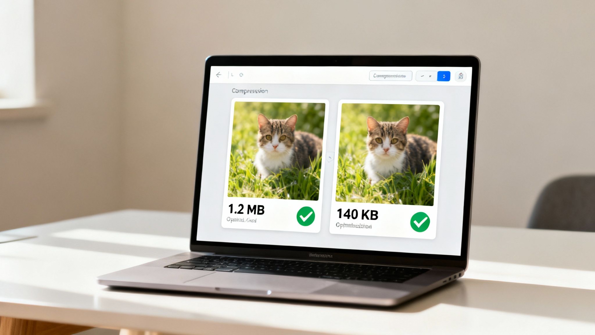
This is where the real magic happens. If getting your image dimensions right is the foundation, then compression is the secret sauce that makes your store feel lightning-fast. It’s the craft of making your image files incredibly lightweight without turning your stunning product shots into a pixelated mess.
Think of it like a professional packer who can somehow fit an entire wardrobe into a single carry-on. They aren’t throwing clothes away; they’re just being incredibly smart with the space they have. That’s what good image compression does for your website’s speed.
Lossy vs Lossless: The Two Sides of Compression
As you dive into compression, you’ll hear two terms thrown around: lossy and lossless. They might sound technical, but the idea behind them is pretty straightforward.
Lossless Compression: Imagine a vacuum-sealed bag. It squeezes all the air out, but when you open it, everything inside is exactly as it was. Every single pixel is preserved. This is fantastic for sharp logos, but the file size reduction isn’t as dramatic.
Lossy Compression: This is the more aggressive—and often more effective—approach for photos. It cleverly removes tiny bits of information the human eye isn’t likely to notice. A touch of lossy compression can slash your file size with no visible drop in quality. Go too far, though, and you’ll start seeing that dreaded blurriness.
The real skill isn’t about choosing one over the other. It’s about finding that sweet spot where your images are feather-light but still look breathtakingly crisp.
Your target file sizes are your North Star for performance. Aim for most product images to land under 150 KB, and keep those big, beautiful hero images under 300 KB. Hitting these numbers is an absolute game-changer for page speed.
Tools That Make Compression Easy
The best part? You don’t need to be a Photoshop guru to master this. There are amazing, user-friendly tools that do all the heavy lifting for you.
Here are a few favorites we always recommend to merchants:
- TinyPNG / TinyJPG: A wildly popular web-based tool. Just upload your files, and it applies smart lossy compression to shrink them, often by 50% or more, without you even noticing a difference.
- ImageOptim: This free Mac app is ruthlessly efficient. It strips out all the unnecessary fluff from your image files to get you the smallest possible size.
- Shopify’s Built-in Optimization: Don’t forget, Shopify automatically applies its own compression when you upload images. Think of it as a safety net. For the best performance, though, always compress your images before you upload. This puts you in total control.
Sometimes, after a heavy compression, you might find an image has lost a bit of its sharpness. A quality online image upscaler can intelligently enhance the resolution, giving you the best of both worlds.
Ultimately, compression isn’t a chore; it’s an opportunity. By taking a few extra seconds to run your images through one of these tools, you are directly investing in a faster, more profitable online store.
Serving the Perfect Image Size to Every Device

Your customers are everywhere—on sprawling desktop monitors, crisp tablets, and phones of every imaginable size. So why would you force a tiny phone screen to download a massive, desktop-sized image? It’s like making someone drink their morning espresso out of a giant soup bowl. It just doesn’t make sense.
This is where responsive images come in. It’s one of the smartest solutions in modern web design, and it’s a game-changer for page speed.
Think of it like a coffee shop that offers small, medium, and large cups. The browser intelligently asks the device, “What size cup do you need?” and then grabs the perfect fit. This simple act ensures no one gets more than they need, which translates to a blazing-fast experience for every single visitor.
How Responsive Images Work Their Magic
The technology that makes this possible is a clever bit of code called srcset (short for “source set”). You don’t need to be a developer to get the concept. It’s simply a menu of different-sized versions of the same image that you offer to the browser.
When a customer lands on your product page, their browser reads this menu and says, “Aha! This person is on a standard smartphone, so I’ll grab the medium-sized image.”
All they experience is a site that loads incredibly fast with images that look perfectly crisp on their screen. This is the key to understanding the best photo size for websites—there isn’t just one size, there are several, each with a specific job to do.
By serving the right image to the right device, you’re not just saving bandwidth; you’re showing respect for your customer’s time and data. That’s a powerful way to build trust.
The Good News: Your Shopify Theme Does the Heavy Lifting
Feeling a bit overwhelmed by the code? Take a deep breath. Here’s the best part: if you’re using a modern Shopify theme, this is almost certainly being handled for you automatically.
When you upload a high-quality product photo, Shopify gets to work creating multiple smaller versions of it in the background. Your theme is then coded to use srcset to serve the most appropriate version to each visitor. It’s a beautifully automated system designed to make your store fast, right out of the box.
So, your main job isn’t to code this yourself. It’s to provide Shopify with a great, high-resolution source image to work with. Think of it as giving a talented chef (your theme) the highest-quality ingredients.
How to Check if Your Site Is Truly Responsive
You can put on your detective hat and check this for yourself in about 30 seconds. This is a fantastic skill for spotting performance issues.
Here’s how to see it in action:
- Open Your Store in Chrome: Navigate to a product page with a large, clear image.
- Right-Click and Inspect: Right-click directly on the product image and choose “Inspect” from the menu. This will open the developer tools panel.
- Look for
srcset: You’ll see the page’s HTML code. The line of code for your image will be highlighted, and if it’s responsive, you’ll see an attribute calledsrcsetfollowed by a list of image URLs with different sizes.
If you see that srcset, you can rest easy knowing your theme is working hard to deliver a tailored, fast experience for every shopper.
Your Simple Step-by-Step Image Optimization Workflow
Alright, theory is one thing, but action is where the magic happens. Let’s forge everything we’ve talked about into a simple, repeatable process. This is your pre-flight checklist for every single image you upload.
Think of this as your recipe for creating a lightning-fast shopping experience. When you make this a habit, optimization stops being a chore and becomes one of your most powerful tools for boosting conversions.
The Six-Step Optimization Checklist
Here’s the entire workflow from start to finish. Internalize these steps, and you’ll never second-guess whether your images are hurting your site speed again.
Start with a High-Quality Source: You can always shrink a great image, but you can’t magically add detail to a small, pixelated one. Always begin with the highest resolution photo you have.
Crop and Resize for the Frame: Before anything else, tailor the image for its specific home. Is this a sprawling 2000px hero banner? Or a crisp 1080px square product shot? Resize it to the exact dimensions needed.
Choose the Best Format: Now, make the call. Is it a photograph? WebP or JPG is the way to go. Does it need a transparent background, like your logo? That’s a job for PNG. For over 90% of your store’s images, WebP will give you the best blend of quality and speed.
This simple workflow isn’t about being a technical expert. It’s about being a smart merchant who understands that every kilobyte saved is a better experience for your customer.
Finalizing Your Image for Launch
With the technical side sorted, these last two steps get your image ready for the spotlight—for both your customers and the search engines.
Compress Like a Pro: This is where the real performance gains are unlocked. Run your perfectly sized image through a tool like TinyPNG. Your mission: get product photos under 150 KB and hero images under 300 KB
Name Your File for SEO: Never upload
IMG_8472.jpg. That tells Google nothing. Instead, give your file a descriptive, keyword-rich name likeblue-linen-button-down-shirt.webp. It’s a small detail that packs a huge SEO punch.Upload to Shopify: You’re ready. Upload your masterpiece, knowing it’s lean, fast, and ready to impress.
If you want to dig even deeper into this topic, check out this fantastic resource: A Guide to Sizing Images for Websites. Making this process second nature is one of the single most impactful things you can do for your store’s speed and, ultimately, your sales.
Your Image Optimization Questions Answered
We get it. Even with the best workflow, questions come up. Image optimization can feel like a minefield of technical jargon. Let’s clear the air and tackle some of the most common questions we hear from Shopify merchants.
Does Shopify Automatically Compress My Images?
Yes, Shopify does compress images for you when you upload them. Think of it as a helpful safety net.
But here’s the pro tip: for the absolute best results, you should always optimize your images before you upload them. Pre-optimizing gives you total control to crush that file size down to its absolute minimum—and that’s the secret to unlocking elite-level page speed.
What Is the Best Resolution for Website Photos: 72 DPI or 300 DPI?
This is one of the biggest myths in web design, a ghost from the world of print that just won’t go away! For websites, DPI (Dots Per Inch) is completely irrelevant. Seriously. Web browsers don’t even look at it.
What truly matters are two things: the pixel dimensions (like 1200px wide) and the final file size (like 125 KB). Your entire focus should be on getting the pixel dimensions right for the space the image fills on the screen, then compressing it as much as possible. You can officially forget about DPI forever.
Can I Use AI Tools to Help Optimize My Images?
Absolutely, and in 2025, you’d be crazy not to! Modern AI tools are a complete game-changer for finding the perfect photo size for websites and nailing your optimization.
Many of these tools can intelligently analyze an image and apply the perfect level of compression, shrinking the file size while preserving stunning visual quality. Some can even auto-generate all the different sizes you need for responsive designs. Using them is a brilliant way to supercharge your workflow and get far better results, faster.
Now that your images are sharp and speedy, the next step is bringing them to life. With Icona, you can move beyond static photos and offer an AI-powered virtual try-on right on your product pages. Let shoppers see exactly how your clothes look on their own bodies, boosting their confidence and driving your sales. Learn more and get started at our website.