
Staring at a high cart abandonment rate is frustrating, but it’s also one of your biggest growth opportunities. Figuring out how to reduce cart abandonment isn’t about finding one silver bullet; it’s about systematically removing the friction that makes a customer hesitate, turning their “maybe later” into a confident “buy now.”
Why Shoppers Really Abandon Carts (It’s Not What You Think)

An abandoned cart is rarely a hard “no.” It’s almost always a “not right now” or a “not like this.” It’s that moment of friction where a customer’s initial excitement slams into an unexpected obstacle. Your job is to find and eliminate those snags.
Instead of seeing it as a lost sale, think of it as raw, unfiltered feedback from people who were this close to buying. They liked your products enough to add them to their cart! The breakdown is happening somewhere in that final mile. Let’s dig into the common culprits.
Financial Sticker Shock: The #1 Conversion Killer
Surprise costs are, by far, the number one reason people leave. Nothing kills the buying mood faster than getting to the checkout and seeing the total jump unexpectedly.
Baymard Institute’s research is crystal clear on this: 48% of US shoppers have abandoned a cart because extra costs like shipping, taxes, and fees were too high. This isn’t just about the money; it’s a trust issue. The customer mentally committed to one price, and now it feels like a classic bait-and-switch. You can dive deeper into these cart abandonment stats to see just how critical transparency is.
Real-World Example: Imagine a customer finds a dress for $60. They add it to their cart, excited about the price. At checkout, they’re hit with a $12 shipping fee and $5 in taxes, turning their $60 purchase into a $77 one. That 28% increase feels deceptive and is often enough to make them close the tab.
The Checkout Chore: Friction in the Final Step
Right behind surprise fees is a checkout process that feels like work. Your customer is ready to hand over their money, but you’re making them jump through hoops.
Common friction points I see all the time include:
- Forced Account Creation: Nobody wants to create yet another account with a password they’ll forget just to buy a t-shirt. It’s a huge barrier, especially for first-time buyers. Baymard found that 24% of users abandon a cart if forced to create an account.
- Too Many Form Fields: Are you really going to call them? Then don’t make the phone number a required field. Every unnecessary box you ask them to fill out is another chance for them to leave.
- Limited Payment Options: People have their favorite ways to pay. If a shopper loves the convenience of Apple Pay but only sees a manual credit card form, that might be all it takes for them to drop off. In fact, 9% of shoppers will abandon a purchase if their preferred payment method isn’t available.
Every extra click or form field you add is another opportunity for a customer to second-guess their purchase. The goal should be to make buying from you feel effortless.
By pinpointing exactly why shoppers are bouncing, you can stop staring at a frustrating metric and start implementing targeted, high-impact fixes that actually move the needle.
Top Cart Abandonment Reasons and Actionable Quick Fixes
This table breaks down the most common issues and the first, most impactful fix you can implement for each.
| Abandonment Reason | The Actionable Fix | Impact Level |
|---|---|---|
| Unexpected Shipping Costs | Use a shipping bar to announce the free shipping threshold site-wide. | High |
| Forced Account Creation | Enable guest checkout and make it the default option in your Shopify settings. | High |
| Long/Complex Checkout | Remove non-essential form fields (e.g., make phone number optional, hide ‘company’). | Medium |
| Lack of Payment Options | Add accelerated checkouts like Shop Pay, Apple Pay, and PayPal in your payments settings. | High |
| Concerns About Returns | Make your return policy clear and link to it from your product pages and footer. | Medium |
| Slow Website Performance | Optimize images with a Shopify app and ensure your theme is mobile-responsive. | High |
Starting with these quick fixes can often provide the biggest initial lift in your conversion rate while you work on the more in-depth strategies.
How to Reduce Cart Abandonment with a Frictionless Checkout
Think of your checkout as the final sprint in a marathon. After all the work a customer has done—browsing, selecting items, falling in love with a piece—this is where you can lose the race. A clunky, confusing, or demanding checkout is a primary reason people just give up and leave.
The goal here is to make paying so seamless that customers barely have to think. It’s about systematically finding and removing those small, frustrating hurdles. Let’s walk through the highest-impact tweaks you can make right inside your Shopify admin.

This screen in your Shopify settings is your command center. You can see the options right there to make accounts optional—this is one of the first and most important things you should change.
Step 1: Ditch the Forced Account Creation
One of the most common—and most damaging—mistakes is forcing a new customer to create an account. For someone making a quick purchase, this feels like an unnecessary commitment. As mentioned, a staggering 24% of shoppers say they’ll abandon their cart if they’re required to create an account.
The fix is incredibly simple: enable guest checkout.
How to Do It:
- In your Shopify admin, navigate to Settings > Checkout.
- Under the “Customer accounts” section, select the option “Accounts are optional.”
- Click Save. You’ve just removed a massive point of friction.
Pro Tip: You can still encourage sign-ups after they’ve paid. On the order confirmation page, add a prompt like, “Want to make your next order faster? Save your details by creating an account.” At this point, it feels like a helpful suggestion, not a roadblock.
Step 2: Turn On Every Express Payment Option
We live in a world of one-click buying. Manually typing in credit card numbers and shipping addresses, especially on a phone, feels like a chore. This is exactly what express checkouts were made for.
How to Do It:
- From your Shopify admin, go to Settings > Payments.
- Activate Shop Pay. It allows customers to save their info for a one-click checkout across Shopify.
- Scroll down to “Additional payment methods” and activate digital wallets like Apple Pay, Google Pay, and PayPal.
By enabling these, you let customers use payment details they already have stored. A checkout that might have taken minutes can be done in seconds with a single tap. For a deeper dive, we have more hands-on strategies in our guides on Shopify checkout optimization.
Step 3: Conduct a Form Field Audit
Every field you ask a customer to fill out adds friction. Take a hard, honest look at your checkout form. For each box, ask yourself: is this information absolutely essential to ship the product?
How to Do It:
- Go to Settings > Checkout.
- In the “Form options” section, set fields like “Company name” to Hidden.
- Set the “Phone number” field to Optional.
- Ensure “Shipping address” is the only required address. The second address line should always be optional.
Remember, the checkout abandonment rate on mobile phones can be as high as 80.2%. Shortening that form makes a huge difference on a small screen. Retailers who nail a streamlined, one-page checkout often see their conversion rates jump by 15-25%.
Build Unshakeable Product Confidence

When it comes to fashion, the biggest reason people bail on their carts isn’t just the price—it’s doubt. For every item a customer adds, a little voice in their head is asking questions: Will this actually fit me? What does the fabric feel like? Is that color the same in real life?
Answering these questions before they become deal-breakers is how you turn a hesitant browser into a confident buyer. You don’t have a physical fitting room, so your job is to build a digital one that leaves no room for uncertainty.
Step 1: Bring Your Products to Life with Rich Visuals
Standard, flat product photos on a white background just don’t cut it anymore. Your customers need to see your apparel from every angle, in different lighting, and on different bodies.
How to Do It:
- Go Beyond Front-and-Back: Shoot every item from the front, back, side, and a 45-degree angle. Zoom in on the details—the texture of the fabric, the quality of the stitching, the finish on a button.
- Show, Don’t Just Tell: Get your clothes on a model and show them in motion. A photo of a dress flowing as someone walks is infinitely more compelling than a stiff mannequin shot.
- Embrace Video: A quick, 15-second clip of a model moving in an outfit communicates fit, drape, and material in a way static images never can. It’s a small effort for a huge payoff, as product videos can boost conversions by up to 80%.
Real-World Example: Fashion brand ASOS is a master of this. They provide studio shots, a catwalk video for every single item, and photos of the product on models of different heights and sizes. This multi-faceted approach answers almost any visual question a shopper might have.
Visual Merchandising Impact on Purchase Confidence
| Technique | How It Builds Confidence | Potential Impact on Abandonment Rate |
|---|---|---|
| High-Res Zoom | Lets shoppers inspect fabric texture, stitching, and small details, mimicking an in-hand inspection. | Significant Reduction: Answers quality and material questions upfront. |
| 360° View | Provides a complete, uninterrupted view of the product, eliminating surprises about the back or side fit. | Moderate Reduction: Helps customers understand shape and structure. |
| On-Model Video | Shows how the garment drapes, moves, and fits during real-world motion. | Significant Reduction: The best way to communicate fit and feel digitally. |
| Lifestyle Context | Displays the item in a real-world setting, helping shoppers visualize it in their own lives. | Moderate Reduction: Connects the product to the customer’s aspirations. |
| User-Generated Photos | Provides authentic social proof on diverse body types, building trust and relatability. | High Reduction: Shows how the product looks on “real people,” not just models. |
Step 2: Craft Descriptions That Answer Questions
Your product descriptions need to do more than just list facts. They should tell the story of the item, answering the questions a customer would ask if they were holding it in their hands.
How to Do It:
- Describe the Feel: Instead of a sterile “100% Cotton,” try painting a picture: “Crafted from a soft, breathable 100% organic cotton that gets even cozier with every wash.”
- Give Fit Notes: Add practical fit advice. Simple notes like “Runs true to size,” “Size up for a more relaxed fit,” or including the model’s height and the size they’re wearing are absolute gold for shoppers.
- Use Bullet Points: List key features like material, care instructions, and fit type in an easy-to-scan bulleted list.
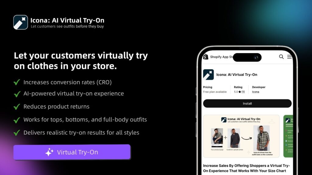
Step 3: Empower Shoppers with Virtual Try-On
The number one question for any online clothing shopper is, “Will this fit me?” Size charts are a starting point, but they’re often confusing and don’t account for unique body shapes.
Virtual try-on tools, like the Icona app, are built to eliminate this specific uncertainty. They allow a customer to upload a photo and instantly see how a garment will look on their own body. It’s a personalized fit visualization that’s far more powerful than any size guide. By adding a simple try-on button to your product pages, you give every shopper a personal fitting room, providing the final nudge of confidence they need. Explore other ecommerce personalization tools to build crucial customer trust.
Step 4: Leverage Social Proof with Authentic Reviews
After everything you’ve shown them, the most powerful confidence booster comes from other customers.
How to Do It:
- Install a Review App: Use a Shopify app like Judge.me or Loox to collect and display reviews.
- Incentivize Photo Reviews: Offer a small discount on a future purchase for customers who upload a photo with their review.
- Showcase Reviews Prominently: Feature your best reviews and user-generated photos directly on your product pages.
A gallery of user-generated content showing your apparel on a diverse range of body types is one of the most effective conversion assets you can have.
Master Pricing and Shipping Transparency
If there’s one golden rule in ecommerce, it’s this: nobody likes a surprise party at checkout. Unexpected costs are the number one reason shoppers abandon their carts. This isn’t just about the extra dollars; it’s about a breakdown of trust at the most critical moment.
The only way to combat this is with radical transparency. Your mission is to make the final price so clear, so early in the process, that by the time a customer hits the checkout page, there are zero questions left to ask.
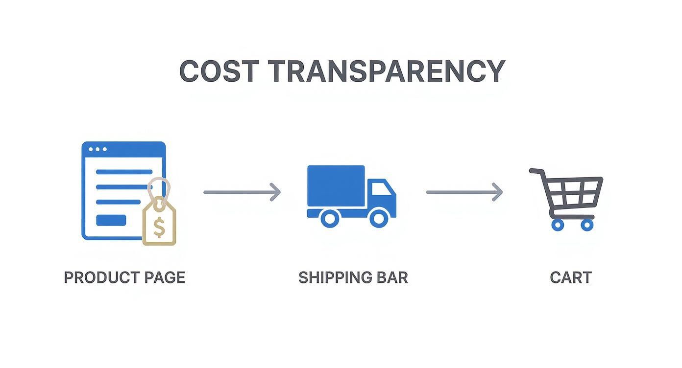
Step 1: Display All Costs Upfront
The absolute worst place to reveal the true cost of an order is on the final payment screen. You have to introduce these costs way earlier in their journey.
How to Do It:
- Install a Shipping Rate Calculator: Add a calculator directly to your cart page. It lets shoppers pop in their zip code and see the exact shipping cost before they even begin checking out.
- Use an Announcement Bar: That little bar at the top of your site is prime real estate. Use it to broadcast your free shipping threshold (e.g., “Free Shipping on All Orders Over $75!”)
- Be Clear About Taxes: While showing exact taxes on a product page is tricky, a simple disclaimer like “+ taxes calculated at checkout” near the price works wonders. It sets the expectation early.
The moment a customer feels misled by your pricing, you’ve likely lost them for good. Total transparency builds the trust needed to not only complete this purchase but also to come back for the next one.
Step 2: Choose and Frame Your Shipping Strategy
How you structure your shipping fees matters just as much as when you show them. You’ll set all of this up in your Shopify shipping settings.
This dashboard is your command center. Getting these rules right is fundamental. Let’s look at the most popular options:
- Free Shipping: This is the heavyweight champion. 73% of consumers are more likely to purchase if a retailer offers free shipping. If your margins can handle it, offer it store-wide. If not, use a threshold (e.g., over $100) to bump up your average order value (AOV).
- Flat-Rate Shipping: My go-to recommendation for most apparel brands. A single, predictable fee like “$5 Standard Shipping” removes all uncertainty.
- Calculated Shipping: This pulls real-time rates from carriers. While accurate, it can create price anxiety. If you use this, a shipping calculator on the cart page is essential.
Real-World Example: The fashion retailer Everlane is a master of transparency. They clearly state their $75 free shipping threshold in the announcement bar. For orders below that, they offer a simple, flat-rate shipping fee. This clarity eliminates any guesswork for the shopper.
Set Up a Killer Cart Recovery System
An abandoned cart isn’t a lost sale—it’s a warm lead. A shopper was interested enough to add your product to their cart. All that’s left is a gentle, strategic nudge to get them across the finish line.
The Magic Is in the Automated Follow-Up Email
A single “you left something behind” email is a decent start, but a multi-part sequence is where you’ll see the real results. The data is compelling: cart recovery emails have an average conversion rate of 10.7%. This tells us that shoppers are not only seeing but also acting on these reminders. Check out the latest stats on the effectiveness of cart recovery emails to see how much revenue they can drive.
Let’s walk through building a proven three-part email sequence you can set up with a tool like Klaviyo or Omnisend.
How to Craft the Perfect Three-Email Sequence
Timing and tone are everything. Each email has a specific job, from a simple reminder to gently creating a bit of urgency.
Email 1: The Gentle Reminder (Send after 1 hour)
The goal is to be helpful, not pushy. The customer could have gotten distracted or their browser might have crashed.
- Subject Line Ideas: “Did you forget something?” or “Your cart is waiting for you!”
- Body Copy: Keep it short and sweet. Remind them what they left behind with a clear picture of the item. Include one prominent call-to-action button, like “Return to Your Cart.”
- Example: “Hey [Customer Name], it looks like you left some great items in your cart. We’ve saved them for you so you can pick up right where you left off. Ready to make them yours?”
The flow here shows how building trust early by being upfront with costs is a huge part of preventing abandonment in the first place.
Email 2: Overcome Hesitation (Send after 24 hours)
If the first reminder didn’t work, there might be some hesitation. This email is your chance to address it by building confidence and showing social proof.
- Subject Line Ideas: “Your [Product Name] is getting a lot of attention” or “Still thinking it over?”
- Body Copy: Remind them why the product is great. Drop in a glowing customer review or a star rating. You can also proactively answer questions by linking to your FAQ or return policy.
- Example: “We noticed you’re still considering the [Product Name]. It’s one of our bestsellers! Here’s what a recent customer had to say: ‘I absolutely love this jacket, the fit is perfect!’ Don’t miss out.”
Email 3: The Final Nudge (Send after 72 hours)
This is your last shot, and it’s the right time to introduce a small incentive. A discount can be incredibly effective for price-sensitive shoppers.
- Subject Line Ideas: “A special treat just for you” or “Last chance to claim your cart.”
- Body Copy: Create subtle urgency. Mention that the items in their cart might sell out. If you offer a deal, make it clear and simple, like a 10% discount or free shipping.
- Example: “We don’t want you to miss out! Complete your order in the next 24 hours and enjoy free shipping on us. Use code: COMEBACK at checkout.”
Pro Tip: Not every abandoned cart needs a discount. Segment your recovery campaigns. For instance, offer discounts only to first-time customers or for carts over a certain threshold, like $100. This protects your margins while still giving a powerful nudge.
For a deeper dive, you can explore our complete guide to Shopify cart recovery techniques.
Putting It All Together: Your Actionable Roadmap
Alright, let’s turn theory into a practical plan. You don’t have to tackle everything at once. We’ll split this into two phases: quick wins you can implement this week and bigger projects that will drive long-term growth.
This is your roadmap for learning exactly how to reduce cart abandonment without the guesswork.
Phase 1: Quick Wins (Implement This Week)
These are the low-hanging fruit. Making these simple changes can have a surprisingly big impact on your numbers, often in a matter of days.
- Step 1: Offer Guest Checkout: Go to
Settings > Checkoutand make customer accounts optional. It’s a simple toggle that can stop up to 24% of your shoppers from walking away. - Step 2: Turn On Express Payments: Activate Shop Pay, Apple Pay, and PayPal in your
Settings > Payments. This is a massive win for mobile shoppers. - Step 3: Be Loud and Clear About Shipping: Use an announcement bar to clearly state your shipping fees or your free shipping threshold. This transforms a nasty surprise into a clear incentive.
Phase 2: Growth Levers (Implement This Month)
Once you’ve plugged the most urgent leaks, it’s time to build genuine trust and confidence in your products, which pays off in both lower cart abandonment and higher customer loyalty.
- Step 1: Level Up Your Product Visuals: Add on-model videos to show how the fabric moves and shoot high-res detail shots of texture and stitching.
- Step 2: Set Up Cart Recovery Emails: Use a tool like Klaviyo or Shopify Email to create an automated three-part cart recovery email sequence. It’s a safety net that works 24/7.
- Step 3: Solve the “Fit” Problem: This is the biggest elephant in the room for online fashion. A virtual try-on tool is your most powerful asset here. An app like Icona replicates that in-person fitting room experience, giving customers the proof they need that an item will look great on them. It’s that final dose of confidence that not only closes the sale but also drastically cuts down on returns.
Have More Questions? We’ve Got Answers
You’re not alone in wondering about the finer points of cart abandonment. Here are some of the most common questions I hear from Shopify store owners.
What’s a Good Cart Abandonment Rate to Aim For?
It’s tempting to look for a magic number, but a “good” rate is relative. While the e-commerce average often sits around a staggering 70-80%, what matters is your store’s performance.
Instead of chasing an industry-wide benchmark, focus on improving your own baseline. A 10-15% reduction from where you are right now is a fantastic starting point. That’s a realistic goal that will have a real, measurable impact on your bottom line.
How Quickly Should I Send That First Recovery Email?
Timing is everything. Send that first email within one hour of the cart being abandoned. Don’t wait.
This is your golden window. The items are still fresh in their mind. Your first message should feel like a friendly tap on the shoulder—a helpful reminder, not a pushy sales pitch. You can then plan a second email for 24 hours later (with social proof) and a final one at 72 hours if you want to include a small incentive.
An abandoned cart isn’t a hard “no.” More often than not, it’s just a “not right now” caused by a distraction. A timely, helpful follow-up is the simplest way to win back a sale you nearly had.
Will Offering Guest Checkout Sabotage My Email List?
Absolutely not. In fact, forcing customers to create an account is more likely to sabotage the sale itself. It’s a huge point of friction, causing 24% of shoppers to walk away.
Here’s the smarter play: let them check out as a guest. Then, on the post-purchase “Thank You” page, give them the option to create an account to save their info for their next visit. This way, you secure the sale first and still get a chance to build that customer relationship on their terms.
Tackling cart abandonment means removing every last bit of doubt from your customer’s mind. By optimizing your checkout, being transparent with costs, and building unshakeable product confidence, you pave a smoother path from browser to buyer.
Ready to solve the biggest reason shoppers hesitate in fashion e-commerce—”Will it fit me?” Icona gives your customers a virtual try-on experience, providing the confidence they need to click “Buy Now.” See exactly how it works at https://apps.shopify.com/icona.